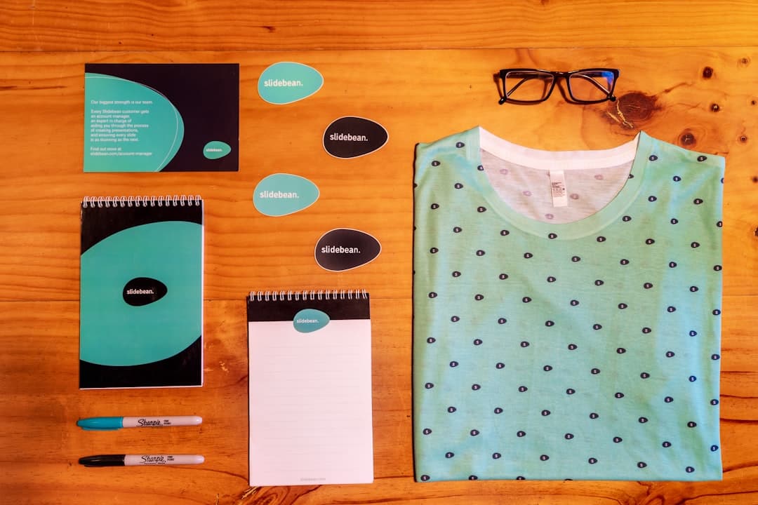
Brand identity for a website is the system of visual and verbal choices — logo, color, type, voice, motion, imagery — that makes a site recognizable as belonging to a specific company. A strong identity does more than decorate; it carries meaning, builds trust, and compounds over time. In 2026, with the average visitor judging a site in under a second, brand identity is the difference between memorable and forgotten.
What Brand Identity Means on the Web
Brand identity is the bridge between the abstract idea of a company and the concrete artifacts a customer encounters. The logo is one artifact. So is the homepage hero. So is the cookie banner copy, the 404 page, and the way the menu animates on tap. Each one contributes to or detracts from a single impression.
On the web, brand identity is also a system. It is not a single homepage that looks good in a portfolio — it is a set of rules and components that produce consistent results across hundreds of pages, multiple devices, and the inevitable changes a site goes through. The system is what makes a brand survive contact with new marketing campaigns, new team members, and new product launches.
Identity vs. Branding vs. Brand
Three terms that get used interchangeably. The brand is the perception a company creates in the minds of customers. Branding is the deliberate work to shape that perception. Brand identity is the set of tangible artifacts produced by branding — the visible, audible, and tactile system. The website is one of the largest brand identity surfaces a company has.
The Components of a Web Brand Identity
Logo and Mark
The logo is the most compressed expression of the brand. For a website, the logo lives in the header, in the favicon, in the social share preview, and in the footer. It needs to work at 24 pixels (favicon), at 200 pixels (header), and at the full-bleed sizes used in hero sections.
A solid web logo has three versions: full lockup (mark + wordmark), wordmark alone, mark alone. Each appears in different contexts. Most also need a light and a dark variant for backgrounds, and a single-color variant for stamping on photographs.
Color System
A color system on the web is more than two brand colors. It is a full palette with semantic roles: primary, secondary, accent, neutral scale, semantic colors (success, warning, error), and surface colors (backgrounds, cards). The same color often needs multiple shades — lighter for backgrounds, darker for text — and the system has to maintain contrast ratios at every level. For the underlying theory, see our color theory guide.
Modern brand color systems use named tokens (–color-primary-500) instead of raw hex values. The token can be reassigned without rewriting every component, which is what enables dark mode, theming, and white-label deployments.
Typography
Type carries more brand weight than most teams realize. The choice between a geometric sans (Inter, Geist) and a humanist sans (Söhne, Untitled) carries character. The choice between a transitional serif (Tiempos, GT Sectra) and a modern serif (Reckless, Editorial New) carries era. Even within a category, the difference is significant.
A complete web type system includes a display face (large headlines), a body face (paragraph text), a UI face (buttons, labels), and often a monospaced face (code, technical numerals). Many brands consolidate to two families to control loading weight. For the full picture, see our typography guide.
Iconography
Icons are easy to overlook and reveal sloppy work fast. A brand identity has consistent stroke weight, corner radius, and grid across every icon used on the site. Mixing line icons with filled icons, or 1.5px strokes with 2px strokes, signals inattention. The best practice is to pick one icon set (Lucide, Phosphor, Heroicons) and stick with it, or commission a small custom set when the budget allows.
Imagery
Photography and illustration carry more brand information than logos. The decision is not “what photos” but “what kind of photos” — high contrast or muted, posed or candid, on-location or studio. The decision is enforced through a treatment: grading, cropping rules, overlay colors, sizing patterns. A brand can use stock if the treatment is consistent enough to make the source invisible.
Motion
How elements animate is brand. A subtle 200ms ease-out feels different from a bouncy 400ms spring. Brands like Stripe, Linear, and Vercel use motion as deliberately as color. A motion system specifies durations, easing curves, and the types of motion (fade, slide, scale) used for different events.
Voice and Tone
Brand voice is what the writing sounds like across pages. Tone is the modulation for context — playful on a 404 page, serious on a checkout. A documented voice covers sentence length, vocabulary level, use of contractions, formatting habits, and forbidden words. Without it, a single new copywriter can undo years of consistency.
Translating Brand to Web Design
Start With the Strategy
A brand identity is a translation of a brand strategy — the company’s positioning, audience, and values. If the strategy says “premium, trustworthy, technically credible,” the identity should not feel playful. If the strategy says “approachable, casual, generous,” it should not feel exclusive. The most common mistake is starting the visual work without writing down what the brand is supposed to feel.
Define the System First, the Pages Second
The temptation is to design the homepage and let the rest fall into place. The opposite produces better results. Define the type scale, color tokens, spacing system, button styles, and component library first. Then assemble pages from the components. This is the same logic as atomic design — molecules and atoms before pages.
Codify in a Design System
Every brand identity that lasts becomes a design system. The pieces are documented, the rules are written down, the components are reusable. For the full picture, see our design system guide. The minimum viable version is a Figma library with a few components and a one-page document describing the color scale, type scale, and spacing scale.
Visual Hierarchy Carries the Brand
How a brand uses scale, weight, and space is more memorable than any specific color. Apple’s brand is recognizable by the way it uses whitespace before it is recognizable by typeface. Most strong brands have a hierarchy signature that survives even when colors and fonts are swapped. For depth, see our visual hierarchy guide.
Building a Brand Identity in 2026
Modern Tools
Figma is the default. Brand identity work that used to happen in Adobe Illustrator now happens in Figma because the same file becomes the design system. Variables let you define tokens once and propagate changes. Component libraries let you ship the identity into Webflow, Framer, and code in one motion.
AI-Assisted Generation
AI logo generators have collapsed the cost of producing a starting point. The trap is that AI generates plausible logos, not strategic ones — without a clear brief, the output is generic. Use AI to explore directions, then commission a designer or refine manually to produce the working identity.
Variable Fonts
Variable fonts let a single file deliver every weight and width of a typeface. This reduces loading cost and opens new design possibilities — animating weight on hover, optical sizing that adjusts based on display size, custom weights between traditional steps. Inter, Recursive, and most new typefaces ship as variable by default.
Dark Mode as a First-Class Citizen
A brand identity now ships in two modes. The color tokens are defined in pairs: –color-bg in light is white, in dark is near-black. The relationship between tokens stays constant. Skipping dark mode in 2026 is a signal that the brand work was rushed.
Common Brand Identity Mistakes on Websites
- Logo that does not work small (too detailed, too thin, too colored).
- Color palette that fails WCAG contrast on real text combinations.
- Type system with three families fighting each other.
- Iconography that mixes sets and stroke weights.
- Stock photography pasted in with no treatment, breaking the brand.
- Inconsistent corner radius across components.
- Different button styles on different pages.
- No documented voice, so copy drifts page by page.
- No favicon or social share image, breaking the brand at the most-shared touchpoints.
Brand Identity and Conversion
Strong brand identity correlates with higher conversion, but the relationship is not direct. A consistent, polished identity raises the perceived trustworthiness of the site, which lowers friction at the conversion moment. Visitors compare the site they are on against the sites they have learned to trust. If your identity reads as amateur, the cart abandonment number grows. For the deeper conversation, our conversion rate optimization guide covers the levers.
When to Rebrand vs. Refine
Most teams reach for a rebrand when a refinement would work. Rebranding is appropriate when the strategy has fundamentally changed — new audience, new positioning, new business. Refinement is appropriate when the strategy is still right but the execution has drifted or aged.
The signs of a needed refinement: type that looks dated, colors that fail contrast, components that have proliferated without discipline. The signs of a needed rebrand: positioning has shifted, the company has outgrown its founding niche, or competitive pressure has compressed the differentiator. Refinement is cheaper, faster, and almost always the right first move.
Frequently Asked Questions
How much does a brand identity for a website cost?
It varies enormously. A starter identity from a freelance designer is typically $3,000 to $8,000. A mid-market identity system from a small studio runs $15,000 to $50,000. Established branding studios charge $75,000 and up for a full strategy-and-identity engagement. The right budget depends on the stakes of the launch and the longevity expected.
How long does it take to build a brand identity?
A focused engagement runs 4 to 8 weeks. Strategy work and discovery take 1 to 2 weeks, identity exploration 2 to 3 weeks, refinement 1 to 2 weeks, documentation and rollout 1 to 2 weeks. Faster engagements skip strategy and produce work that drifts later. Slower engagements often add cost without proportional value.
Do I need a brand identity before I build a website?
The two work better together than apart. If the brand is brand new, build the identity and site as a pair, because each informs the other. If the brand exists but the identity is weak, refine the identity first — building a site around weak identity guarantees a rebuild within 18 months.
What is the difference between a brand identity and a design system?
Brand identity is the visual and verbal system that expresses the brand. A design system is the technical and component-level implementation of that identity in software. The brand identity defines what a button should feel like; the design system defines how the button component is built so every developer ships the same one.
If you want a Framer or WordPress site designed around a coherent brand identity from the start, see our pricing or get in touch.