Visual hierarchy in web design is the deliberate arrangement of elements so the eye notices the most important content first and the least important content last. It uses size, color, contrast, spacing, and position to guide attention, helping visitors understand a page and take action without conscious effort.
Key Takeaways
- Visual hierarchy controls the order in which people notice things. It is one of the most powerful tools for usability and conversion.
- The main levers are size, color and contrast, spacing, position, typography, and visual weight.
- People scan rather than read. Designing around F-pattern and Z-pattern scanning matches how the eye actually moves.
- A page should have one clear focal point. Competing focal points cancel each other out and confuse the visitor.
- Framer makes hierarchy easy to apply consistently with type scales, layout tools, and reusable components.
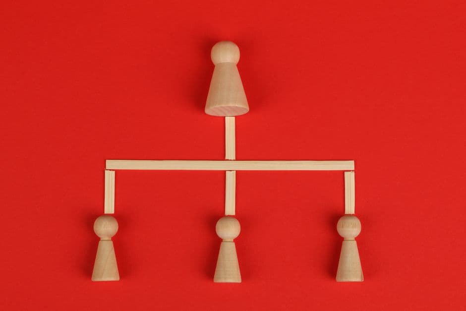
What Visual Hierarchy Means
Visual hierarchy is the principle that some elements on a page should stand out more than others. When a visitor lands on a page, their eye does not absorb everything at once. It moves from the most prominent element to the next, building an understanding of the page step by step. Visual hierarchy is the designer deciding what that order should be.
Without hierarchy, every element competes equally for attention, and the visitor has to do the work of figuring out what matters. With strong hierarchy, the page does that work for them. A clear headline, a supporting line, a single obvious button, and quieter supporting details create a path the eye follows naturally. The visitor feels the page is easy, even though they could not explain why.
The Tools That Create Hierarchy
Visual hierarchy is built from a small set of reliable levers. Used together, they make some elements unmistakably more important than others.
Size and scale
Larger elements draw attention first. This is the simplest and strongest lever. A headline at 48 pixels dominates a paragraph at 16 pixels. Scale should map to importance: the most important message is the largest, supporting content is smaller, and fine print is smallest.
Color and contrast
The eye is drawn to contrast. A single saturated button on a calm, neutral page is impossible to miss. This is why a primary call to action should use your most distinct color while everything else stays restrained. Our website color theory guide explains how to choose an accent color that carries this weight without clashing.
Spacing and isolation
White space creates emphasis. An element surrounded by empty space reads as important because nothing competes with it. Isolation is often more powerful than making something bigger or brighter.
Position and placement
Elements near the top of a page and along common scanning paths get noticed first. Placing the key message and primary action where the eye naturally lands gives them prominence for free.
Typography and weight
Font weight, style, and case all signal importance. Bold text reads as more significant than regular text. A clear type scale with distinct heading levels builds hierarchy into the content itself. Our website typography guide covers how to set that scale.
How People Actually Scan Pages
People do not read web pages line by line. They scan. Eye-tracking research shows two dominant patterns, and designing around them makes hierarchy far more effective.
The F-pattern appears on text-heavy pages like blogs and search results. The eye reads across the top, drops down, reads across again in a shorter sweep, then scans down the left edge. This means the most important information belongs at the top and along the left. The Z-pattern appears on simpler, more visual pages like landing pages. The eye moves across the top, diagonally down to the opposite corner, then across the bottom. Placing a logo top-left, a key message top-right, and a call to action bottom-right follows this natural path. Our landing page design best practices guide shows how to apply Z-pattern thinking to high-converting pages.
One Page, One Focal Point
A common mistake is giving a page several elements that all shout for attention: a giant headline, a bright banner, an autoplaying video, and three buttons in different colors. When everything competes, nothing wins, and the visitor feels overwhelmed.
Every page or section should have one clear focal point: the single element you most want noticed. Everything else should support it or step back. This does not mean a page can only have one button. It means there should be one obvious primary action, with secondary actions visually quieter. A primary button in a solid accent color paired with a secondary link in plain text creates a clear order of importance. This principle is central to effective CTA button design.
Before and after thinking
Before: a homepage hero has a large headline, a large subheading at almost the same size, two equally bright buttons, and a busy background image with text over it. Visitors are not sure where to look or what to do. The primary action gets few clicks. After: the headline is clearly the largest element, the subheading is noticeably smaller and lighter, one button uses a bold accent color while the other becomes a quiet text link, and the background is calmed so the text is readable. The eye now lands on the headline, reads the support line, and moves to the obvious button. Clicks on the primary action rise sharply.
Hierarchy and the Above-the-Fold Decision
The area visible before scrolling carries the heaviest hierarchy load. In the first moments on a page, the visitor decides whether to stay. That decision depends on whether the hierarchy makes the page instantly understandable. A clear, dominant headline that names the value, a readable support line, and one obvious action are usually enough.
This is why hierarchy and the above the fold design decision are tightly linked. The fold is not about cramming everything into view. It is about making sure the most important element is unmistakable in the first glance, with a clear reason to scroll for more.
Common Hierarchy Mistakes
Hierarchy breaks down in a few predictable ways. The first is flatness, where headings, body text, and captions are too similar in size and weight, so nothing stands out. The fix is a wider type scale with clear jumps between levels.
The second is too many emphasized elements. When five things are bold, large, or brightly colored, emphasis loses meaning. Restraint restores it. The third is hierarchy that fights the content, where a minor element is the most prominent thing on the page while the key message is buried. Always check that visual prominence matches actual importance. The fourth is ignoring mobile. A hierarchy that works on a wide screen can collapse on a narrow one, so test the order of attention at every breakpoint. These checks are part of broader web design best practices.
Building Strong Hierarchy in Framer
Framer makes visual hierarchy practical to design and, just as importantly, to keep consistent. Its typography tools let you define a clear type scale with distinct heading and body styles, so size-based hierarchy is built in rather than guessed at each time. Color styles let you reserve a single accent color for primary actions, keeping contrast meaningful.
Framer layout tools handle spacing and isolation cleanly, so you can give a focal element the room it needs to stand out. Because components are reusable, a section designed with correct hierarchy stays correct everywhere it appears. Framer also makes it easy to adjust size, spacing, and layout per breakpoint, so the order of attention holds on mobile as well as desktop. For an agency, this turns hierarchy from a fragile, page-by-page effort into a reliable system across the whole site.
Want a website where visitors instantly know where to look and what to do? We design and build sites in Framer with deliberate visual hierarchy that guides attention and lifts conversions. Get in touch with our team to discuss your project, or see our pricing for the right fit.
Frequently Asked Questions
What is visual hierarchy in web design
Visual hierarchy is the deliberate arrangement of elements so visitors notice the most important content first and the least important last. It uses size, color, contrast, spacing, and position to guide attention, making a page easy to understand and act on without conscious effort.
What are the main tools for creating hierarchy
The core tools are size and scale, color and contrast, spacing and isolation, position, and typography. Larger, brighter, more isolated, and higher-placed elements draw attention first. Used together, these levers make some elements clearly more important than others.
What is the difference between the F-pattern and the Z-pattern
Both describe how the eye scans a page. The F-pattern appears on text-heavy pages, where the eye reads across the top and down the left edge. The Z-pattern appears on simpler visual pages, moving across the top, diagonally down, then across the bottom.
Should a web page have more than one focal point
Each page or section should have one clear focal point. A page can include several actions, but only one should be the obvious primary action, with others made visually quieter. Multiple competing focal points cancel each other out and leave visitors unsure where to look.