Data visualization in web design is the craft of turning numbers into visual forms (charts, graphs, dashboards, and infographics) that people understand instantly. Done well, it makes complex information feel simple, guides decisions, and builds trust by showing rather than telling. The goal is clarity first, decoration never.
Key Takeaways
- Always start with the question your audience is trying to answer, then choose the chart that answers it.
- Match the chart type to the data: lines for trends, bars for comparisons, pie only for simple parts of a whole.
- Strip away clutter. Every gridline, label, and color should earn its place.
- Color carries meaning, so use it deliberately and ensure it passes contrast and colorblind checks.
- Design data visuals to be responsive and accessible, with text alternatives for screen readers.
- In Framer, you can build charts as components, embed live data tools, or animate visuals as users scroll.
Why Data Visualization Belongs in Web Design
People process visuals far faster than raw figures. A wall of numbers in a table forces the reader to do mental math, while a well-built chart delivers the conclusion in a glance. On a website, where attention is scarce and bounce rates are unforgiving, that speed is everything. A single clear graph can communicate what three paragraphs of text cannot.
Data visualization also builds credibility. Showing real numbers in a clean, honest visual signals that you have evidence behind your claims. A SaaS landing page that charts its growth, a report that maps survey results, a pricing page that visualizes savings: each uses data to persuade more convincingly than adjectives ever could.
But there is a catch. A misleading or cluttered chart does the opposite. It confuses, erodes trust, and can even misrepresent the truth. That is why data visualization is a design discipline with its own rules, not just a feature you bolt on at the end.
The Golden Rule: Clarity Before Beauty
The most important principle in data visualization is that clarity always beats decoration. A chart exists to communicate a specific insight, and anything that gets in the way of that insight should go. This idea, often called maximizing the data-to-ink ratio, means removing every element that does not carry information.
Heavy gridlines, 3D effects, drop shadows, gradient fills, and redundant labels all add visual noise. They make a chart look busy without making it clearer. A flat bar chart with thin axis lines and direct labels will almost always outperform a glossy 3D version that hides the actual values. When in doubt, take elements away rather than add them.
This restraint connects to a broader truth in web design: the cleanest interfaces communicate fastest. The same discipline that makes a minimalist layout effective applies to a chart, and it stands in deliberate contrast to louder aesthetics like brutalist web design, where rawness is the point. With data, the point is always comprehension.
Choosing the Right Chart Type
Picking the wrong chart is the most common data visualization mistake. Each chart type is built to answer a particular kind of question, and forcing data into the wrong shape obscures the story.
Line Charts: Trends Over Time
Use line charts when you want to show how something changes across a continuous period. Revenue by month, traffic over a year, temperature across a day: lines connect points to reveal direction and momentum. The eye naturally follows the slope, making rises and falls immediately obvious.
Bar Charts: Comparing Categories
Bar charts are the workhorse of data visualization because they compare distinct categories with precision. The length of each bar maps directly to a value, and humans are excellent at judging length. Use horizontal bars when category labels are long, and order bars by value rather than alphabetically when ranking is what matters.
Pie and Donut Charts: Use Sparingly
Pie charts show parts of a whole, but they are easy to misuse. People struggle to compare angles accurately, so a pie with more than three or four slices becomes hard to read. If you need to compare many categories, a bar chart almost always works better. Reserve pies for simple, two or three part splits.
Scatter Plots and Beyond
- Scatter plots reveal relationships and correlations between two variables.
- Area charts emphasize volume or cumulative totals over time.
- Heatmaps show density or intensity across two dimensions.
- Single big numbers sometimes beat any chart when one metric is the whole story.
Color in Data Visualization
Color is one of the most powerful and most abused tools in charting. Used well, it highlights, groups, and guides. Used carelessly, it overwhelms and misleads. The first rule is to use color with intent: reserve your boldest color for the data point you want people to notice, and keep everything else muted.
Sequential data (low to high) calls for a single color that moves from light to dark. Categorical data (distinct groups) needs colors that are clearly different from one another but still harmonious. Diverging data (negative to positive) works best with two contrasting hues meeting at a neutral midpoint. These choices flow directly from a working understanding of color theory in web design, which tells you which combinations read as related and which read as opposed.
Accessibility and Contrast
Roughly one in twelve men has some form of color vision deficiency, so a chart that relies on red versus green alone will fail many readers. Always reinforce color with another cue: labels, patterns, or position. And ensure your colors meet contrast requirements so values are legible against the background. Getting this right is the same skill as nailing color contrast in web design, applied to bars, lines, and legends instead of text and buttons.
Designing for Honesty
A chart can lie without stating a single false number. The classic example is a bar chart with a truncated y-axis that starts at 90 instead of 0, exaggerating tiny differences into dramatic gaps. For most bar charts, the baseline should start at zero so bar lengths stay proportional to values. Line charts have more flexibility, but you should still avoid framing that distorts the real trend.
Other honesty traps include cherry-picking date ranges, using inconsistent intervals, and overlaying two y-axes to imply a correlation that does not exist. Ethical data visualization means letting the data speak accurately, even when a more dramatic version would be more persuasive. Trust, once lost to a misleading chart, is hard to win back.
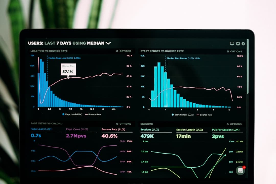
Dashboards: Bringing Visuals Together
A dashboard is a collection of visualizations arranged to give a complete picture at a glance. Designing one is as much about layout as it is about charts. The most important metric belongs in the top-left, where eyes land first. Supporting visuals flow outward in order of importance, and related charts group together so the reader can scan logically.
- Limit the number of visuals so the dashboard reads in seconds, not minutes.
- Keep a consistent style across every chart: same fonts, same color logic, same spacing.
- Use whitespace to separate sections so the page does not feel crammed.
- Lead with the headline number, then let charts explain the why behind it.
A great dashboard answers questions in the order the user asks them. Map that order before you place a single chart, and the layout almost designs itself.
Responsive and Mobile Data Visualization
Charts that look perfect on a wide monitor often break on a phone. Labels overlap, bars shrink to slivers, and dense scatter plots turn into mush. Responsive data visualization means rethinking, not just resizing. On small screens, you might switch a horizontal bar chart to vertical, reduce the number of data points shown, or replace a complex chart with a single summary figure plus a tap-to-expand detail.
Prioritize the core insight on mobile and let users drill into detail only if they want it. Interactive tooltips, which reveal exact values on tap or hover, are especially valuable on small screens where you cannot label everything at once. Test every chart at phone width before you ship it.
Building Data Visualizations in Framer
Framer gives you several routes to add data visuals without leaving the design environment, scaling from simple static graphics to live, interactive charts.
Static Charts as Components
For figures that do not change often, you can design charts directly on the canvas using shapes, frames, and text, then save them as reusable components. This gives you total control over style and keeps everything perfectly on brand. It is ideal for landing pages, reports, and marketing visuals where the numbers are fixed.
Code Components for Live Data
When you need charts that pull from real, updating data, Framer’s code components let you bring in charting libraries and connect to data sources. This is the path for dashboards and product pages that should always reflect current numbers. You get the flexibility of code with the design control of Framer.
Animation and Scroll Effects
Framer’s interaction tools let you animate charts as they enter the viewport. Bars can grow from the baseline, lines can draw themselves, and numbers can count up as the user scrolls. Used in moderation, this motion draws attention to key figures and makes data feel dynamic. Used heavily, it distracts, so reserve animation for the visuals that matter most.
Common Data Visualization Mistakes
- Wrong chart type. A pie chart with ten slices or a line chart for unordered categories confuses readers.
- Truncated axes. Starting a bar chart above zero exaggerates differences dishonestly.
- Too much color. A rainbow of hues with no logic creates noise instead of meaning.
- 3D and decoration. Visual gimmicks distort values and hide the real data.
- Overcrowding. Cramming too much into one chart defeats its purpose.
- No text alternative. Charts without accessible labels exclude screen reader users.
If you want polished, accurate data visuals built into a fast, professional website, our team designs custom Framer sites that turn your numbers into clear, persuasive stories. Take a look at our pricing and plans to get started.
Frequently Asked Questions
What is data visualization in web design?
Data visualization in web design is the practice of presenting numbers and information as visual elements like charts, graphs, dashboards, and infographics on a website. The aim is to make complex data instantly understandable, support decision-making, and build trust by showing evidence clearly. Good data visualization prioritizes clarity and accuracy over decoration.
Which chart type should I use?
Match the chart to the question. Use line charts for trends over time, bar charts for comparing categories, scatter plots for relationships between two variables, and pie charts only for simple two or three part splits. If you are unsure, a bar chart is usually the safest and clearest choice because people judge length more accurately than angles or areas.
How do I make charts accessible?
Ensure colors meet contrast requirements and never rely on color alone to convey meaning, since many users have color vision deficiencies. Reinforce color with labels, patterns, or position. Provide a text alternative or data table so screen reader users can access the information, and make interactive charts usable by keyboard. Accessible charts reach a wider audience and improve overall usability.
Can I build interactive charts in Framer?
Yes. Framer supports static charts built as components, code components that connect to live data using charting libraries, and scroll-triggered animations that bring visuals to life. This means you can create everything from a fixed marketing graphic to a dashboard that reflects real-time numbers, all while keeping full control over the design.