Brutalist web design is a raw, deliberately unpolished style that strips a website down to its rawest elements: stark typography, high-contrast colors, visible structure, system fonts, hard edges, and an honest, almost confrontational layout. It rejects the soft gradients and rounded corners of mainstream design in favor of bold, functional, unapologetically digital aesthetics.
Brutalism is one of the most polarizing styles in web design. People either love its boldness or find it abrasive, and that reaction is exactly the point. This guide covers what brutalist web design is, where it came from, when it works and when it backfires, real examples, how to execute it well in Framer, and how to keep it accessible despite its raw edges.
What Is Brutalist Web Design?
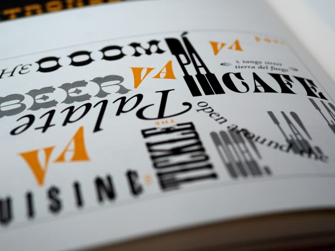
Brutalist web design takes its name and spirit from brutalist architecture, the mid-twentieth-century movement that celebrated raw concrete, exposed structure, and honest materials over decoration. Translated to the web, brutalism means showing the raw bones of a website rather than hiding them behind polish. Think exposed grids, default browser fonts, heavy borders, jarring color combinations, oversized type, and layouts that prioritize impact over comfort.
The defining quality is honesty. A brutalist site does not pretend to be a glossy app or a soft lifestyle brand. It looks like what it is: HTML, type, and structure presented directly. Where mainstream design smooths every edge, brutalism leaves them sharp. It is the opposite end of the spectrum from styles like glassmorphism or minimalist website design, even though it shares minimalism’s distaste for unnecessary decoration.
The Origins of Web Brutalism
Architectural brutalism emerged in the 1950s, with raw concrete buildings that wore their construction openly. The web version surfaced decades later as a reaction. By the mid-2010s, web design had converged toward a sameness: the same hero, the same rounded cards, the same stock photography, the same gentle gradients. Designers grew restless. Brutalism became a rebellion against that homogeneity, a way to make a site feel human, opinionated, and distinctly handmade.
Early web brutalism was often genuinely raw, built by developers and artists who treated default HTML as an aesthetic. Over time it matured into a more intentional style, where the rawness is a careful choice rather than an accident. Today’s brutalism ranges from harsh and chaotic to a refined neo-brutalism that keeps the bold type and hard edges while adding just enough structure to stay usable.
When to Use Brutalist Web Design
Brutalism is a strong flavor, and it suits some brands far better than others. It works when standing out matters more than fitting in, and when your audience rewards boldness rather than reassurance.
- Creative portfolios: Designers, artists, and studios use brutalism to signal originality and confidence.
- Cultural and editorial brands: Magazines, galleries, music projects, and fashion labels that want an avant-garde edge.
- Tech and developer products: Brands that want to feel anti-corporate, technical, and authentic.
- Campaigns and microsites: Short-lived, attention-grabbing projects where memorability beats convention.
The common factor is a brand that benefits from a strong point of view. Brutalism makes a statement, and a site that needs to be memorable in a crowded field can use that statement to cut through. It pairs naturally with the kind of distinctive thinking found in our roundup of web design inspiration.
When to Avoid Brutalism
Brutalism is the wrong choice far more often than it is the right one. Avoid it when trust and clarity are paramount. A bank, a healthcare provider, a law firm, or any business where users need to feel safe and guided will usually be hurt by a raw, confrontational style. Conversion-focused ecommerce and lead generation also tend to suffer, because brutalism can add friction exactly where you want smoothness.
Be honest about your audience, too. Brutalism appeals to design-literate, younger, or niche audiences who read it as cool. A mainstream or older audience may simply read it as broken or unprofessional. And never adopt brutalism because it looks edgy if it fights your actual goals. The style serves expression, not conversion rate optimization, and forcing it onto a high-stakes funnel usually costs you results.
Real Examples of Brutalist Web Design
Brutalism lives most visibly in creative corners of the web. Independent design studios frequently use it for their own sites, treating the homepage as a portfolio piece that proves their range through bold type and unexpected layout. Fashion and streetwear brands lean into neo-brutalism, with oversized headlines, raw color blocks, and stark product presentation that feels more like a zine than a catalog. Music artists and cultural institutions use it to feel current and uncompromising.
The strongest examples share a trait: the rawness is controlled. Underneath the harsh surface there is a clear structure, a deliberate type system, and a navigable experience. The weak examples mistake chaos for boldness and become genuinely unusable. The line between striking and broken is thin, and craft is what keeps you on the right side of it.
How to Implement Brutalism Well
Good brutalism is harder than it looks. Anyone can make an ugly page, but making a raw page that is intentional, memorable, and still usable takes skill. A few principles separate the two.
Make Typography the Hero
Type carries brutalist design. Oversized headlines, strong system or monospace fonts, tight or exaggerated spacing, and high contrast do most of the visual work. Treat typography as the central element rather than an afterthought, and study the fundamentals in our website typography guide so your bold choices read as confident rather than careless.
Embrace Contrast and Hard Edges
Brutalism thrives on stark contrast: black on white, bright unexpected accents, visible borders, and sharp rectangular blocks. Skip the soft shadows and rounded corners. Let elements butt against each other with clear divisions. The honesty of exposed structure is the aesthetic.
Keep an Underlying Order
The paradox of great brutalism is that rawness needs structure to work. Use a real grid even if you break it deliberately, maintain a consistent type scale, and ensure navigation remains findable. Intentional disorder reads as design; accidental disorder reads as a mistake.
Use Restraint With Motion and Noise
A little goes a long way. One bold idea executed cleanly beats five competing for attention. Add friction where it creates interest, not everywhere, or the site tips from striking into exhausting.
Building Brutalist Sites in Framer
Framer is a strong tool for brutalist work because it gives you precise control over type, layout, and spacing on a visual canvas. You can set oversized type, hard borders, and exact grid positions, then break them on purpose where the design calls for it. Framer’s text animation tools let you push typography into the spotlight with kinetic, attention-grabbing effects that suit the bold brutalist mood without requiring custom code.
Because brutalism often relies on raw, unconventional motion and interaction, Framer’s component and variant system helps you build expressive hover states, jarring transitions, and interactive type while keeping the project maintainable. You design the rawness deliberately and ship exactly what you see. At Framer Websites, we build distinctive, opinionated sites for brands that want to stand apart, and we keep them usable underneath the edge. See our work for the range, or review our pricing if you are planning a bold build.
Accessibility and Brutalism
Brutalism’s biggest danger is accessibility. The raw aesthetic can easily produce low color contrast, tiny or illegible type, confusing navigation, and broken keyboard flows. None of that is required by the style, and skipping it is a choice, not a constraint. Maintain sufficient contrast even within a stark palette, keep body text legible regardless of how bold the headlines are, ensure the site is fully keyboard navigable, and respect reduced-motion preferences for any jarring animation. Use semantic HTML and proper heading structure so the experience reads logically for assistive technology, even when the visual layout is unconventional. Done right, a brutalist site can be both raw and accessible, proving the aesthetic and inclusion are not in conflict. For the full standard, see our website accessibility guide.
Frequently Asked Questions
What is brutalist web design?
Brutalist web design is a raw, deliberately unpolished style that exposes a website’s structure rather than hiding it. It uses stark typography, high contrast, hard edges, system fonts, and bold, unconventional layouts. Inspired by brutalist architecture, it values honesty and impact over the smooth polish of mainstream design.
Is brutalist web design good for business websites?
It depends heavily on the brand. Brutalism works well for creative portfolios, cultural brands, fashion labels, and anti-corporate tech products that benefit from a strong, memorable point of view. It usually hurts businesses that depend on trust and clarity, such as banks, healthcare providers, and conversion-focused ecommerce, where a smoother experience performs better.
Can a brutalist website still be accessible?
Yes. Accessibility problems in brutalist sites come from carelessness, not from the style itself. By maintaining strong color contrast, keeping body text legible, ensuring full keyboard navigation, using semantic HTML, and respecting reduced-motion preferences, you can build a brutalist site that is both raw in appearance and fully accessible.
What is the difference between brutalism and neo-brutalism?
Traditional brutalism is often genuinely raw and chaotic, treating default HTML and harsh layouts as the aesthetic. Neo-brutalism is a more refined evolution that keeps the bold typography, hard edges, and high contrast while adding enough structure and usability to function as a practical, modern website. Neo-brutalism is generally the safer, more usable approach.