The three best sources for web design inspiration in 2026 are curated award sites like Awwwards and Site Inspire, designer communities like Dribbble and Read.cv, and niche-specific galleries focused on the industry you build for. The right way to use them is anatomical study, not visual mimicry. Save patterns, name what works, then rebuild the structure inside your own brand layer.
Why Most Inspiration Searches Fail
Most designers open Pinterest or Dribbble, scroll for an hour, and close the tab feeling further from a solution than when they started. The problem is the goal, not the gallery. Scrolling for “ideas” without a question to answer turns inspiration into entertainment. You absorb visual noise, your taste drifts toward whatever is trending, and the work you ship looks like everyone else’s.
Good inspiration searches start with a defined problem. Searching for “landing page hero” surfaces a thousand layouts. Searching for “B2B SaaS hero with secondary CTA for free trial signup” narrows the field to a dozen useful references. The narrower the question, the more useful the answer.
The second mistake is collecting without analyzing. A swipe file of 400 screenshots is worse than a swipe file of 30 screenshots with notes. The screenshots are the raw material. The notes are the asset.
The third mistake is over-indexing on visual polish. A site can look stunning and convert poorly, or look plain and convert exceptionally. If your goal is a working product page and your reference set is full of award-winning agency portfolios, you are studying the wrong genre. Inspiration has to match intent.
Awards and Curated Showcases
Award sites are curated by editors with a clear point of view. The bar to entry is high, so average quality is high, and the cost is that the work skews experimental. Use them to see what is possible, not always what is practical.
Awwwards is the longest-running and most influential. Site of the Day winners push interaction, motion, and 3D work. The Honors section is more accessible and often more useful for client work. Filter by category (portfolio, ecommerce, corporate) to narrow the noise.
FWA (Favourite Website Awards) skews toward immersive, often Three.js or WebGL-heavy experiences. Great for studying motion design. Less useful if you build conversion-focused marketing sites.
CSS Design Awards sits between Awwwards and FWA in tone, strong on typography and grid systems. Site Inspire is the calmer cousin: less flashy, more functional, with one of the best taxonomies on the web (type, style, subject) for finding references by category. Land-book focuses exclusively on landing pages, filterable by industry, style, or color. It is the right starting point for any conversion-focused brief because every entry was designed to sell something.
Designer Communities
Communities give you higher volume at a wider quality range. The signal-to-noise ratio is lower, but you see what working designers post day-to-day, which often surfaces patterns before they hit the award sites.
Dribbble is the largest. Filter heavily: search “landing page” and add modifiers like “SaaS”, “real estate”, or “minimal”. Follow specific designers whose taste you trust rather than browsing the global feed, which is dominated by the algorithm.
Behance hosts full case studies, not just shots. This is the right place to see process and rationale. If you want to understand why a designer made a choice, Behance shows you the reasoning far more often than Dribbble does.
Read.cv is the newer, quieter alternative: personal pages from working designers, often with project notes and lessons. Lapa Ninja aggregates landing pages from across the web with light curation, useful when you want volume over depth.
Framer-Specific Inspiration
If you build in Framer, study sites built in Framer. The platform has constraints and capabilities other tools do not, so a reference built in Webflow or coded from scratch may not be reproducible without significant effort.
The official Framer Showcase at framer.com/showcase highlights production sites built on the platform, filterable by category. Most entries link to the live site, so you can inspect the actual behavior, not just a screenshot. Made in Framer is a community-curated gallery with a higher refresh rate than the official showcase, skewing toward agency and freelance work.
Both sources are also useful for finding remix-able templates. Many showcased designers sell their templates, and a $50 template can save a week of layout work on a project where the brand and content are the actual deliverable.
Twitter/X and LinkedIn Designer Accounts
Following the right designers on Twitter/X and LinkedIn turns your timeline into a slow drip of curated references. The accounts worth following share work, breakdowns, and links rather than only hot takes.
On Twitter/X, look for designers who post weekly site breakdowns or “this week in design” threads: a screenshot, a few sentences on what works, sometimes a link. Save the tweets to a list so the signal survives the algorithm. On LinkedIn, the design community is smaller but more business-focused, with more posts about conversion data and the commercial side of design choices. Build a list of 15 to 30 accounts whose taste matches your work and check it twice a week.
Niche-Specific Galleries
Generic inspiration is the enemy of specific work. A SaaS landing page brief is best served by SaaS galleries, an agency rebrand by agency site galleries, a photographer portfolio by photographer portfolio galleries.
For SaaS landing pages, sites like SaaS Landing Page and Refero index hundreds of B2B and B2C SaaS sites with annotations on the patterns each one uses. You can search by section type (hero, pricing, features) and pull together a section-specific swipe file without leaving the site. For more on patterns that move conversion, see our guide to landing page design best practices.
For agency sites, the Agency Awesome directory and the agency category on Site Inspire are reliable. Agency sites tend to push the visual envelope further than client work because they function as proof of capability. For portfolios, the personal portfolio category on Read.cv and the portfolio filter on Site Inspire surface a wide range. Search by medium (illustrator, photographer, developer) to narrow further.
The deeper your niche, the more your inspiration set should reflect that niche. A wedding photographer portfolio borrowing layout cues from a fintech dashboard is going to feel off, even if both are technically well-designed.
How to Build a Personal Swipe File
A swipe file is a personal archive of references organized by problem, not by aesthetic. The aesthetic-based file (“dark mode”, “brutalist”, “soft pastels”) is a mood board. The problem-based file (“pricing page with three tiers”, “hero with video background”, “footer with newsletter signup”) is a working tool.
The simplest workable setup is a Notion or Figma board with tags by section type, industry, and pattern. When you screenshot, include the URL, the date, and one sentence on what made you save it. The one-sentence note is the difference between a swipe file you use and one you forget. Update monthly and delete entries that no longer feel useful. A swipe file with 50 great references is more valuable than one with 500 mixed references, because you will actually review the 50.
How to Study a Design Without Copying It
Copying a design as-is teaches you almost nothing. Studying its anatomy teaches you most of what you need. The anatomy approach has three layers.
The structure layer is the skeleton: what sections does the page have, in what order, with what proportions? Sketch the wireframe of the reference in 60 seconds with no styling. If you cannot reproduce the structure from memory, you have not understood it yet.
The pattern layer is the recurring visual logic: how type is sized across sections, how color directs attention, how spacing changes between dense and breathing sections. Name the patterns in writing. Naming forces understanding. Our deep-dive on visual hierarchy in web design covers the vocabulary worth learning here.
The detail layer is the craft: button states, hover animations, the way a heading interacts with an image. These details often make a site feel finished, and they are the easiest to lift without thinking. Lift them sparingly, and only after you understand why they exist. The point of the exercise is to internalize a vocabulary, not to clone a page.
Turning Inspiration into Original Work
Original work is rarely invented from zero. It is most often a combination of three to five existing patterns recomposed under a new brand layer. The patterns are public domain. The combination is the originality.
A practical workflow: define the brief in one sentence, list the five hardest problems the page has to solve (hero, social proof, feature explanation, pricing, CTA), and for each problem pull two or three references from your swipe file. Sketch your own version that borrows the structural pattern from one reference, the type treatment from another, and the spacing logic from a third. The final composition will not look like any of the references because the combination is yours and the brand layer (color, typography, imagery, voice) is yours.
Inspiration vs Trend Following: The Difference
Trend following is when your work shifts because everyone else’s has shifted. Inspiration is when your work shifts because you learned something useful. The distinction matters because trends have a half-life of about 18 months, and a site built on a trend ages with the trend.
The pattern this year is heavy use of bento grids, scroll-triggered text reveals, and aggressive serif type. By 2027, half of these will feel dated. The underlying principles (visual chunking, motion as a comprehension aid, type as personality) will not. A useful filter: if a design choice serves the content and the user, it is a principle worth learning. If a choice exists because it is currently popular, it is a trend worth using selectively. Our piece on website design trends for 2026 goes deeper into which current trends have staying power.
10 Quick Sources to Bookmark Today
- Awwwards for ambitious, experimental work
- Site Inspire for the best taxonomy on the web
- Land-book for landing pages by industry
- Behance for full case studies and process
- Dribbble for designer accounts you trust
- Read.cv for personal pages with project notes
- Framer Showcase for production sites built in Framer
- Made in Framer for the community-curated gallery
- SaaS Landing Page for B2B and B2C product sites
- Lapa Ninja for a quick volume scan
Pick three. Bookmark them in a single folder. Visit one a week. A regular intake of curated work compounds far more than an occasional binge through twenty sites.
Frequently Asked Questions
How often should I refresh my inspiration sources?
Monthly is enough for most designers. Weekly is useful if you ship a lot of new work. The risk of refreshing too often is that your taste drifts with every trend cycle, which makes your portfolio feel inconsistent. Set a fixed slot (the first Monday of the month works well) and avoid the daily Dribbble scroll, which is mostly entertainment.
Is it ethical to use another designer’s work as inspiration?
Yes, when you study the underlying patterns and rebuild them inside your own brand. It is not ethical when you replicate a design closely enough that the original designer or client would recognize it as a copy. The line is fuzzy in some cases but clear in most. If you would be uncomfortable sending the reference and your version to the original designer side by side, you crossed the line.
What if my client sends me a reference and asks for “something like this”?
Treat the reference as a clue about taste, not a brief. Ask which specific elements they liked (the structure, the type, the color, the motion) and which would not work for their brand. Clients often send references because they lack the vocabulary to describe what they want. Your job is to translate the reference into the underlying patterns and propose your own composition inside their brand.
How do I avoid my work looking like everyone else’s?
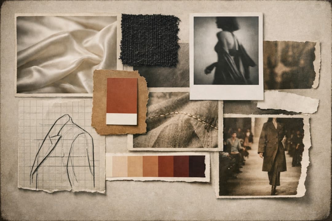
Three habits help. First, broaden your inspiration sources outside of web design (architecture, magazine layout, packaging, fashion). Second, write down the principles you learn rather than collecting the executions. Third, design for your specific brand and audience rather than for a generic “good site”. Most homogeneity comes from designers chasing the same Dribbble feed. If your input set differs, your output set will differ.
If you want a partner to help turn inspiration into a shipped site, get in touch with Framer Websites. We build conversion-focused sites in Framer with the speed of a template and the polish of a custom design.