Maximalist web design is a bold, expressive style that embraces vivid color, layered textures, oversized type, rich imagery, and dense visual energy. Where minimalism strips everything away, maximalism piles it on with intention, using abundance to create personality, memorability, and emotional impact. The art lies in making “more” feel deliberate rather than chaotic.
Key Takeaways
- Maximalism is abundance with intent, not clutter. Every bold element should serve the brand’s personality.
- It works best for brands that want to feel expressive, creative, energetic, or unforgettable.
- Strong structure underneath the visual richness is what keeps maximalism usable rather than overwhelming.
- Color, type, motion, and texture are the core tools, used at full volume but with a guiding logic.
- Performance and accessibility need extra care, since dense visuals can slow pages and reduce readability.
- Framer’s design freedom and animation tools make it an ideal environment for maximalist sites.
What Maximalism Actually Is
Maximalism is a reaction against years of clean, restrained, almost interchangeable web design. After a long era where countless sites looked alike, with thin fonts, lots of whitespace, and muted palettes, maximalism brings back exuberance. It celebrates color, pattern, decoration, and density. It wants to be noticed, to feel alive, and to leave an impression.
The crucial word is intent. Maximalism is not the same as a messy, accidental pile-up of elements. A truly maximalist design is carefully composed; the abundance is curated. Every clashing color, oversized headline, and layered graphic is a choice that builds toward a feeling. The difference between maximalism and clutter is the same as the difference between a richly decorated room designed by a stylist and a room that is simply full of stuff.
Maximalism shares some DNA with other expressive, anti-corporate movements. It sits near the energy of brutalist web design in its willingness to break polite conventions, though maximalism leans into richness and color while brutalism leans into rawness and starkness. Both reject the safe, templated middle.
When Maximalism Is the Right Choice
Maximalism is not for every brand, and choosing it should be a strategic decision. It shines when a brand wants to project creativity, boldness, playfulness, or cultural relevance. Creative agencies, fashion labels, music projects, art platforms, entertainment brands, and ambitious startups often benefit from a maximalist identity because standing out is part of the goal.
It is a riskier fit for brands that need to project calm trust, precision, or simplicity, like financial institutions, healthcare providers, or enterprise software. For those, the visual noise can undercut the message. The test is whether boldness serves the audience. If your visitors want to feel energy and personality, maximalism delivers. If they want reassurance and efficiency, restraint usually wins.
Maximalism also works brilliantly for moments rather than entire sites. A launch page, a campaign microsite, or a hero section can go fully maximalist to grab attention, while the rest of the experience stays more measured. Used this way, it becomes a spotlight rather than the whole stage.
The Tools of Maximalism
Maximalism turns the usual design dials up to full, but each tool still needs a guiding logic to keep the result intentional.
Bold, Abundant Color
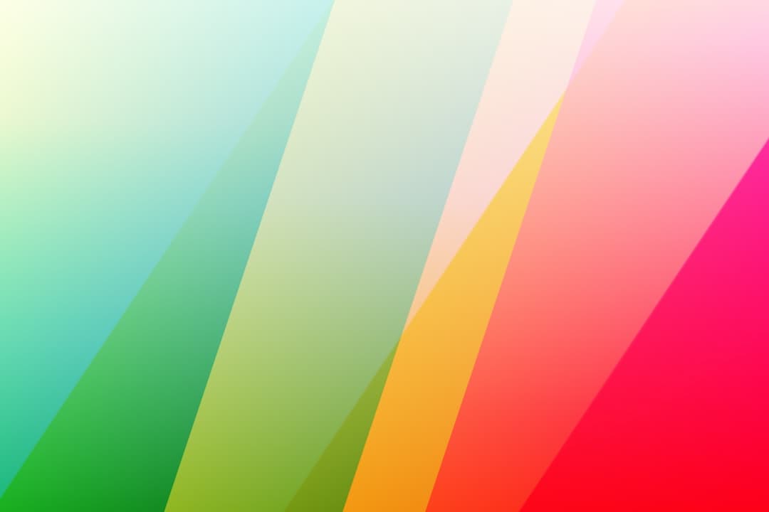
Color is the heart of maximalism. Instead of a restrained two or three color palette, maximalist designs embrace rich, saturated, sometimes clashing combinations. The key is that even bold color needs a system. Choosing colors that create energy while still relating to one another comes from a solid grasp of color theory in web design. Complementary and triadic relationships, for instance, let you push saturation hard while keeping a sense of order beneath the chaos.
Expressive Typography
Type in maximalism is loud and characterful. Oversized headlines, decorative display fonts, mixed typefaces, and text used as a graphic element are all common. Type can overlap images, run at angles, or fill the screen. The trick is keeping at least one readable, functional typeface for body content so the page stays usable while the display type provides the drama.
Layers, Texture, and Pattern
Maximalism loves depth. Overlapping elements, background patterns, grain, gradients, stickers, and collage-like compositions create a rich, tactile feeling. These layers reward exploration and make a page feel hand-crafted rather than templated. The danger is muddiness, so each layer needs enough separation to remain legible.
Motion and Interaction
Animation amplifies maximalist energy. Elements that move, react to scroll, follow the cursor, or animate on hover add life and surprise. Motion makes the abundance feel dynamic rather than static. As with every other tool, restraint in placement matters: motion everywhere becomes exhausting, so the most dramatic animations should anchor key moments.
Keeping Maximalism Usable
The biggest risk in maximalism is that visual richness destroys usability. A page so dense that users cannot find the navigation, read the text, or figure out where to click has failed, no matter how striking it looks. The secret to successful maximalism is a strong, almost invisible structure underneath the abundance.
That structure comes from disciplined hierarchy. Even in a busy composition, something must clearly be most important, something second, something third. The eye needs a path to follow. This is where a firm command of visual hierarchy in web design becomes essential, because hierarchy is what separates organized intensity from pure noise. Size, contrast, position, and spacing guide attention even when the page is full.
- Establish a clear focal point on every screen, so users always know where to look first.
- Preserve pockets of breathing room amid the density to prevent total overwhelm.
- Keep navigation and key actions obvious and consistent, even when surrounding visuals are wild.
- Maintain readable body text with adequate contrast, regardless of how bold the rest gets.
Accessibility and Contrast in Maximalist Design
Bold color and dense layouts make accessibility harder, which means it needs deliberate attention. Saturated backgrounds behind text can crush legibility, and busy patterns under copy can make words swim. Ensuring text remains readable against vibrant or textured backgrounds is non-negotiable, and that depends on the same standards you apply for color contrast in web design.
Practical safeguards help a lot. Placing text on solid color blocks or semi-opaque overlays rather than directly on busy imagery keeps it legible. Reserving the most extreme color clashes for decorative areas, not for content, protects readability. And honoring reduced-motion preferences ensures that the heavy animation enhancing your maximalist energy does not become a barrier for users sensitive to movement. Maximalism and accessibility can coexist; it just takes intention.
Performance Considerations
Rich visuals come with weight. Large images, multiple fonts, layered graphics, and heavy animation can all slow a page down, and a maximalist site that takes forever to load undermines its own impact. Performance discipline is therefore part of doing maximalism well.
- Compress and properly size images, using modern formats so dense imagery does not bloat load times.
- Limit the number of custom fonts and load them efficiently.
- Use animation techniques that stay smooth rather than janky, and avoid animating too many elements at once.
- Lazy-load offscreen visuals so the initial view appears quickly.
A fast maximalist site feels luxurious and confident. A slow one feels broken. The extra performance care is what keeps the boldness from backfiring.
Building Maximalist Sites in Framer
Framer is an excellent environment for maximalism because it combines pixel-level design freedom with powerful animation, all without forcing you to hand-code complex interactions. You can layer elements freely, overlap graphics and type, and compose dense, expressive scenes directly on the canvas.
Layered, Free-Form Layouts
Framer lets you stack and position elements with precision, which is exactly what maximalism needs. You can build collage-style compositions, overlap text and imagery, and create the rich depth that defines the style, while still controlling responsive behavior so the boldness survives on smaller screens.
Animation and Interaction
Framer’s interaction and animation tools make it straightforward to add scroll effects, hover reactions, and cursor-following elements that bring maximalist energy to life. Because these are built into the tool, you can experiment quickly and tune the motion until it feels alive rather than chaotic. Honoring reduced-motion settings is also achievable so your animations stay inclusive.
Components for Consistency
Even a wild maximalist site benefits from reusable components. Building buttons, cards, and navigation as components keeps the functional parts consistent across a busy site, so users always recognize how to interact even as the decorative elements vary from page to page. This blend of free expression and structured reuse is what makes a maximalist Framer build both striking and maintainable.
Common Maximalism Mistakes
- Confusing clutter with maximalism. Abundance without intent is just a mess.
- No focal point. When everything shouts equally, nothing stands out.
- Unreadable text. Placing copy on busy backgrounds without contrast safeguards.
- Ignoring performance. Heavy visuals that crawl on load undercut the whole effect.
- Overusing motion. Animation on everything becomes exhausting and distracting.
- Wrong brand fit. Forcing maximalism onto a brand that needs calm and trust.
If you want a bold, memorable website that uses maximalism with real intent and stays fast and usable, our designers build custom Framer sites that turn big visual ambitions into polished reality. Explore our pricing and plans to bring your boldest ideas to life.
Frequently Asked Questions
What is maximalist web design?
Maximalist web design is a bold, expressive style that embraces vivid color, layered textures, oversized typography, rich imagery, and high visual density. It is a deliberate reaction against minimalism, using abundance to create personality and memorability. The key distinction is intent: true maximalism is carefully composed so the richness feels purposeful rather than cluttered or accidental.
Is maximalism right for every brand?
No. Maximalism suits brands that want to project creativity, boldness, playfulness, or cultural relevance, such as creative agencies, fashion, music, and entertainment. It is riskier for brands that need to convey calm, trust, and precision, like finance or healthcare, where visual noise can undercut the message. It can also be used for specific moments, like a launch page, rather than an entire site.
How do you keep maximalist design usable?
The secret is a strong, almost invisible structure beneath the abundance. Establish a clear focal point on every screen, preserve pockets of breathing room, keep navigation and key actions obvious and consistent, and maintain readable body text with adequate contrast. Disciplined visual hierarchy is what turns intense visuals into organized intensity rather than overwhelming noise.
Can I build a maximalist site in Framer?
Yes. Framer is well suited to maximalism because it offers free-form layered layouts, precise positioning, and powerful animation tools without requiring complex hand-coding. You can build collage-style compositions, add scroll and hover interactions, honor reduced-motion preferences, and use components to keep functional elements consistent, so the site stays both striking and usable across devices.