Color theory in web design is the set of principles that explain how colors relate, combine, and affect the people who view them. On a website, color does three jobs at once: it sets the mood, guides the eye, and signals which actions matter. Used well, it makes a site feel intentional. Used carelessly, it makes even good content feel amateur.
Key takeaways
- Color theory for web design is practical, not academic. It governs mood, hierarchy, and which buttons get clicked.
- A workable palette usually needs one dominant color, one or two accents, and a neutral base, applied in roughly a 60-30-10 ratio.
- The color wheel and a few proven schemes, such as complementary and analogous, give you reliable starting points instead of guesswork.
- Contrast and accessibility are not optional. Text must stay readable for everyone, which also protects your search visibility.
- Framer makes color systems easy to manage with shared color styles, so your whole site stays consistent and is simple to retheme.
What color theory means for a website
Color theory began as a way to understand how pigments mix, but on the web it becomes a tool for communication. Before a visitor reads a word, your colors have already told them something. A muted palette of deep blues and grays reads as serious and trustworthy. Warm oranges and bright accents read as energetic and approachable. This first impression happens in milliseconds and shapes how the rest of the experience feels.
The practical takeaway is that color is never just decoration. Every choice carries meaning and direction. A well-built palette makes a site feel cohesive and deliberate, while a random collection of colors makes it feel thrown together no matter how good the underlying content is. Understanding a few core principles lets you make those choices on purpose rather than by accident.
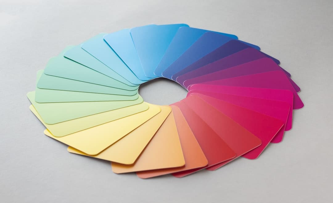
The color wheel and core schemes
The color wheel arranges colors in a circle so you can see how they relate. From it come a handful of schemes that consistently produce pleasing combinations, and knowing them saves you from endless trial and error.
Complementary
Complementary colors sit opposite each other on the wheel, like blue and orange. They create strong contrast and energy, which makes them excellent for drawing attention to a single element such as a call to action. The risk is overuse. Two clashing colors across a whole page becomes exhausting, so reserve the complementary pop for the moments that matter most.
Analogous
Analogous colors sit next to each other on the wheel, such as blue, teal, and green. They feel harmonious and calm because they share an underlying hue. This scheme works beautifully for backgrounds and large areas where you want cohesion rather than contrast, paired with one stronger accent for emphasis.
Monochromatic and triadic
A monochromatic scheme uses one hue in different shades and tints, producing an elegant, focused look that is hard to get wrong. A triadic scheme uses three colors evenly spaced on the wheel for a vibrant, balanced palette that takes more skill to handle. For most websites, starting monochromatic or analogous and adding a single complementary accent is the safest path to a professional result. We go deeper into building these systems in our website color theory guide.
Building a usable palette
A practical web palette is smaller than people expect. You need one dominant color that defines the brand, one or two accent colors for emphasis and actions, and a neutral base of whites, grays, or near-blacks for backgrounds and text. Trying to use more than that usually dilutes the identity and creates visual noise.
The 60-30-10 rule is a dependable guide for applying them. Roughly 60 percent of the page is the dominant or neutral color, 30 percent is a secondary color, and 10 percent is the accent reserved for the elements you most want noticed. This ratio keeps the design balanced and ensures your accent color retains its power, because it stays rare. When everything is bright, nothing stands out.
Color and conversion
Because the accent color is scarce, it becomes the natural home for your primary buttons. Visitors learn within seconds that the accent color means action, and that consistency makes your calls to action effortless to find. This is where color theory directly touches conversion. A palette that reserves one distinct color for actions outperforms one where buttons blend into the surrounding design.
Contrast and accessibility
The most important practical rule in web color is contrast. Text needs enough contrast against its background to be comfortably readable, and this is not a matter of taste. Low-contrast text, like light gray on white, excludes people with visual impairments and frustrates everyone else, especially on phones in bright light. Accessibility guidelines define minimum contrast ratios precisely for this reason.
Meeting those ratios protects more than usability. Search engines factor user experience into rankings, so a hard-to-read site can quietly lose visibility. Designing with strong contrast from the start keeps your content open to the widest audience and avoids painful redesigns later. Our deep dive on color contrast in web design covers exactly how to check and hit the right ratios. Never rely on color alone to convey meaning either. Pair it with text or icons so a colorblind visitor is never left guessing.
Real-world color in action
Look at any well-regarded software site and you will usually find the same disciplined approach. A calm neutral background, a single strong brand color used sparingly, and one bright accent reserved almost entirely for buttons and links. The restraint is the point. The palette feels intentional because it is small and consistently applied.
Bolder brands take color further. Some lean into high-contrast, near-clashing palettes to feel raw and unconventional, a hallmark of the brutalist web design movement, where loud color choices are part of the statement. That works when it matches the brand’s personality and the audience expects edge. The lesson from both extremes is that effective color is matched to the message. A wellness brand and a streetwear label should not share a palette, and color theory is how you decide which one fits.
The psychology of color choices
Colors carry associations that shape how a brand is perceived before any reading happens, and matching those associations to your message is part of the work. Blue tends to read as stable, professional, and trustworthy, which is why so much software and finance leans on it. Green suggests growth, health, and calm. Red commands attention and signals urgency or energy, which makes it powerful but easy to overuse. Yellow and orange feel friendly and optimistic, while black and deep neutrals read as premium and confident.
These associations are tendencies, not rules, and they shift with culture and context. The point is not to follow a rigid chart but to choose colors that reinforce the feeling you want. A meditation app and a sports brand can both succeed, but they should not borrow each other’s palettes. When your color choices align with your message, the design does part of the persuading for you, quietly and instantly.
Common color mistakes
The first mistake is using too many colors. A palette with five or six competing hues feels chaotic and unprofessional. The discipline of one dominant, one or two accents, and a neutral base exists precisely to prevent this. The second mistake is poor contrast, especially trendy light-gray body text that looks elegant in a mockup and becomes unreadable in real conditions.
The third mistake is ignoring color meaning and accessibility, such as using red and green as the only way to show success and error, which colorblind visitors cannot distinguish. The fourth is inconsistency, where the same kind of button appears in three different shades across the site, eroding the visual logic. The fifth is choosing colors purely on personal preference without considering the audience or the emotional signal. Each of these mistakes is easy to make and just as easy to avoid once color is treated as a system rather than a series of one-off picks.
How Framer helps you manage color
Framer turns color theory into something you can actually maintain across a whole site. Its color styles let you define your palette once as named, reusable values, then apply them everywhere. When you change a style, every element using it updates at once, so your dominant color, accents, and neutrals stay perfectly consistent without manual hunting.
This system makes the 60-30-10 discipline practical, because your accent color is a single defined style that you apply only to the elements that deserve it. It also makes rethemeing painless. If you decide your brand color should shift, you update one style and the entire site follows. That is a powerful advantage when a palette inevitably evolves.
Framer also makes it easy to preview your colors in context across desktop and mobile, so you can catch contrast problems before they ship. Combined with its clean, fast output, you get a site where the color system is both beautiful and effortless to keep accessible. The result is a palette that looks designed and behaves predictably on every page and every device.
Get a color system that converts and stays consistent
We design Framer sites with deliberate, accessible color systems that guide attention and feel unmistakably on brand. See how the right palette lifts the whole experience.
Frequently Asked Questions
How many colors should a website use?
Most sites work best with a small palette: one dominant brand color, one or two accent colors for emphasis and actions, and a neutral base of whites, grays, or near-blacks. Applying them in roughly a 60-30-10 ratio keeps the design balanced and ensures the accent color stays powerful. More than a few competing colors usually makes a site feel chaotic.
What is the 60-30-10 rule in color design?
It is a guideline for distributing colors across a layout. About 60 percent of the page uses the dominant or neutral color, 30 percent uses a secondary color, and 10 percent uses the accent reserved for the most important elements like buttons. The ratio creates visual balance and keeps your accent color rare enough to draw attention where you want it.
Why does color contrast matter so much?
Contrast determines whether your text is readable, especially for people with visual impairments and anyone viewing on a phone in bright light. Low-contrast text excludes part of your audience and frustrates the rest. Search engines also factor readability into rankings, so strong contrast protects both usability and search visibility. It is one of the most important practical rules in web color.
Can I manage a color palette in Framer easily?
Yes. Framer uses reusable color styles, so you define your palette once and apply it across the entire site. Changing a style updates every element that uses it instantly, which keeps your colors consistent and makes rethemeing simple. You can also preview colors across devices to catch contrast issues before publishing.