A web design portfolio is a curated website that showcases your best design work, explains your process, and gives prospective clients or employers a reason to hire you. Build one by selecting three to five strong projects, framing each as a case study with context and results, and presenting it all on a fast, well-structured site that reflects your taste.
Most designers treat their portfolio as a gallery. That is the mistake. A gallery shows pictures. A portfolio sells outcomes. The difference decides whether someone scrolls past your work or sends you an email. This guide walks through the decisions that separate a portfolio that wins projects from one that collects digital dust.
Key Takeaways
- Quality beats quantity: three to five sharp case studies outperform twenty thumbnails.
- Every project should read as a story with a problem, an approach, and a result.
- Your portfolio is itself a design sample, so the craft of the site matters as much as the work inside it.
- Framer lets designers ship a fully custom portfolio without writing code, with animation and CMS built in.
- Clear contact paths and an honest about section convert visitors into conversations.
What a Web Design Portfolio Actually Needs to Do
Before you pick a layout or a color, get clear on the job. A portfolio has one purpose: to move a stranger from curiosity to contact. Everything else serves that. When you remember this, decisions get easier. A flashy hero animation that delays your work is bad. A tidy grid that surfaces your three strongest projects in two seconds is good.
Visitors arrive with a question in mind. A hiring manager wants to know if you can solve their kind of problem. A founder wants to know if you understand business, not just pixels. A creative director wants to see if your taste matches the studio. Your portfolio answers those questions before anyone asks them.
The audience defines the content
A freelancer chasing SaaS clients needs different projects on display than a junior designer applying to an agency. Decide who you are speaking to, then choose work that proves you can serve that person. If you want more brand identity work, lead with brand projects even if you have more landing pages in the drawer. You attract what you show.
Choosing the Right Projects
The single biggest improvement most designers can make is cutting projects, not adding them. A portfolio with twelve mediocre pieces dilutes the three great ones. Reviewers judge you by your weakest visible work, so remove anything you would feel the need to apologize for.
How to audit your existing work
- List every project you could show.
- Rate each on craft, relevance to your target client, and the strength of the story behind it.
- Keep only the pieces that score high on all three.
- If you land at three strong projects, that is enough. Depth wins.
Designers early in their careers often worry they lack enough work. The answer is not to pad with weak pieces. It is to create one or two self-directed projects that demonstrate the skills you want to be hired for. A thoughtful redesign of a product you admire, presented as a genuine case study, can outperform a stack of real but forgettable client work.
Turning Projects Into Case Studies
A thumbnail says “I made this.” A case study says “I solved this, and here is how I think.” Clients hire the second designer. Each case study should follow a simple arc that any reader can follow without design jargon.
The structure of a strong case study
- Context: who the client was, what they sold, and what was at stake.
- Problem: the specific challenge you were brought in to fix.
- Approach: the key decisions you made and why, with a few process artifacts.
- Outcome: what changed, ideally with a number, a quote, or a clear before and after.
You do not need to expose every wireframe and revision. Show the moments that reveal your judgment. One sharp explanation of why you chose a particular navigation pattern tells a reviewer more than forty screens of polished UI. Write like you are talking to a smart friend who is not a designer. Clarity reads as confidence.
Numbers help, but honesty matters more
If you have results, share them. A redesign that lifted signups, a brand refresh that the client loved, a launch that hit its date. When you lack hard metrics, describe the qualitative win honestly. Inflated claims get sniffed out fast, and a single exaggeration makes a reviewer doubt the rest of your portfolio.
Designing the Portfolio Itself
Here is the part many designers underweight. Your portfolio site is a live sample of your work. If it loads slowly, breaks on mobile, or feels generic, you have just shown a client exactly the kind of site you would build for them. The medium is the message.
Visual decisions that signal taste
Restraint reads as confidence. Generous whitespace, a tight type scale, and a limited palette make work look more expensive than busy layouts ever could. If you want to push boundaries, study how a strong point of view comes through in movements like brutalist web design, where raw structure and bold type become the aesthetic rather than a flaw. The goal is intentionality, not decoration for its own sake.
Readability is non-negotiable. Even the most striking layout fails if visitors strain to read your case studies. Pay attention to color contrast in web design so your text passes accessibility standards and your work is legible on every screen. Designers who ignore contrast quietly lose the audience that matters most.
Performance and responsiveness are part of the design
- Compress images so high-resolution mockups do not stall the page.
- Test every breakpoint, because reviewers often open portfolios on a phone first.
- Keep animations purposeful, since motion that delays content frustrates rather than impresses.
- Make sure interactive elements respond instantly, signaling that you sweat the details.
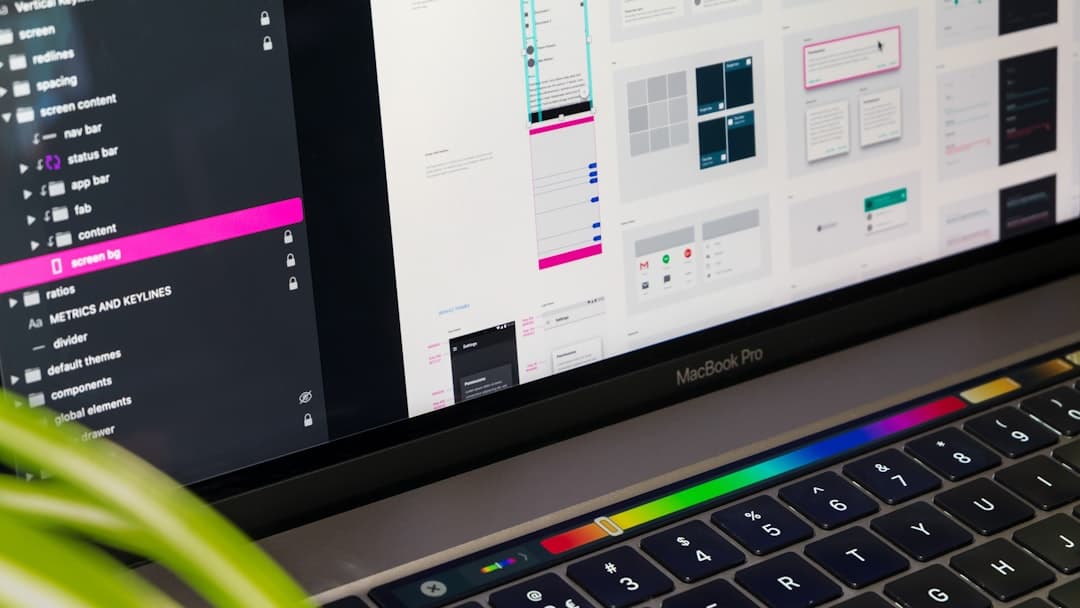
Why Framer Fits Portfolios So Well
Designers want full creative control without becoming front-end engineers. That tension is exactly what Framer resolves. It gives you a true design canvas where layout, typography, and interaction live together, then publishes a fast, responsive site without you touching code. For a portfolio, where craft is the entire pitch, that control is the point.
What Framer brings to the table
- Pixel-level control: position and style elements freely instead of fighting a rigid template.
- Built-in animation: add scroll effects and transitions that make your work feel alive without plugins.
- CMS for case studies: manage projects as structured content so adding a new piece takes minutes.
- Fast hosting included: publish to a custom domain with performance handled for you.
If you would rather start from a proven structure and customize from there, browse the best Framer templates for portfolios and adapt one to your work. Starting from a strong foundation lets you spend your energy on the case studies, which is where projects are actually won.
Common Portfolio Mistakes to Avoid
Most weak portfolios share the same handful of flaws. Knowing them in advance saves you from learning the hard way.
- No clear contact path: if a visitor wants to hire you, do not make them hunt. Put a contact option in the navigation and at the end of every case study.
- Missing the about section: clients hire people. A short, human about page builds trust that pure work cannot.
- Showing process without point of view: dumping every artifact looks thorough but reads as noise. Curate.
- Ignoring mobile: a portfolio that breaks on a phone undermines your entire credibility.
- Letting it go stale: a portfolio dated two years ago signals you have stopped growing. Refresh it as you produce better work.
Writing Copy That Sells Your Work
Designers obsess over visuals and neglect words, yet copy carries enormous weight in a portfolio. The text around your work frames how it is read. A weak caption flattens a brilliant project, while a sharp sentence elevates a modest one. Treat writing as part of the design, because to the visitor it is.
Start with your headline. The first thing someone reads should make your value obvious. “Brand and web designer helping startups look established” tells a visitor exactly what you do and who you serve. Vague taglines about passion and creativity say nothing and waste the most valuable space on the page.
Copy principles for portfolios
- Lead with outcomes, not adjectives. Show what changed for the client.
- Write project intros that frame the challenge before the visuals appear.
- Keep paragraphs short, since people scan portfolios rather than read them deeply.
- End each case study with a sentence that invites the next step, like a contact prompt.
Read your portfolio copy aloud. If a line sounds like marketing filler, cut it. The strongest portfolios feel like a confident person talking plainly about work they are proud of. That tone builds trust faster than any superlative ever could.
Showcasing Range Without Looking Scattered
Many designers worry that showing different types of work makes them look unfocused, while showing only one type makes them look limited. The resolution is intentional grouping. Organize your work so that variety reads as versatility rather than randomness. Structure turns a mixed bag into a deliberate story about your capabilities.
If you do brand, web, and product work, present them as distinct strengths rather than a jumble. Clear categories let a visitor find the relevant proof quickly. A hiring manager looking for a web designer can jump straight to your web projects without wading through unrelated pieces, which respects their time and increases the odds they reach out.
Balancing focus and breadth
- Lead with the work you most want more of, since the top of the page sets expectations.
- Group related projects so range looks intentional.
- Limit each category to your best two or three pieces to maintain quality.
- Use consistent presentation across categories so the site feels cohesive.
Launching and Iterating
Do not wait for perfection. A live portfolio with three solid case studies beats an unpublished one you keep polishing. Ship it, share it, and watch how people move through it. If you can, ask a few trusted peers where they got confused or lost interest, then fix those spots.
Treat the portfolio as a living asset. Each new project is a chance to replace your weakest case study with something stronger. Over time, the average quality of your visible work climbs, and so does the quality of the clients it attracts. That compounding is the whole game.
Your portfolio is the most important design project you will ever own, because it is the one that decides which other projects you get. Give it the same care you would give a paying client. When you are ready to build it on a platform made for designers, explore the Framer Websites pricing options and ship a portfolio that does its job.
Frequently Asked Questions
How many projects should a web design portfolio include?
Three to five strong projects is the sweet spot for most designers. Reviewers judge you by your weakest visible piece, so a tight set of excellent case studies beats a large gallery of average work. Quality and a clear story matter far more than volume.
Do I need real client work to build a portfolio?
No. Self-directed projects, such as a thoughtful redesign of a product you admire, can be just as persuasive when presented as genuine case studies. What matters is that the work demonstrates the skills you want to be hired for and that you explain your thinking clearly.
Why build a design portfolio in Framer instead of a template site builder?
Framer gives designers pixel-level control, built-in animation, and a CMS for managing case studies, all without writing code. Because your portfolio is itself a design sample, the creative freedom and fast performance Framer provides directly strengthen the impression your work makes.