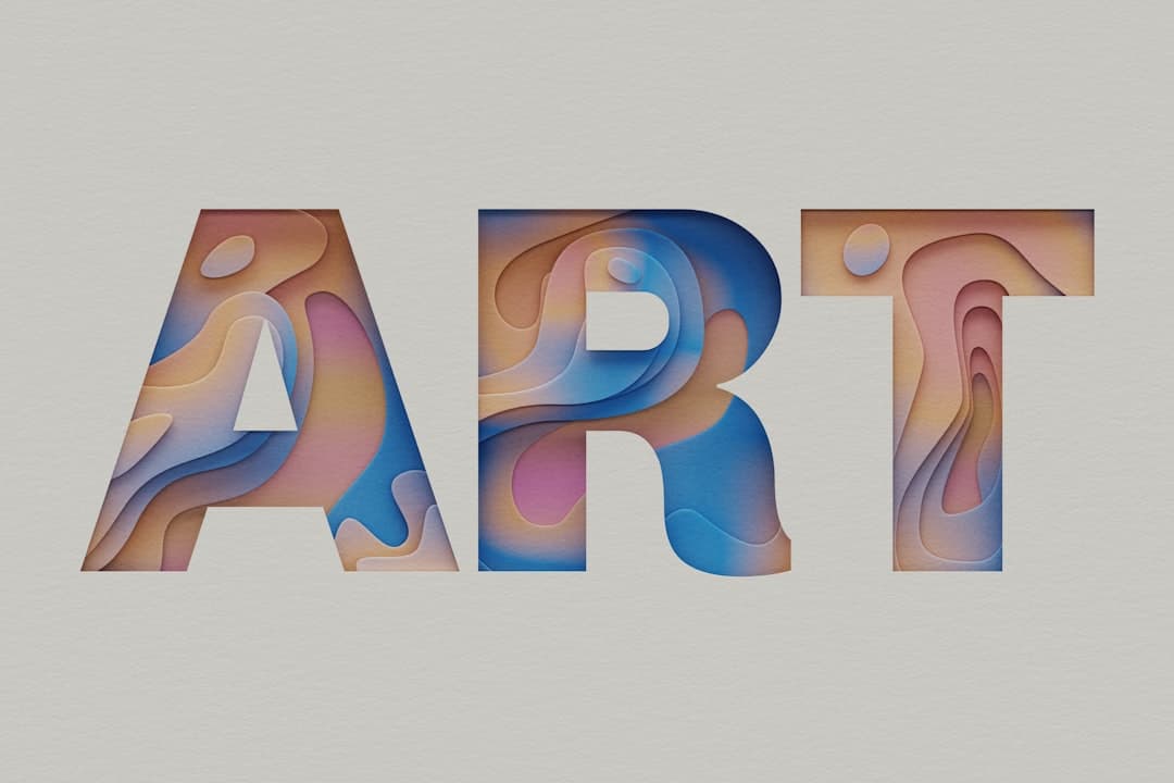
Kinetic typography is the practice of animating text so that words move, change, scale, or reveal themselves over time and in response to user actions. In web design it turns headlines and key messages into motion, drawing the eye, reinforcing meaning, and guiding visitors toward the action you want them to take.
What Is Kinetic Typography?
Kinetic typography means moving type. Rather than presenting words as a fixed block, you animate them: letters fade in one at a time, a headline slides into place, words swap on a loop, or text scales as the visitor scrolls. The term comes from motion graphics and film title sequences, where animated text has long been used to set tone and direct attention.
On the modern web, kinetic typography has become practical because browsers now handle text animation smoothly and design tools expose it without code. It ranges from subtle entrance animations that make a hero headline feel alive to bold, looping word cycles that become the centerpiece of a page. The common thread is that the type itself is the moving element, not a graphic wrapped around it.
Used well, kinetic typography is a content technique disguised as a visual one. The motion is not decoration. It is a way of pacing how a message lands, emphasizing the words that matter, and creating a sense of energy that static text cannot match.
Why Kinetic Typography Matters for Conversion
Text carries your message, so anything that makes the right words more memorable has a direct line to conversion. Kinetic typography earns attention at the exact moment a visitor is deciding whether to keep reading.
First, motion captures attention involuntarily. The human eye is wired to notice movement. When a headline animates into view, it pulls focus before a static block would. That first second of attention is where most pages win or lose the visitor, and animated type tilts it in your favor.
Second, it directs the reading order. By staggering when words appear, you control the sequence in which the visitor absorbs them. This reinforces your visual hierarchy, making sure the most important phrase is read first and the supporting detail second. Motion becomes a tool for emphasis, the same way bold and size are.
Third, it adds personality and brand feel. A confident, well-timed text animation signals craft. Visitors form an impression of your product within seconds, and a polished kinetic headline communicates that the team behind the page sweats the details. That perception of quality transfers to the product itself.
The Emotional Layer
Words have rhythm, and motion lets you express it. A punchy three-word value proposition that snaps into place feels decisive. A phrase that gently fades in feels calm and premium. Matching the motion to the message gives your copy an emotional layer that static type cannot deliver, and emotion is what moves people from reading to acting. This works best when it complements your overall website typography rather than fighting it.
Concrete Examples of Kinetic Typography
Kinetic typography appears in several distinct forms. Recognizing them helps you choose motion that fits your message instead of animating for its own sake.
- Staggered entrance animations. Letters or words fade and slide into view in sequence as the section loads or enters the viewport. This is the most common and most versatile form, ideal for hero headlines.
- Word cycling. A fixed phrase keeps one part static while another word rotates through options, such as “Built for [designers / founders / agencies].” This compresses several value propositions into one line.
- Scroll-linked typography. Text scales, shifts, or changes color as the visitor scrolls, tying the animation to scroll position. This pairs naturally with longer narrative pages.
- Variable font animation. The weight, width, or slant of a typeface animates smoothly using a variable font, letting a single word breathe from thin to bold.
- Marquee and ticker effects. Text scrolls horizontally in a continuous loop, useful for displaying client names, testimonials snippets, or a repeating brand statement.
- Reveal-on-hover. Words shift, underline, or transform when the visitor hovers, adding interactivity to links and navigation.
The strongest examples use one or two of these techniques per page, not all six. Restraint is what separates a sophisticated page from a chaotic one. To see how animated type works inside complete, conversion-focused sites, the Framer Websites portfolio shows it in context.
How to Apply Kinetic Typography in Real Websites
Effective kinetic typography starts with the words and ends with the timing. Treat it as a craft with a clear order of operations.
Step 1: Pick the Right Text to Animate
Animate the words that carry the most weight, usually the hero headline and a small number of high-impact phrases. Body paragraphs should stay still, because readers expect to control their own pace through longer text. Animating everything dilutes the effect and slows reading. Choose one or two moments where motion genuinely helps the message land.
Step 2: Match Motion to Meaning
Let the animation reflect the tone of the copy. A bold claim deserves a sharp, fast entrance. A reassuring message deserves a soft fade. The motion should feel like a natural extension of the words, never a generic effect applied indiscriminately. When motion and meaning align, the headline becomes more persuasive.
Step 3: Get the Timing Right
Timing is where kinetic typography succeeds or fails. Entrance animations should be quick, generally between 300 and 700 milliseconds, with easing that feels natural rather than mechanical. Stagger delays between words should be short, around 50 to 100 milliseconds, so the sequence reads as one fluid motion. Slow animations test patience and delay the moment the visitor can read the message.
Building Kinetic Typography in Framer
Framer makes kinetic typography accessible because text animation is part of the core toolset. You can split a headline into individual characters or words and apply staggered appear effects, link transforms to scroll position, and animate variable font properties, all from the visual canvas. A practical workflow looks like this:
- Set the headline as a text layer and choose the appear animation, then enable per-word or per-character staggering.
- Tune the duration, delay, and easing until the motion feels effortless rather than showy.
- For scroll-linked effects, attach a scroll transform that maps the visitor’s scroll position to scale or position.
- Test the reduced-motion fallback so visitors who disable animation still see clean, readable type.
Because Framer outputs optimized code, these animations run smoothly without the performance penalty that hand-built JavaScript animation often carries. That combination of visual sophistication and fast loading is precisely the standard Framer Websites builds to.
Common Pitfalls to Avoid
Kinetic typography goes wrong in recognizable ways. Avoid these and your animated type will help rather than hurt.
- Slowing down the message. If a visitor has to wait for words to finish animating before they can read, you have added friction. Keep animations fast and ensure the full message is legible almost immediately.
- Animating body text. Long passages of moving text are exhausting to read. Reserve motion for headlines and short phrases, and leave paragraphs static.
- Hurting legibility. Effects that blur, distort, or overlap text during animation can make words hard to read. Legibility always beats novelty. If the visitor cannot read it, the animation has failed.
- Ignoring reduced-motion preferences. Some visitors enable reduced motion for comfort or accessibility. Always provide a static fallback so the message survives without animation.
- Overusing the effect. When every heading on the page animates, the technique loses its power and the page feels frantic. One or two animated moments carry more impact than a dozen.
- Layout shift. Poorly built text animations can push surrounding content around as they load, hurting both the experience and your Core Web Vitals. Reserve space for animated text so the layout stays stable.
The discipline is the same one that governs all good motion design: every animation must earn its place. Kinetic typography is powerful precisely because it is selective.
When Kinetic Typography Works Best
Kinetic typography is most valuable on pages where first impressions and brand feel drive results: homepages, product launches, agency sites, and portfolios. It is less appropriate on documentation, pricing tables, and dense informational pages where visitors want to read quickly and act. Match the technique to intent. A high-energy hero headline that animates into view sets the tone for a marketing page, while a pricing page benefits more from clarity and stillness. The best designers know when motion adds value and when it gets in the way.
If you want a site that uses kinetic typography with the restraint and timing that actually converts, the Framer Websites team builds exactly this. Explore the pricing options or reach out to discuss your project.
Frequently Asked Questions
Does kinetic typography slow down my website?
Not if it is built correctly. Modern text animations that use transform and opacity are inexpensive for browsers to render and have minimal impact on load time. Problems arise from heavy JavaScript libraries or unoptimized assets. When built in a tool like Framer that outputs efficient code, kinetic typography runs smoothly without hurting performance.
Is animated text bad for accessibility?
It can be if you ignore reduced-motion preferences and legibility. The fix is straightforward: provide a static fallback for visitors who disable animation, keep text fully readable during and after the animation, and never trap essential content inside motion. Handled this way, kinetic typography stays accessible.
How much text should I animate on a page?
Animate sparingly. One hero headline and perhaps one or two supporting phrases is usually enough. Body paragraphs should stay static so visitors can read at their own pace. Over-animating dilutes the effect and makes the page feel chaotic, so treat each animated moment as a deliberate choice.
Can I build kinetic typography without code?
Yes. Framer includes per-word and per-character text animation, scroll-linked transforms, and variable font controls directly in its visual canvas, so you can build polished animated type without writing code. For highly custom effects, working with a specialized team like Framer Websites ensures the result is both striking and performant.