Jewelry ecommerce website design is the practice of building an online store that sells the feeling of luxury before it sells a single ring. It blends large, high-resolution imagery, generous white space, refined typography, and a trust-heavy checkout so shoppers feel confident spending hundreds or thousands of dollars on something they cannot touch.
Selling jewelry online is harder than selling almost anything else. The product is small, expensive, emotionally loaded, and impossible to inspect in person. A buyer cannot feel the weight of the gold or watch the diamond catch the light. Your website has to do that work for them. This guide walks through every layer of jewelry ecommerce website design, from visual strategy to conversion mechanics, and shows where a modern platform like Framer changes what is possible.
Why Jewelry Ecommerce Is Different
Most ecommerce playbooks were written for fast-moving consumer goods. Jewelry breaks those rules. The average order value is high, the purchase is considered, and the emotional stakes are enormous. A wedding band carries meaning that a phone case never will. That changes how you design every screen.
Three pressures define the category. First, perceived value: the site itself must look as expensive as the products, or shoppers assume the pieces are cheap. Second, trust: people hand over large sums to a brand they may have discovered an hour ago. Third, the imagination gap: buyers cannot try the piece on, so your imagery and detail pages must close that gap. Get these three right and conversion follows. Miss any one and the cart stays empty.
Visual Strategy: Make the Pixels Look Expensive
Luxury is communicated through restraint. Cluttered layouts, loud banners, and aggressive discount badges signal a discount bin, not a fine jeweler. The most effective jewelry stores borrow from print editorial and gallery curation rather than from typical retail.
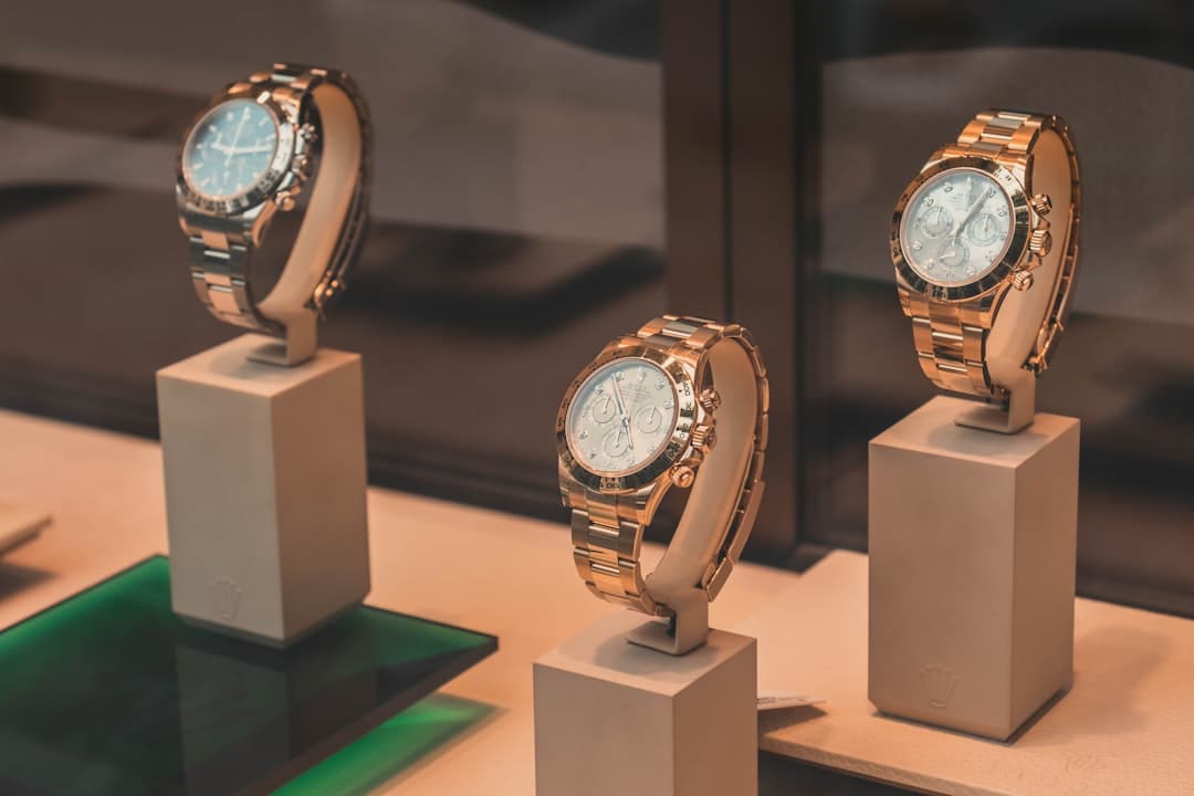
Photography Is the Product
Your photography budget is not a line item, it is the foundation. Shoppers judge a ring by its photos because that is all they have. Every product needs multiple angles, a macro shot that reveals the setting and metal texture, a scale reference such as a hand or a model, and ideally a short video or 360-degree spin. Consistent lighting and a clean, repeated background across the catalog make the store feel curated rather than thrown together.
High-resolution imagery comes with a cost: file weight. Large photos slow a page down, and slow pages lose sales. This is why image handling and performance matter so much for jewelry. A thoughtful approach to image optimization for websites lets you serve gallery-quality visuals without the page crawling on a phone over cellular data.
Typography and Color That Signal Craft
Fine jewelry brands lean on elegant serif headlines paired with clean sans-serif body text, plenty of letter spacing, and a tight color palette. Black, white, warm neutrals, and a single metallic accent do more than a rainbow of competing hues. If you want a deeper framework for choosing tone and contrast, our guides on website typography and website color theory cover how type and color quietly establish prestige.
Building Trust Before the Sale
Trust is the deciding factor in jewelry conversion. A first-time visitor needs reasons to believe you are real, established, and safe to pay. Build those reasons into the page rather than burying them on a separate policy link.
| Trust Element | Why It Matters | Where to Place It |
|---|---|---|
| Materials and certification | Diamond grading, metal purity, and authenticity proof reduce purchase anxiety | Product page, near the price |
| Returns and warranty | A generous return window offsets the no-try-on risk | Product page and global header strip |
| Customer reviews and photos | Real buyers wearing the piece close the imagination gap | Below the product gallery |
| Secure payment badges | Visible security cues reassure high-value buyers | Cart and checkout |
| Brand story and craftsmanship | Heritage and process justify premium pricing | About page and homepage |
Reviews deserve special attention. A customer photo of a necklace in real light, on a real person, does more to convert than any studio shot. Design a dedicated space for user-generated content and make submitting a review effortless. For the structure of social proof, our testimonial section design guide is worth a read.
The Product Page: Where Jewelry Sales Are Won
If the homepage sets the mood, the product page closes the deal. It carries the heaviest design load in the entire store. A strong jewelry product page includes a large primary image with thumbnail or swipe navigation, a zoom and ideally a video, a concise but complete specification block, clear pricing, and a single dominant call to action.
Specifications matter more in jewelry than in most categories. Buyers want carat weight, metal type and purity, dimensions, gemstone details, and sizing guidance. Present this in a scannable layout rather than a wall of text. For variant-heavy pieces such as rings sold in multiple sizes and metals, the selector must be obvious and forgiving, because a confusing variant picker is a quiet conversion killer. Strong form design best practices apply directly to these selectors and to the ring-sizing tools many jewelers offer.
Pricing Presentation
How you show price changes how it feels. For luxury, avoid the strikethrough-discount aesthetic of fast fashion. Display the price cleanly, and if you offer financing or installment payments, present that as an option rather than an apology. Many jewelry buyers will complete a purchase they would have abandoned once a four-figure ring becomes four monthly payments.
Checkout and Mobile: Removing Friction
A beautiful store still fails if checkout is clumsy. High-value purchases bring higher anxiety, so every extra field and surprise cost increases abandonment. Keep the flow short, show shipping and any duties early, offer guest checkout, and support the wallet payments shoppers already trust. Because the majority of jewelry browsing now happens on phones, your entire experience must be designed for the small screen first. Our mobile first design guide explains how to prioritize the thumb zone, tap targets, and load speed that mobile jewelry shoppers demand.
Implementing a Jewelry Store in Framer
Framer has become a serious option for jewelry brands that care about how their site looks and feels. Its strength is design fidelity: the polished, editorial layouts that fine jewelry needs are achievable without wrestling with a heavy theme system. You design visually, and what you build is what ships.
For the storefront itself, Framer pairs cleanly with a commerce backend. Many jewelry brands run their catalog and checkout on Shopify while using Framer for the marketing and brand experience, connected through the Framer Shopify integration. This gives you Shopify’s reliable payments and inventory with Framer’s superior design control. If you are weighing platforms before committing, our comparison of Framer vs Shopify lays out where each one leads.
Framer also handles the experience details that make jewelry feel premium: smooth scroll animations that reveal a collection, subtle hover states on product cards, fast image delivery through a built-in content delivery network, and responsive layouts that hold their composition across devices. The result is a store that looks custom-built without the timeline and cost of a fully bespoke build.
At Framer Websites, we build exclusively in Framer for brands that refuse to choose between beautiful and functional. If you are launching or rebuilding a jewelry store, take a look at our recent work to see the standard, and review our pricing to understand what a conversion-focused jewelry build involves.
Accessibility in Jewelry Ecommerce
Luxury and accessibility are not opposites. An accessible store reaches more buyers and protects you legally. Ensure every product image carries descriptive alt text that conveys the piece, maintain sufficient color contrast even on those elegant neutral palettes, make variant selectors and the checkout fully keyboard navigable, and label form fields clearly. Decorative animation should never trap focus or trigger motion sickness, so respect reduced-motion preferences. Accessible design also tends to be cleaner design, which serves the luxury goal rather than fighting it.
Common Mistakes to Avoid
The recurring failures in jewelry ecommerce are predictable. Low-quality or inconsistent photography undermines perceived value instantly. Hidden or vague pricing erodes trust. Slow pages from unoptimized imagery push mobile shoppers away. Overloaded layouts with too many promotions cheapen the brand. And a checkout that demands account creation before purchase loses the impulse buyer. Avoid these and you are ahead of most competitors in the category.
Frequently Asked Questions
What is the best platform for a jewelry ecommerce website?
The strongest setup for design-led jewelry brands is Framer for the brand and storefront experience paired with a commerce backend such as Shopify for payments and inventory. Framer delivers the editorial, luxury look that jewelry requires, while Shopify handles secure transactions. For smaller catalogs, Framer’s native commerce features may be enough on their own.
How important is photography for selling jewelry online?
Photography is the single most important element. Because buyers cannot inspect the piece in person, your images and video carry the entire weight of communicating quality, scale, and craftsmanship. Invest in macro shots, multiple angles, scale references, and short videos before spending on anything else.
How do I build trust on a jewelry ecommerce site?
Surface trust signals throughout the experience rather than hiding them. Display materials and certification near the price, offer a generous return and warranty policy, show real customer reviews with photos, include visible secure-payment cues at checkout, and tell an authentic brand and craftsmanship story. These elements together reassure shoppers spending significant money.
Should a jewelry store be designed mobile first?
Yes. Most jewelry discovery and a growing share of purchases happen on phones. Design for the small screen first, prioritizing fast-loading images, large tap targets, an easy variant selector, and a short checkout. A mobile experience that feels as refined as the desktop one is essential for conversion.