Art gallery website design is the practice of building a quiet, image-led site that puts the artwork first, makes artists and exhibitions easy to browse, and lets collectors inquire or buy without friction. A strong gallery site uses restrained typography, generous white space, and high-resolution imagery so the work, not the interface, holds the visitor’s attention.
Key Takeaways
- The artwork is the hero. Every design choice should recede so the images can breathe.
- An art gallery website design needs a clean structure for artists, exhibitions, and individual works, with fast, high-quality image rendering.
- Collectors expect a calm, premium experience and a simple path to inquire about or purchase a piece.
- White space, minimal navigation, and a single restrained typeface signal seriousness and let the work command attention.
- Framer is well suited to galleries because it delivers gallery-grade visuals, smooth motion, and fast image loading without a developer.
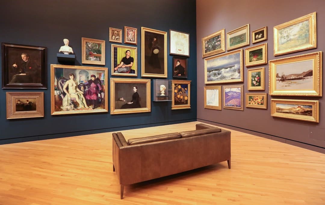
Why a Gallery Website Is Different
Most business websites compete for attention with bold headlines and busy layouts. A gallery does the opposite. The site is a frame around the art, and the best frames disappear. Visitors come to look closely, to understand an artist’s body of work, and to consider a purchase or visit. That means the design must be confident enough to get out of the way.
This restraint is itself a credibility signal. A serious collector reads a cluttered, slow site as amateurism. The same trust dynamics covered in our B2B website design guide apply to galleries, where a polished, considered presentation reassures a buyer making a significant decision.
The Structure Every Gallery Site Needs
Gallery sites are image-heavy but should feel effortless to navigate. A clear information architecture keeps a large body of work organized.
Home
The home page sets the tone. A single striking work or a quiet grid of current highlights, the gallery name, and minimal navigation. Resist filling the first screen. One powerful image says more than a busy collage.
Artists
Each represented artist deserves a dedicated page: a short biography, a statement, a portrait, and a curated selection of their work. Collectors often follow artists, so make these pages rich and easy to find.
Exhibitions
Current, upcoming, and past exhibitions each need clear listings with dates, a curatorial note, and installation views. Past exhibitions are an archive that builds the gallery’s authority and earns search traffic over time.
Works and Individual Pieces
The single most important interaction is viewing one work. Each piece should display at high resolution with the ability to zoom, alongside the title, year, medium, dimensions, and an inquire or price option. This is where consideration turns into contact.
About, Visit, and Contact
An about page tells the gallery’s story and mission, a visit page handles hours, location, and a map, and a clear contact path lets collectors, artists, and press reach the right person.
Visual Design Patterns for Galleries
The visual language of a gallery site is minimalism with intent. A few patterns consistently serve the work well.
- Generous white space. Margins and breathing room around each image mimic the way art hangs on a wall. Crowding kills the experience.
- Restrained typography. One refined typeface, used at a few sizes, keeps the focus on the art. Avoid decorative fonts that compete with the work.
- A near-neutral palette. Whites, off-whites, and soft grays let the colors in the artwork stand out. The interface should add no color of its own.
- High-resolution, fast-loading images. The art must look crisp on a retina screen yet load quickly. This balance is the central technical challenge of a gallery site.
- Subtle, slow motion. Gentle fades and smooth transitions feel curatorial. Flashy animation feels like a sale.
Let the content drive every visual decision. The work itself dictates the crop, the spacing, and the pace. The design system should adapt to the art rather than imposing a template on it.
Building an Art Gallery Website in Framer
Framer fits gallery work because it combines precise visual control with fast image handling and built-in hosting. You can craft the calm, high-resolution presentation collectors expect, and Framer outputs optimized, responsive code with no separate development step.
Build a Consistent Layout System First
Establish your grid, margins, typography, and image treatment once, then apply them across artist and exhibition pages. Consistency is what makes a gallery feel curated rather than assembled.
Use a Content Structure for Works
Galleries hold many pieces, and entering them by hand is tedious. Framer’s content management features let you build a works collection where each piece carries its title, artist, year, medium, dimensions, and image, then renders through one consistent template. Add or update a work in one place and the whole site stays in sync.
Optimize Images Without Losing Quality
Framer serves responsive, appropriately sized images automatically, so a large artwork looks sharp on desktop yet loads fast on mobile. Provide high-resolution source files and let the platform handle delivery.
A multi-page, image-dense site benefits from a disciplined build order. Our website design process lays out research, wireframing, design, build, and launch in a sequence that keeps a large gallery project organized from first concept to live site.
Helping Collectors Inquire and Buy
A gallery site should make the next step obvious without feeling like a storefront. Depending on your approach:
- Inquire to purchase. Many galleries prefer a discreet inquiry form on each work rather than a public price and cart. This preserves the relationship-led nature of art sales.
- Transparent pricing. Some galleries and online-first dealers list prices to lower the barrier for new collectors. Choose the model that fits your audience.
- Viewing rooms. A curated set of works presented as a private or themed viewing room can drive focused interest in a show.
- Clear provenance and detail. Edition information, condition, and framing details build the confidence a serious buyer needs.
SEO and Discovery for Galleries
Even a minimal site can be found by the right people. A few fundamentals help.
- Descriptive alt text. Image-heavy sites depend on alt text for both accessibility and search, so describe each work clearly, including artist and medium.
- Artist and exhibition pages as content. Biographies, statements, and curatorial notes give search engines real text to index on an otherwise visual site.
- Structured data. Schema for events and visual artwork can help exhibitions and pieces surface in search.
- Fast performance. Speed is a ranking factor, and Framer’s optimized image delivery gives a gallery an edge despite its heavy visuals.
Common Gallery Website Mistakes to Avoid
- Overdesigning the interface. Heavy graphics and loud color steal attention from the art.
- Low-resolution or slow images. Blurry work or long load times undermine the whole point of the site.
- No alt text. It hurts both accessibility and discoverability on an image-first site.
- Hidden contact or inquiry paths. A collector ready to act should never have to hunt for how to reach you.
- Neglected archives. Deleting past exhibitions discards search equity and the gallery’s documented history.
Most of these stem from choosing tools that make careful, ongoing curation hard. The principle that the right platform should make updating effortless runs through every field, including the tooling guidance in our SaaS website design guide.
Accessibility and Responsive Behavior
A gallery site is judged on craft, and craft includes how it behaves for every visitor on every device. Accessibility is not a compliance chore here, it is part of treating the work and the audience with respect. A few practices matter most on an image-led site.
- Write meaningful alt text for every work. Describe the piece, the artist, and the medium so a screen reader user understands what is on the wall, and so search engines can index an otherwise visual page.
- Maintain readable contrast. Minimal, near-neutral palettes are beautiful, but caption and navigation text still needs enough contrast to be legible for everyone.
- Support keyboard navigation. A visitor should be able to move through artists, exhibitions, and individual works without a mouse.
- Scale gracefully across devices. A large work should fill a desktop screen yet remain crisp and tappable on a phone, with zoom that works naturally on touch.
Framer handles much of the responsive behavior automatically, serving appropriately sized images and adapting layouts per breakpoint, which lets you focus on curation while the platform protects the experience on small screens.
Writing for an Image-First Site
A gallery site is quiet, but the small amount of text it carries does real work. Artist statements, curatorial notes, and exhibition introductions are what give a collector context and what give search engines something to read. The tone should match the restraint of the visuals: precise, unhurried, and free of marketing noise. A short, well-written note about an exhibition’s theme tells a collector more than a wall of adjectives.
Treat the writing as part of the curation. One thoughtful paragraph per artist, a clear line about each work’s medium and year, and a concise statement of the gallery’s point of view do more than length ever could. This restraint also serves discovery, since clear, specific text around artists and shows is exactly what helps the right collector find the gallery in the first place. Let the words frame the art the same way the white space does, by getting out of the way at the right moment.
Building the Gallery’s Long-Term Authority
A gallery website is also an archive and a reputation. Documenting every exhibition, keeping artist pages current, and adding press and writing over time turns the site into a resource that collectors, curators, and writers return to. That accumulated record quietly compounds into authority, and authority is what brings the next collector to your door.
Want a gallery website that lets your artists’ work speak and gives collectors a calm path to inquire? Reach out to our team to plan an art gallery website design built in Framer.
Frequently Asked Questions
Should an art gallery website show prices?
It depends on your model. Traditional galleries often prefer a discreet inquiry form on each work to preserve a relationship-led sale, while online-first dealers list prices to lower the barrier for newer collectors. Choose the approach that matches how your buyers prefer to engage.
How do I keep image quality high without slowing the site?
Provide high-resolution source files and let a modern platform serve responsive, appropriately sized versions for each device. Framer does this automatically, so a piece looks sharp on a desktop retina screen while still loading quickly on a phone.
What pages does a gallery website actually need?
At minimum a home page, artist pages, exhibition listings, individual work pages, and a visit or contact page. The artist and work pages do the heavy lifting, since collectors browse by artist and make decisions on individual pieces.
Why build an art gallery website in Framer?
Framer gives precise visual control, smooth curatorial motion, automatic image optimization, content management for large bodies of work, and built-in hosting. A gallery can ship a refined, fast, high-resolution site that puts the art first without hiring a developer.