Yoga studio website design is the practice of building a calm, welcoming site that communicates your studio’s vibe, makes the class schedule easy to read, and turns visitors into booked students. A strong yoga site leads with atmosphere and a clear schedule, then makes signing up for a first class effortless on a phone.
Key Takeaways
- The schedule and a “book a class” action are the most important elements, and both must be obvious on mobile.
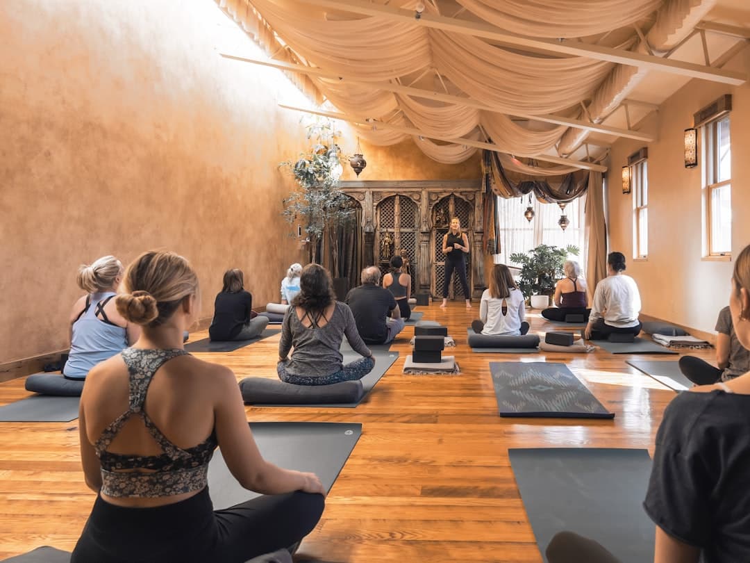
- Atmosphere converts. Warm photography of real classes and your space communicates the experience faster than any paragraph.
- A good yoga studio website design lowers the anxiety of a first visit by explaining what to expect, what to bring, and who teaches.
- Integrating your booking software is essential, since most studios manage schedules and memberships through a dedicated platform.
- Framer lets a studio ship a serene, fast, mobile-first site with smooth motion and no developer, and it integrates cleanly with booking tools.
What a Yoga Studio Website Is For
A yoga website has one core job: convert a curious local into a booked student. People find your studio while searching for “yoga near me” or “beginner yoga classes”, land on your site, and within a few seconds decide whether this feels like a place they belong. The design has to answer three quiet questions instantly: is this for someone like me, when can I come, and how do I sign up.
That reassurance is a trust exercise as much as a design one. The credibility and clarity principles in our B2B website design guide translate directly, because a nervous first-timer choosing a studio is making the same gut judgment as a buyer choosing a vendor: does this feel professional, warm, and safe to commit to.
The Pages a Yoga Studio Website Needs
Home
The home page should feel like walking into the studio. A calm hero image of a real class or your space, a one-line promise of the experience, your location, and a clear “Book a Class” button. Keep it uncluttered. Serenity is the brand.
Schedule and Classes
This is the page students return to most. The weekly schedule must be readable at a glance on a phone, with class names, times, levels, and teachers. Each class type benefits from a short description so a newcomer knows whether vinyasa, restorative, or hot yoga suits them.
Pricing and Memberships
Be transparent about drop-in rates, class packs, and memberships. A clear, honest pricing page removes hesitation. Highlight any first-class offer prominently, since a low-risk trial is the most common entry point.
Teachers
People connect with teachers, not just studios. Short bios with warm photos help a student pick a class and feel they know someone before they arrive.
New Student Guide
A simple “first visit” page that explains what to bring, when to arrive, what to wear, and what to expect removes the anxiety that stops beginners from booking. This single page often lifts conversions more than any redesign.
About, Contact, and Visit
Tell the studio’s story and values, share your location with a map, and make it easy to reach you with questions about workshops, privates, or teacher training.
Visual Design Patterns for Yoga Studios
- Lead with calm photography. Real images of your classes and space, shot in soft natural light, set the mood instantly. Avoid stiff stock photos of unfamiliar people.
- A grounded, natural palette. Warm neutrals, sage, terracotta, and soft earth tones feel calming and authentic.
- Generous spacing. Breathing room in the layout mirrors the breathing room of the practice. Cramped pages feel stressful.
- Gentle motion. Slow fades and soft transitions as content scrolls into view reinforce a sense of ease. Framer handles these natively without slowing the page.
- A persistent book action. A sticky “Book a Class” button means a student can act the moment they feel ready.
Let the content lead the visual choice rather than reaching for an effect first. Decide what each section should make a visitor feel, then choose the photo or animation that delivers it. That keeps the site feeling intentional and calm instead of busy.
Building a Yoga Studio Website in Framer
Framer suits yoga studios because it pairs serene, precise design with fast performance and built-in hosting, and it embeds the booking tools studios already use. You design visually, and Framer outputs optimized, responsive code with no separate development step.
Design Mobile First
Most students check the schedule and book on a phone, often on the way to class. Design the mobile breakpoint first, confirm the schedule and book button are thumb-friendly, then expand to desktop. Framer lets you tune each breakpoint independently.
Integrate Your Booking Software
Studios typically run scheduling and memberships through a dedicated platform. Framer lets you embed that booking widget directly, so a student moves from your beautiful site into the real booking flow without a jarring handoff. Place the book action site-wide.
Use Components for Classes and Teachers
Class cards and teacher bios repeat. Build each as a Framer component so updating a schedule change or adding a new instructor takes seconds and stays consistent across the site.
A repeatable build sequence keeps the project calm too. Our website design process is referenced indirectly in many studio builds, and choosing the right platform from the start matters. If you are weighing options, our comparison of Framer versus Wix Studio walks through how the two stack up for design control, performance, and ongoing ease of editing.
Reducing First-Visit Anxiety
The biggest barrier to a new student is not price, it is uncertainty. They wonder whether they will be the least flexible person in the room, whether they are dressed right, whether they will know where to go. Your site can dissolve that anxiety:
- Show real classes with real people of varied ages and abilities.
- Spell out the first-visit logistics plainly.
- Name a clear beginner-friendly class and link straight to its booking.
- Offer a low-risk first-class deal so the decision feels small.
The same warm, photography-led approach works for adjacent wellness and creative spaces. If you run a related studio, the patterns in our photography studio website design guide overlap closely, since both depend on atmosphere, real imagery, and an easy booking path.
Local SEO for Yoga Studios
- Target neighborhood keywords. Use phrases students search, like “hot yoga in Midtown” or “prenatal yoga near me”, in headings and copy.
- Keep your name, address, and phone consistent across your site, Google Business Profile, and directories.
- Add LocalBusiness structured data so search engines understand your hours, location, and class offerings.
- Create content around class types and benefits to capture students researching before they commit.
- Keep the site fast. Speed is a ranking factor, and Framer ships optimized images and clean code by default.
Common Yoga Website Mistakes to Avoid
- A hard-to-read schedule. If a student cannot scan the week on a phone, they will not book.
- Hiding prices. Mystery pricing breeds hesitation. Be open about drop-ins, packs, and memberships.
- Generic stock photos. Images of strangers in an unfamiliar studio feel impersonal. Use real photos of your space.
- No first-visit guidance. Without it, beginners quietly drop off.
- A clunky booking handoff. A jarring jump to an unstyled booking page breaks the calm you worked to create.
Performance and the Mobile Booking Flow
The moment a student decides to come to class is fragile. They feel the impulse, open your site on a phone, and either book in seconds or lose the feeling. Every bit of friction between that impulse and a confirmed booking costs you a student. A few performance habits protect that moment.
- Keep the page fast. Compress your class and studio photos and avoid heavy autoplay video on mobile. Aim for a load under two seconds so the schedule appears before the impulse fades. Framer serves responsive, optimized images by default.
- Make the schedule scannable on a phone. A student should see the day, time, class, and teacher without zooming or scrolling sideways. Stack the schedule into clean rows for small screens.
- Smooth the booking handoff. When the student taps to book, the jump into your scheduling tool should feel like one continuous experience, not a jarring leap to an unstyled page.
- Test the real flow. Book a class on an actual phone start to finish. Tap every button, confirm the date picker works with a thumb, and make sure the confirmation is clear.
Speed is part of the calm you promise. A studio that markets serenity and then serves a slow, stuttering site breaks the spell. A fast, gentle site keeps the feeling intact from the first scroll to the booked class.
Writing Copy That Welcomes Beginners
The words on a yoga site carry a lot of emotional weight. A nervous newcomer reads them looking for permission to belong. Copy that is warm, plain, and specific does more to fill classes than any clever tagline. Instead of “elevate your practice,” say “new to yoga? Start with our Gentle Flow on Tuesday mornings, no experience needed.” Specifics reassure, and reassurance is what converts a curious browser into a booked student.
Speak to the real fear underneath the hesitation. Acknowledge that walking into a first class is daunting, then remove the unknowns one by one: what to wear, when to arrive, where to leave your shoes, what the class actually feels like. When your copy treats a beginner with that kind of care, it signals exactly the welcoming community they hope to find. Keep the tone calm, keep sentences short, and let the booking action follow naturally from the welcome you just offered.
Building Lasting Student Relationships
A studio site can nurture the community, not just acquire it. An email signup for workshops, a gentle newsletter, and a members area for regulars keep students engaged between classes. These quiet loops reduce reliance on paid advertising and turn first-timers into the long-term members who sustain a studio. As your community grows, the site becomes the calm hub it all flows through.
Want a yoga studio website that feels as calm as your classes and fills your schedule? Get in touch with our team to plan a yoga studio website design built in Framer.
Frequently Asked Questions
How do I add my class schedule and booking to the website?
Most studios run scheduling and memberships through a dedicated booking platform. You embed that platform’s widget directly into your Framer site so students browse your design and then book through the real system without a clunky handoff, and you place the book action on every page.
What is the most important page on a yoga studio website?
The schedule, paired with an easy booking action, is the page students use most. A close second is a clear first-visit guide, because reducing the anxiety of a newcomer’s first class often lifts bookings more than any other single change.
How do I make a yoga website feel calming?
Use real, soft-lit photography of your space, a grounded natural color palette, generous spacing, restrained typography, and gentle motion. Let the design breathe and get out of the way so the atmosphere of the studio comes through.
Why build a yoga studio website in Framer?
Framer gives you serene design control, fast mobile-first performance, smooth motion, easy integration with booking software, and built-in hosting. A studio can ship a polished, calming, SEO-ready site and keep it current without hiring a developer.