Font pairing is the practice of combining two or more typefaces that work together to create contrast, hierarchy, and personality on a website. A strong pairing usually sets a distinctive font for headings against a highly readable font for body text, balancing character with clarity so your page feels intentional rather than accidental.
Key Takeaways
- Good font pairing relies on contrast: pair fonts that differ enough to create hierarchy but share an underlying mood.
- The safest reliable formula is a characterful display or serif for headings with a clean, neutral sans-serif for body copy.
- Limit a site to two or three typefaces, because more fragments the design and slows page load.
- Readability of body text is non-negotiable: size, line height, and line length matter as much as the typeface itself.
- Web fonts affect performance, so choose efficient formats and let your platform handle loading well.
Why Font Pairing Matters
Typography is most of what a visitor reads, which means your font choices carry a large share of the impression your site makes. A thoughtful pairing makes a page feel polished, trustworthy, and easy to navigate. A clashing or careless one makes even good content feel amateur. People rarely notice typography consciously, yet they feel it instantly.
Pairing matters because a single font rarely does every job well. A font with strong personality might shine in a big headline but tire the eye across a long paragraph. A font built for relentless readability might feel flat as a hero title. Combining fonts lets each do what it does best, heading fonts for impact and body fonts for comfort.
There is also a hierarchy argument. Different fonts, weights, and sizes signal to the reader what is a title, what is a subhead, and what is body. That visual structure is part of how people skim and decide whether to keep reading, which ties directly to how content gets read at all. Our guide to visual hierarchy in web design goes deeper on how type, size, and spacing guide the eye through a page.
The Core Principles of Pairing Fonts
You do not need a design degree to pair fonts well. A handful of principles handle most cases.
Contrast without conflict
The fonts should be different enough that the difference reads as deliberate. Pairing two similar sans-serifs often looks like a mistake rather than a choice. Pair a serif with a sans-serif, or a bold display face with a quiet body face, so the contrast is obvious and purposeful.
Shared mood
Contrast in form, harmony in feeling. Two fonts can look different yet share a personality, both modern, both warm, both editorial. When the moods clash, a stiff geometric heading over a playful handwritten body, the page feels confused. Match the vibe even as you vary the shapes.
Hierarchy through weight and size
You can build hierarchy within a single font family using weights and sizes, then add a second font only where it earns its place. Sometimes one well-chosen typeface with a bold and a regular weight beats a busy two-font pairing. Restraint reads as confidence.
Readability first
The body font is doing the heavy lifting, so it must be readable at small sizes on every screen. Test it on mobile, in long paragraphs, and against your background color before you commit. A gorgeous heading cannot rescue body text that strains the eye.
Reliable Pairing Formulas
If you want shortcuts that almost always work, lean on these proven structures.
- Serif heading, sans-serif body: the classic editorial look. A serif like Playfair Display or Lora for titles, a clean sans like Inter or Source Sans for text. Feels authoritative and timeless.
- Sans-serif heading, serif body: the inverse, modern and approachable up top with a warm, readable serif below. Good for blogs and long-form content.
- Two weights of one family: a superfamily like Inter or Roboto used in bold for headings and regular for body. Cohesive, fast, and foolproof.
- Display heading, neutral body: a characterful display font for big moments paired with a neutral workhorse for everything else. The display font carries the brand, the body keeps things legible.
When in doubt, start with the third option. One family in two weights is the lowest-risk choice and loads fast, which keeps your pages quick and your design coherent.
Matching Type to Brand Personality
Fonts have voices. A geometric sans feels precise and tech-forward. A humanist sans feels friendly and human. A high-contrast serif feels elegant and premium. A slab serif feels sturdy and confident. Choosing a pairing is choosing how your brand sounds before anyone reads a word.
Map the pairing to the audience and the promise. A law firm and a children’s toy brand should not share a typeface system, because the expectations are opposite. Write down three adjectives for your brand, then pick fonts that embody them. This keeps the decision grounded in strategy rather than personal taste.
Typography also works hand in hand with color. The same font feels different in charcoal on cream versus white on deep navy. Treating type and color as one system produces a far stronger result than choosing each in isolation, which is why it helps to read our color theory for web design guide alongside this one. The pairing and the palette should be decided together.
Getting the Details Right
A great pairing can still fail on execution. The settings around the fonts matter as much as the fonts.
- Body size: aim for 16 to 18 pixels for body text on desktop, never smaller. Mobile can flex slightly but stay comfortable.
- Line height: roughly 1.5 to 1.7 times the font size for body copy gives the eye room to track lines.
- Line length: keep paragraphs to around 50 to 75 characters per line. Too wide and the eye loses its place.
- Heading spacing: tighten line height on large headings, which look loose at the same ratio as body text.
- Weight contrast: a clear jump between heading weight and body weight reinforces hierarchy.
These mechanics are the difference between type that looks designed and type that looks default. They are covered in depth in our broader website typography guide, which walks through sizing scales, spacing, and responsive type in more detail than a single section allows here.
Web Fonts and Performance
Every font you load is a file the browser must download before text renders cleanly. Load too many weights and styles and you slow the page, which hurts both the experience and your search rankings. Discipline pays off.
- Limit families and weights: two families and three or four total weights is plenty for almost any site.
- Use modern formats: WOFF2 is compact and well supported, so prefer it.
- Avoid invisible text: configure font display so text shows immediately with a fallback while the web font loads.
- Subset where possible: load only the characters and languages you need.
Platform matters here. A site builder that handles font loading efficiently and serves assets from a fast CDN means you get beautiful typography without paying a speed penalty. On a well-built Framer site, custom fonts and Google Fonts load cleanly and the page stays fast, so your pairing looks sharp and renders quickly. That combination of design freedom and performance is exactly what you want when typography is central to your brand.
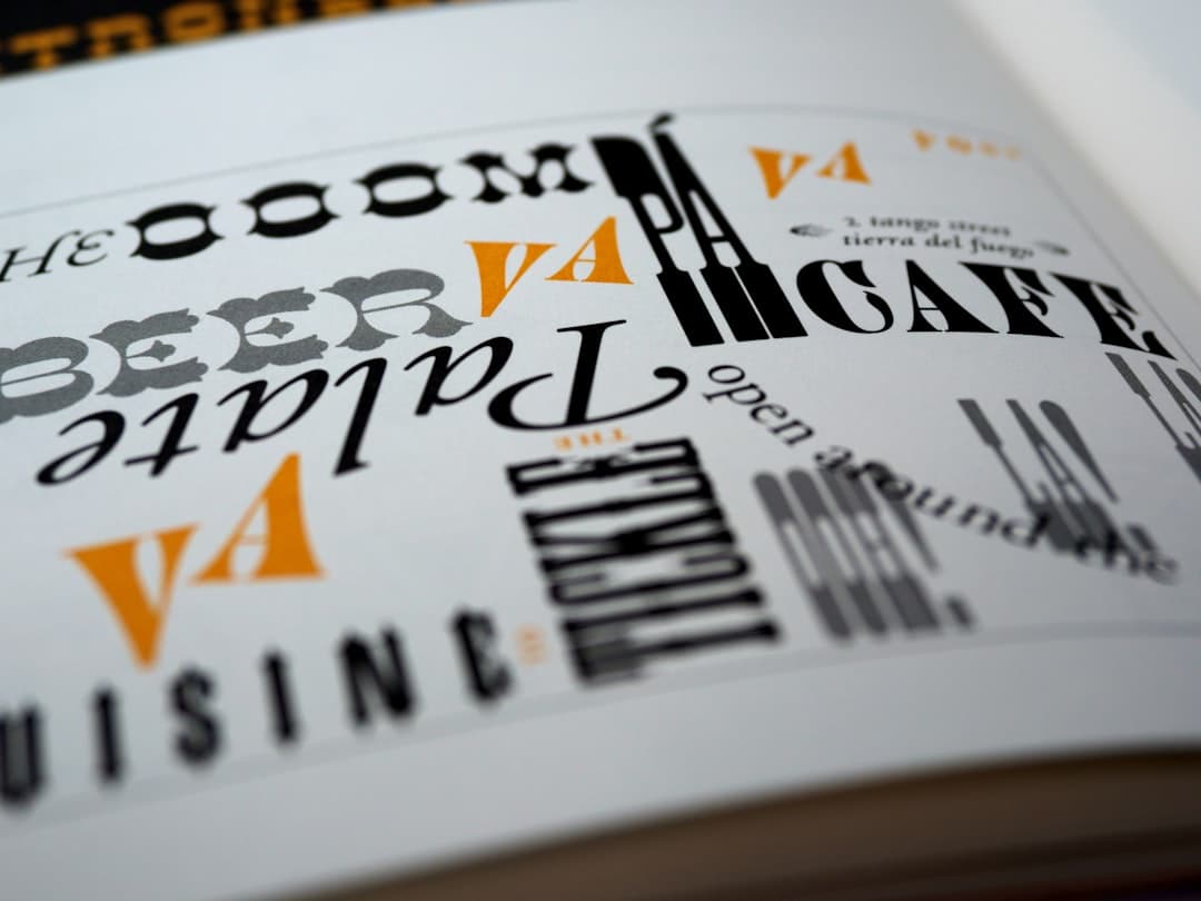
Pairing Examples That Work
Abstract principles land better with concrete examples. Here are pairings that hold up across many sites, with a note on the mood each creates. Treat them as starting points to adapt, not rules to copy blindly.
- Playfair Display and Source Sans: a high-contrast serif heading over a clean sans body. Reads premium and editorial, well suited to a portfolio, a magazine-style site, or a high-end service brand.
- Inter Bold and Inter Regular: one superfamily in two weights. Crisp, modern, and bulletproof, ideal for software products and dashboards where clarity rules.
- Montserrat and Merriweather: a geometric sans heading with a warm serif body. Friendly yet substantial, a good fit for blogs and content-heavy sites.
- Poppins and Lora: a rounded sans heading with an elegant serif body. Approachable and refined at once, strong for lifestyle and wellness brands.
- Space Grotesk and Inter: a characterful sans display over a neutral sans body. Distinctive and contemporary, popular with startups wanting a touch of edge.
Notice that each pairing carries a clear personality, and each keeps the body font firmly in readable territory. That balance, character on top and comfort below, is the through-line of every reliable combination. When you audition a pairing, set real headings and a few real paragraphs rather than placeholder text, because the fonts only reveal their true relationship with your actual words in place.
Tools for Testing Font Pairings
You do not have to guess. Several free tools let you preview pairings before committing, which saves the pain of discovering a clash only after you have built the page.
- Google Fonts: browse, filter, and preview hundreds of free web fonts, then test how two render together in its interface.
- Fontjoy: generates pairing suggestions and lets you lock one font while it proposes a complement.
- Typewolf: showcases real-world pairings from live sites, a strong source of inspiration grounded in working examples.
- Your design tool: mock the pairing inside the platform you will actually build on, since rendering differs slightly between environments.
The most reliable test is the real one. Drop the pairing into a draft of your actual page, on the actual background, viewed on both desktop and a phone. A combination that looks crisp in a tidy preview can feel cramped or low-contrast in your real layout. Building on a platform that makes swapping fonts quick means you can try several pairings against your live design in minutes rather than committing to one on faith.
Common Font Pairing Mistakes
- Too many fonts: three families maximum, ideally two. More fragments the design.
- Pairing near-identical fonts: low contrast reads as an error, not a choice.
- Sacrificing body readability: a stylish but hard-to-read body font undermines the whole page.
- Ignoring mobile: a pairing that sings on desktop can fall apart at small sizes.
- Forgetting the system: deciding fonts without considering color, spacing, and hierarchy produces a disjointed result.
If you want a website where typography, color, and layout work as one polished system, we build fast Framer sites with that craft baked in. See our pricing to find the right fit for your project.
Frequently Asked Questions
How many fonts should a website use?
Two is ideal, three is the practical maximum. One characterful font for headings and one highly readable font for body text covers most needs. More than three fragments the design and slows page load, so restraint usually produces a stronger, faster result.
What is the safest font pairing for a website?
A clean serif for headings paired with a neutral sans-serif for body text, or a single superfamily used in bold for headings and regular for body. Both create clear hierarchy with strong readability and almost never look wrong, making them reliable starting points.
Should headings and body use serif or sans-serif?
Either order works as long as you create contrast and keep body text readable. Serif headings with a sans body feel editorial and authoritative. Sans headings with a serif body feel modern and warm. Choose based on your brand mood, then test on mobile.
Do custom fonts slow down a website?
They can if you load too many families and weights or use heavy file formats. Limit yourself to two families and a few weights, use the WOFF2 format, and configure font display so text appears immediately. A fast platform that serves fonts from a CDN keeps the speed penalty minimal.