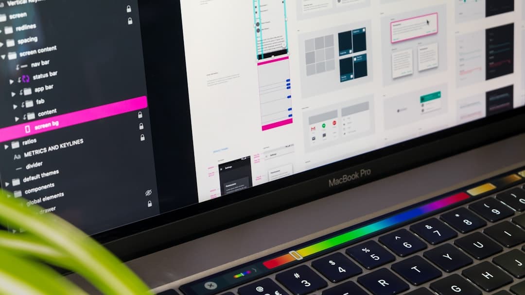
A component library is a curated collection of reusable UI elements such as buttons, forms, cards, modals, and navigation patterns that designers and developers share across projects. Component libraries enforce visual consistency, accelerate production, reduce bugs, and give teams a single source of truth for how interfaces should look and behave. They live in design tools like Figma and in code as React, Vue, or Svelte packages, often mirrored so design intent matches what ships.
What a Component Library Actually Is
A component library is more than a folder of buttons. It is a versioned, documented, governed system of UI primitives and composite patterns that teams use to assemble screens. Each component has defined states, accessible behavior, props or variants, and visual rules tied to design tokens such as color, spacing, and typography.
The library sits inside a broader design system, which also includes principles, tokens, content guidelines, and patterns. The component library is the executable layer where those principles become real interfaces.
Design Libraries vs Code Libraries
A design library lives in tools like Figma or Sketch and contains master components designers drop into mockups. A code library lives in a repository and exposes the same components as importable code modules. Mature teams keep both in sync so a designer changing a button in Figma triggers an update to the code component, and vice versa.
When the two drift, designers ship pixel-perfect mockups that engineers cannot build without rework. The whole point of a component library is to close that gap.
Why Component Libraries Matter
Without a component library, every new page is a fresh decision. Should this button be 40 pixels tall or 44? Is the primary color #2563EB or #2962FF? Does the modal trap focus correctly? Multiply those decisions by every screen and every contributor, and inconsistency becomes inevitable.
- Consistency — every instance of a card or input looks and behaves the same, building trust through familiarity.
- Speed — assembling a new page from existing components takes hours, not weeks.
- Quality — components are tested once for accessibility, responsiveness, and edge cases, then reused everywhere.
- Onboarding — new designers and engineers ship within days because patterns are documented.
- Maintenance — a single update propagates everywhere instead of touching dozens of files.
Popular Component Libraries in 2026
You can build a library from scratch or adopt an existing open source or commercial one. The right choice depends on team size, brand requirements, and how much customization you need.
Open Source Code Libraries
- shadcn/ui — copy-paste React components built on Radix UI primitives and Tailwind CSS, fully owned by your codebase.
- Radix UI — unstyled, accessible primitives for menus, dialogs, popovers, and more in React.
- Material UI — Google’s Material Design implemented as React components.
- Chakra UI — accessible, themeable React components with strong defaults.
- Headless UI — unstyled components from the Tailwind CSS team for React and Vue.
- Ant Design — comprehensive enterprise component set used widely in data-heavy apps.
Design Libraries
- Figma Community kits — Material 3, Apple Human Interface, and thousands of free starter kits.
- Untitled UI — premium Figma library with 10,000+ components and variants.
- Figma Tokens — for syncing design decisions to code-friendly token formats.
Framer Component Library
Framer ships an extensive built-in library of layouts, navigation, hero sections, pricing tables, and animated components. Designers can override styles, swap variants, and connect components to a CMS. For teams that want a code-free path to a maintained library, Framer collapses the design-to-code gap entirely.
Anatomy of a Component
Every well-built component has the same set of considerations, whether it lives in Figma or React. Skipping any of these is how libraries fall apart.
Variants and States
A button is not one thing. It has primary, secondary, and tertiary variants. It has default, hover, focus, active, and disabled states. It has small, medium, and large sizes. A complete component documents every combination and provides them as switchable properties.
Accessibility
Components must be operable with a keyboard, announce themselves to screen readers, and meet contrast requirements. Accessible components handle focus rings, ARIA roles, and reduced-motion preferences out of the box. See our website accessibility guide for the full standard.
Tokens, Not Hardcoded Values
Every color, spacing value, and font size should reference a design token rather than a raw hex code or pixel value. This means changing your brand color updates every component automatically, no search-and-replace required.
Responsiveness
Components must work from 320 pixel screens up to ultrawide monitors. Mobile-first design assumptions and container queries make this manageable. Our responsive design guide covers the patterns that matter.
How to Build Your Own Component Library
Building from scratch is the right choice when your brand requires distinctive styling, when you need full ownership of the code, or when off-the-shelf libraries bring more weight than value. Here is the practical sequence.
Step 1: Audit Existing Interfaces
Screenshot every page of your current product or site. Cluster similar UI elements. You will discover thirty button styles where there should be three, twenty input variants where five would suffice. This audit becomes your component inventory.
Step 2: Define Design Tokens
Before building components, lock in tokens for color, typography, spacing, radii, shadows, and motion. Tokens become the vocabulary every component uses. Store them in a format like JSON or YAML so they can be consumed by Figma, code, and documentation tools.
Step 3: Build Atomic Primitives First
Following atomic design methodology, start with the smallest pieces. Build buttons, inputs, labels, icons, and typography components. Once those are stable, compose them into molecules like form fields and search bars, then organisms like navigation bars and footers.
Step 4: Document Every Component
Use a tool like Storybook, Ladle, or Histoire to publish a live, interactive catalog. Each component page should show props, variants, accessibility notes, do-and-don’t examples, and code snippets that can be copied.
Step 5: Version and Distribute
Publish your library as a versioned package, ideally with semantic versioning so consumers know what is safe to upgrade. Use a private npm registry, GitHub Packages, or a monorepo workspace depending on your setup.
Step 6: Establish Contribution Rules
Decide who can add components, who reviews changes, and how breaking changes are handled. Without governance, a library degrades within a quarter as people add one-off variants to ship features faster.
Governance: Keeping the Library Healthy
The single biggest reason component libraries fail is lack of governance. Without a clear owner and rules, every team adds custom variants and the library becomes a graveyard of duplicates.
- Library owner — assign a designer and an engineer who are accountable for the library’s quality.
- Contribution path — document how new components or changes get proposed, reviewed, and merged.
- Deprecation policy — when a component is replaced, mark the old one deprecated and give consumers a migration window.
- Quarterly audit — review usage metrics, kill dead components, consolidate near-duplicates.
- Public roadmap — let teams see what is coming so they don’t build their own version of a planned component.
Common Mistakes That Kill Component Libraries
Most libraries do not fail because of bad code. They fail because of organizational drift and missing rules. Watch for these patterns.
Too Many Variants Too Early
Shipping a button with fifteen variants on day one guarantees teams will use them wrong. Start with three and expand only when a real use case appears.
No Single Source of Truth
If the Figma library and the code library disagree about button padding, designers and engineers will fight forever. Pick one as canonical and sync the other to it.
Ignoring Accessibility From Day One
Retrofitting accessibility into a library is brutal. Build it in from the first component so every team that adopts the library gets compliance for free.
Treating Documentation as Optional
Undocumented components do not get used. People reinvent them instead. Documentation is the product, not an afterthought.
Skipping the Naming Convention
If half your components use PascalCase and half use kebab-case, if some props are called variant and others type, adoption suffers. Lock in conventions before component number three.
Component Libraries and Visual Consistency
A well-built library transforms how a brand feels across every touchpoint. Every page reinforces the same visual hierarchy, the same color logic, the same interaction patterns. Users build mental models faster, and trust grows.
Inconsistent interfaces, by contrast, force users to relearn the system on every page. Even when each individual decision is reasonable, the cumulative effect is exhausting and erodes confidence in the product.
FAQ
What is the difference between a component library and a design system?
A design system is the broader framework — principles, tokens, content rules, accessibility standards, and patterns. A component library is the executable subset: the actual reusable UI building blocks. Every design system contains a component library, but a component library alone is not a design system.
Should I build a component library or use an existing one?
Use an existing one when your brand can live with its visual defaults and you want to ship faster. Build your own when your brand requires distinctive styling, when you need long-term ownership of the code, or when you are at sufficient scale that the maintenance cost is justified. Many teams use a hybrid — adopt Radix or Headless UI for primitives, then style them to match the brand.
How big should a component library be?
Smaller than you think. A focused library with 30 to 60 well-built components beats a sprawling one with 200 inconsistent ones. Add components only when they solve a real, recurring problem across multiple screens or teams.
Need a website built on a maintainable component library from day one? See our pricing or get in touch to plan your build.