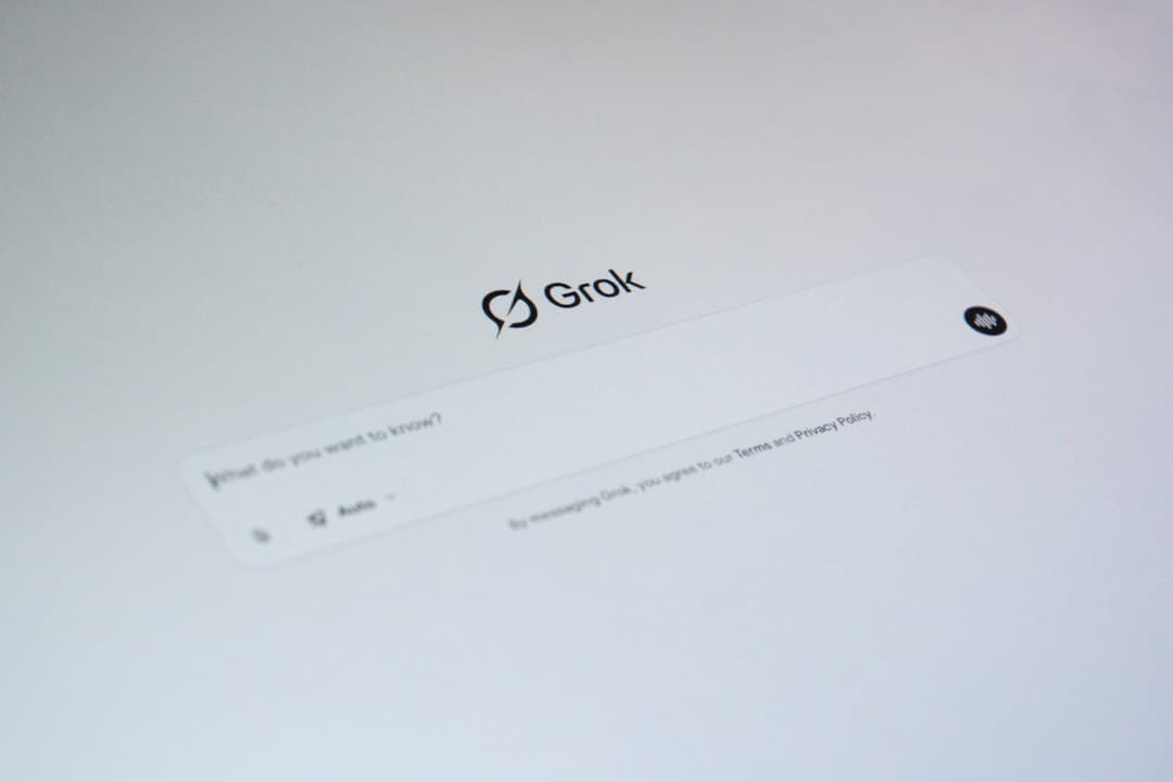
The five biggest UI design trends in 2026 are AI-native interfaces that put generation and suggestion at the core of the experience, fluid typography powered by variable fonts, motion treated as a first-class design material, a refined glassmorphism revival, and brutalist editorial hybrids that mix raw structure with magazine-style polish.
How to Read Design Trend Posts
Most trend roundups treat every pattern as equally important, which is how teams end up shipping interfaces that look like a Pinterest board exploded. A better way to read trend posts is to sort each pattern into three buckets: adopt now, ignore entirely, or watch and wait.
Adopt means the pattern solves a real problem in your product and fits your audience. AI-native interfaces are worth adopting if your users do repetitive work a model can shortcut. Variable fonts are worth adopting because they ship better typography with smaller payloads.
Ignore means the pattern is decorative, expensive, or about to age out. Heavy 3D hero scenes that take three seconds to render fall here. So do gimmicky cursor effects and any trend that requires users to learn a novel interaction to do something basic.
Watch means the pattern is interesting but not proven for your context. Spline scenes embedded inside dashboards and adaptive UIs that rearrange based on behavior sit here for most teams. Bookmark them, test on side projects, revisit in six months. For a complementary view, see our 2026 website design trends guide.
Trend 1: AI-Native Interfaces
The biggest shift in 2026 is that AI stopped being a bolt-on feature and became a primary interface pattern. Three flavors dominate. Chat-first interfaces (Linear Asks, Notion AI, Raycast) where a text input is the main entry point. Inline AI (Cursor, Figma Make, Google Docs) where suggestions appear next to your work as you type. Suggestion UIs (Spotify DJ, Arc Browser, Superhuman) where the product proactively recommends actions you might want next.
The design challenge is restraint. Early AI features felt like talking to a chatbot trapped behind a tiny modal. Mature AI interfaces in 2026 disappear into the canvas, surface only when relevant, and always offer a clear escape hatch back to manual control. The pattern to copy is from Linear and Raycast: a single keyboard shortcut opens an ambient command bar that accepts natural language, structured commands, or both.
If you adopt this trend, start with one high-friction task your users repeat often. Build the AI affordance directly into that flow rather than launching a separate AI section.
Trend 2: Fluid Typography and Variable Fonts
Fluid typography uses CSS clamp() to scale type smoothly between viewport sizes instead of jumping at fixed breakpoints. Variable fonts ship multiple weights and widths in a single file, so you can interpolate between Regular and Bold or compress letterforms for mobile without loading extra files. In 2026, both are table stakes for serious sites.
A variable font with a fluid type scale gives you a system where every heading feels deliberate at every screen size, with no awkward gaps where a hero looks too big at 1440px or too small at 375px. Inter, Geist, Söhne, and the new wave of editorial display faces like Migra and General Sans all ship variable versions. The adoption pattern is to define a small set of fluid type tokens (display, h1, h2, body, caption) using clamp(min, preferred, max), then use them everywhere.
Trend 3: Motion as a First-Class Citizen
Motion moved from delight layer to structural element in 2026. Scroll-driven animations powered by the new CSS scroll-timeline property let you choreograph entire pages without JavaScript libraries. View Transitions API smooths navigation between pages or states. Framer Motion, GSAP, and Motion One handle the heavier lifts when CSS alone is not enough.
The shift is philosophical. Motion is part of the information architecture. A well-designed scroll experience uses motion to reveal hierarchy, signal cause and effect, and pace the reader through the content. Apple, Vercel, Stripe, and Linear all treat motion with the same rigor they apply to typography and color. For practical guidance on building these systems inside Framer, see our scroll animations guide. The general rule: every animation should communicate something. If it does not, cut it.
Trend 4: Glassmorphism Revival
Glassmorphism returned in 2026 but it learned its lesson. The 2021 wave used heavy blurs, gradient borders, and so much translucency that text became unreadable. The 2026 revival is refined and restrained. Apple Vision Pro and the macOS Sequoia visual language brought back frosted surfaces with proper contrast guards, subtle borders, and meaningful depth.
The new rules are clear. Use glass on chrome (navigation, sidebars, floating panels), not on content. Maintain minimum 4.5:1 contrast between text and the blurred background even when the background changes. Apply backdrop-filter sparingly and always pair it with a fallback solid color for browsers that cannot render the blur.
Trend 5: Brutalist and Editorial Hybrid
Pure brutalism (raw HTML, monospace fonts, no styling) was a 2022 reaction against bland SaaS minimalism. In 2026, the more interesting move is the hybrid: brutalist structural choices (asymmetric grids, oversized type, hard edges, visible system constraints) combined with editorial polish (considered typography, generous white space, thoughtful imagery). Think of agency sites like Locomotive, magazine layouts like It is Nice That, and product brands like Arc, Linear, and Vercel.
The hybrid borrows the personality of brutalism without the hostility. You get an interface that feels confident and human instead of generic. The headings are large enough to read as a poster. The grids break in interesting places. The brand has an opinion. But the underlying experience still respects the conventions that make a site usable.
Trend 6: 3D and Spline Integrations
Spline made 3D approachable for designers who do not write WebGL. In 2026, the best 3D work on the web is small, purposeful, and tightly integrated with the surrounding content. A rotating product hero on a hardware site. A spatial diagram that responds to scroll. A hover state that reveals depth without launching a render-heavy scene.
The bar is performance. A 3D hero that ships 8MB of textures and tanks Largest Contentful Paint will lose you traffic faster than it impresses anyone. Watch this trend rather than adopt it broadly. If you have a product where 3D genuinely tells the story better than 2D, invest. Otherwise, a great static hero with thoughtful typography will outperform a mediocre 3D scene every time.
Trend 7: Personalized and Adaptive UIs
Adaptive UIs change based on context: who the user is, what they have done before, what device they are on, what time of day it is. In 2026, the pattern is moving from heavy personalization (recommendation feeds) to lightweight adaptation (a dashboard that promotes the workflows you actually use, a navigation that hides links you never click, an onboarding that skips steps you already completed elsewhere).
The design challenge is predictability. Users build mental models based on where things live. If the interface keeps moving, those models break and the product feels unreliable. Good adaptive design changes slowly, signals changes when they happen, and always provides a way to see the full picture. Adopt this only if you have enough usage data to power it well.
Trend 8: Bento Box Layouts
Bento layouts (grids of differently sized cards, each showing a distinct feature or piece of content) had a breakout moment with Apple’s product pages and quickly spread across SaaS marketing sites. In 2026, the pattern is still strong but the standard has risen. Generic bento grids with stock illustrations look dated. The bento layouts that still work are dense with real product screenshots, animated previews, and content that earns the cell it occupies. The pattern fits product landing pages and feature pages better than long-form content.
Trend 9: Accessible Dark Mode
Dark mode is no longer a checkbox. The bar in 2026 is a dark mode that is genuinely usable: proper contrast ratios on every text and icon pair, careful color shifts (true black is harsh, off-black is comfortable), thoughtful elevation cues since shadows do less work in dark themes, and brand colors that adapt so accents still feel like accents rather than glowing distractions.
The mistake to avoid is inverting your light theme. Good dark themes are designed independently, with their own palette, contrast logic, and elevation system. The Stripe, Linear, and Vercel dark themes are reference quality. Each one feels native to dark mode rather than translated into it.
Trend 10: Microinteractions Everywhere
Microinteractions (the small, purposeful animations that confirm an action, signal a state change, or guide attention) became table stakes in 2026. A button that compresses on press. A toggle that springs. A form field that shifts its label up when focused. A success state that briefly celebrates before fading. The cumulative effect is an interface that feels considered and responsive.
The principle is feedback. Every action a user takes should produce visible, immediate confirmation. The animation should be fast (under 200ms for most), purposeful, and consistent. For a deeper treatment, see our guide on microinteractions in web design.
Trends to Skip
Not every pattern in circulation deserves your attention. Several are overhyped or actively user-hostile in 2026.
Custom cursors that hide the system pointer and replace it with a colored dot. They break accessibility and serve no purpose beyond signaling that a designer touched the page. Auto-playing video backgrounds in hero sections burn battery, hurt performance, and rarely communicate anything a still image cannot. Excessive scroll hijacking where every scroll event becomes a full-page transition loses customers. AI-generated stock illustrations with the telltale six-finger hands and uncanny lighting now signal laziness rather than novelty. Neumorphism was a fun thought experiment in 2020 and a usability disaster in production. Let it rest.
Adopting Trends Without Looking Dated in 12 Months
Every trend on this list will age. The question is whether your site ages with it or stays fresh because the foundations were strong. Invest in the layer that does not change. Typography hierarchy, content clarity, performance, accessibility, and brand voice will matter in 2030 just as much as they do now. A site with a clear point of view, fast load times, and considered typography will outlast three trend cycles even if it never adopts a single one.
For trend layers (motion, glass, bento, 3D), use them as accents on top of a strong foundation rather than as the foundation itself. A scroll animation that reveals a meaningful diagram is timeless. A scroll animation that exists to fill space dates immediately. Ship with restraint. Every trend you adopt is a maintenance burden. Pick two or three trends that genuinely serve your product and ignore the rest. If you want help applying these patterns to a real site, get in touch.
Frequently Asked Questions
Which UI design trends are worth adopting in 2026?
The trends with the highest practical payoff are AI-native interfaces (if your users do repetitive work a model can shortcut), variable fonts with fluid typography, motion designed as a first-class element rather than a decoration, and accessible dark mode that respects contrast. These four solve real problems and age well. Most other trends are accents rather than foundations.
Is glassmorphism still relevant in 2026?
Yes, but only in the refined form. The 2026 glassmorphism revival uses frosted surfaces on chrome (navigation, sidebars, floating panels) with strict contrast guards and meaningful depth. Apply blur sparingly, always pair it with a fallback solid color, and never put unreadable text over a busy blurred background.
How do you adopt UI trends without your site looking dated in a year?
Build a strong foundation first: typography hierarchy, performance, accessibility, and a clear brand voice. Those layers do not date. Use trends as accents on top of that foundation. Pick two or three trends that genuinely serve your product and ignore the rest. A focused site that adopts one trend well will outlast a maximalist site that adopts ten poorly.
Are bento box layouts still in style?
Yes, bento layouts remain strong in 2026 for product landing pages, feature pages, and case study indexes. Generic bento grids with stock illustrations look dated. The ones that still work are dense with real product screenshots, animated previews, and content that earns each cell. If your product is mostly text or workflows, a prose layout with a few diagrams will outperform a bento grid.