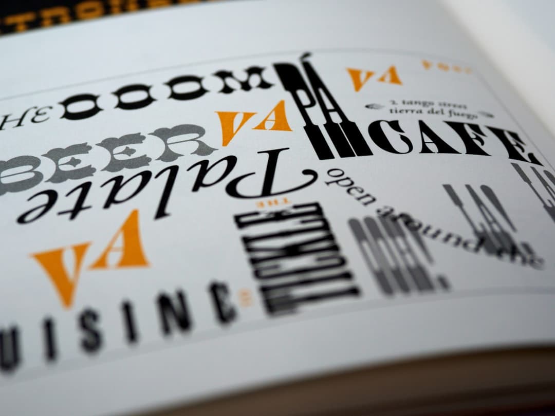
A website style guide is a living document that defines the visual and verbal rules of a site — colors, type, components, spacing, voice, content patterns — so that every page, every campaign, and every new team member produces work that feels like it belongs to the same site. It is the difference between a website that ages well and one that becomes a patchwork in two years.
What a Style Guide Actually Is
The phrase “style guide” is used loosely. In practice it covers three overlapping artifacts. A visual style guide documents colors, type, spacing, and imagery rules. A content style guide documents voice, grammar, and editorial conventions. A component library (sometimes called a UI kit) documents the reusable interface pieces — buttons, cards, navigation patterns. Together they form what most teams now call a design system. For the system-level view, see our design system guide.
A small site needs a small style guide. A large site needs a full system. The goal is the same: future work matches past work without anyone having to remember the rules.
Why a Style Guide Pays for Itself
Without a style guide, every new page is a fresh negotiation. Should this button be primary or secondary? How much padding goes around this section? Is the heading 32px or 36px? Decisions get made differently by different people on different days. Six months later the site has eleven shades of gray and four button styles, and a designer has to spend a week consolidating before the next campaign.
A style guide removes those decisions from the daily work. The rule already exists; the work is to follow it.
What to Include in a Website Style Guide
The Color System
Document every color used on the site, named semantically. Not “blue” but “primary,” not “gray-2” but “surface-secondary.” Each color is shown with its hex value, its accessible text pairings, and its allowed uses. Include a contrast table so designers and developers know which color combinations pass WCAG. The foundation theory is in our color theory guide.
The Type System
List every typeface (display, body, UI, monospace), every weight loaded, every size in the scale (with its line height and tracking), and a usage rule for each role. The classic structure: H1 / H2 / H3 / H4, body, small, caption. Modern systems add eyebrow, lead, and various display sizes. For depth, our typography guide covers the choices.
The Spacing System
Define the spacing scale (usually a multiple of 4 or 8 pixels: 4, 8, 12, 16, 24, 32, 48, 64, 96). Every margin and padding in the site should map to one of these values. Random values like 17px or 23px are an immediate red flag that the system is being ignored.
The Grid System
Document the columns, gutters, and breakpoints. Show how the grid changes between mobile, tablet, and desktop. Reference our grid systems guide for the underlying patterns.
Iconography Rules
Specify the icon set, the standard stroke weight, the standard corner radius, and the sizes used. Include rules for custom icons: how to draw one that fits the family, what grid to use, what stroke weight to match.
Imagery Rules
Photography and illustration guidelines. Define the treatment (color grading, cropping, overlay rules), the subjects allowed (on-brand vs. off-brand), and the aspect ratios used. For sites with original photography, document the lens and lighting style.
Components
The reusable interface elements. Each component gets a name, an anatomy diagram, every state (default, hover, focus, active, disabled, loading), and rules for when to use it versus a similar component. Buttons, form fields, cards, navigation patterns, modals, toasts. The component list grows as the site grows.
Voice and Tone
Document how the brand sounds. Sentence length range. Vocabulary level. Use of contractions, second person, humor. Examples of on-brand copy and off-brand copy. Tone modulation rules (more serious during checkout, more playful on a 404).
Content Patterns
How specific content types are written: headlines, microcopy, error messages, form labels, button text, empty states, confirmation dialogs. These are the most-edited parts of a site and benefit the most from clear rules.
Accessibility Standards
The site’s WCAG conformance level, color contrast minimums, focus indicator rules, motion preference handling. For the broader picture, see our accessibility guide.
Code Conventions (Optional but Useful)
For sites where the same team designs and builds, include the CSS variable names, the component class structure, and the spacing token IDs. This eliminates the gap between design and implementation.
Where the Style Guide Lives
Three viable homes, each with trade-offs.
A Page on Your Site
A public /style-guide or /design-system page is the most accessible option. New team members can read it. Vendors can reference it. Visitors curious about the work get a peek behind the curtain. Many design-forward brands publish theirs (Atlassian, Material, Polaris, Carbon).
A Figma File
For visual rules, a Figma library is hard to beat. Components are clickable, variables are inspectable, the same file becomes the source of truth for new design work. The downside is that non-designers cannot easily browse it.
A Notion or Confluence Doc
Best for content rules — voice, tone, vocabulary. The structured page format makes it easy to read and update. Combine with a Figma library for the visual side.
A Storybook
For component-heavy sites, a Storybook documents every component with live previews, all states, and code snippets. It is the deepest integration between design documentation and development.
Most mature teams use a combination — Figma for design, Storybook for components, Notion or a dedicated page for voice and content. The key is that one source is canonical for each artifact, not that all artifacts live in one place.
How to Build a Style Guide From Scratch
Step 1: Audit What Exists
Walk through the existing site (or competitor sites, if you are starting fresh) and inventory every color used, every type style, every button style, every spacing value. The audit reveals how much inconsistency has already accumulated.
Step 2: Consolidate
Reduce the inventory to a minimum viable set. Eleven shades of gray become five. Four button styles become two. The pruning is harder than it sounds because each variant has a use case someone defended.
Step 3: Name the Tokens
Every consolidated value gets a semantic name. “Brand blue” becomes “primary-500”. “16px” becomes “spacing-4”. Naming is the most underrated step because it makes the system shareable across design, code, and documentation.
Step 4: Document the Rules
Each component, color, and pattern gets a short documentation: what it is, when to use it, when not to use it, what comes with it. Aim for 50-150 words per item. Long enough to be useful, short enough to be read.
Step 5: Build Reference Components
Create the canonical version of every component in Figma and (if applicable) in code. These become the source-of-truth versions. New work copies and adapts them rather than starting from scratch.
Step 6: Roll It Out
Replace the existing inconsistent versions across the site. This is the slow part — every page touched, every component swapped, every old hex value retired. Doing this in waves is better than trying to ship it all at once.
Step 7: Maintain
The style guide is not a one-time deliverable. As the site evolves, the guide evolves. Set a quarterly review to add new components and prune obsolete ones.
Style Guide Examples Worth Studying
- Material Design (Google) — the most comprehensive design system documentation in existence. Covers principles, components, motion, and accessibility.
- Polaris (Shopify) — strong content guidelines alongside visual ones. The voice and tone section is a model.
- Carbon (IBM) — clear separation between design tokens, components, and patterns.
- Atlassian Design System — practical examples and code snippets.
- GOV.UK Design System — exceptional accessibility focus and component documentation.
- Lightning (Salesforce) — heavyweight system worth studying for the scale of components covered.
How to Keep a Style Guide Current
One Owner
Someone owns the style guide. Without an owner, it goes stale within a quarter. The owner does not have to do all the work; they just have to be responsible for the guide being current.
A Change Process
New components and tokens go through a defined intake. A proposal, a review, an approval, an update. Without a process, every team member adds their own variants and the system fragments.
A Deprecation Process
Components and patterns that no longer fit get marked deprecated, with a migration note, then removed. Skipping deprecation means the system grows monotonically — old patterns stick around forever.
Quarterly Review
A scheduled time to audit what has been added, what should be removed, and what new patterns have emerged organically that need to be documented. The quarterly cadence is short enough to catch drift and long enough to avoid bureaucratic overhead.
Common Style Guide Mistakes
- Writing it once and never updating it.
- Documenting visual rules and ignoring voice and content.
- Including too many variants — five button sizes, three primary colors — that defeat the consolidation goal.
- No examples of what NOT to do. The do-not gallery is often more useful than the do gallery.
- Living in a place no one looks (a PDF on a shared drive, an outdated wiki).
- Disconnected from the code. Designers reference design tokens that developers do not know exist.
- No version history. When a token changes, no one can find out why.
Style Guide for a Small Site
A five-page marketing site does not need a 200-page system. The minimum viable style guide for a small site is one page covering: color palette (3-5 colors with hex codes), type scale (5-6 sizes with weights), spacing scale (5-6 values), button styles (1-2 variants with all states), and voice in two paragraphs. This fits on a single side of A4 and prevents 80% of the inconsistency problems that plague larger guides.
Style Guide for an Agency
If you build sites for clients, your style guide is also a deliverable. The version handed over should include everything a future designer or developer needs to extend the site without breaking it. A common mistake is delivering the design files but not the rules — leaving the client locked in to the original team because no one else can match the work.
Frequently Asked Questions
Is a style guide the same as a design system?
A style guide is a subset of a design system. The style guide documents the rules; the design system implements them as reusable design tokens and components. A small site might have a style guide without a full design system. A larger site has both.
How long should a website style guide be?
It depends on the site. A small marketing site can be served by a one-page guide. A SaaS product with dozens of screens needs a 30-100 page document or its equivalent in Figma and Storybook. The length follows the surface area, not a fixed page count.
How often should I update my style guide?
Continuously, with a formal review quarterly. New components get added when they are designed. Deprecated components get retired. A quarterly cadence catches drift. Going six months without an update almost always means the guide is now out of sync with the live site.
Should I publish my style guide publicly?
If the brand is design-forward, yes — publishing signals craft and helps with recruiting. If the brand is in a competitive product space where the design is a differentiator, consider keeping it internal. There is no universal answer; the trade-off is brand transparency versus competitive defensibility.
If you want a Framer or WordPress site delivered with a complete style guide and design system from day one, see our pricing or get in touch.