Onboarding UI design is the practice of structuring a new user’s first experience so they reach value quickly and confidently. Good onboarding reduces drop-off, shortens time to first value, and turns curious signups into active users by guiding them through setup, teaching core actions, and removing friction at every step.
Key takeaways
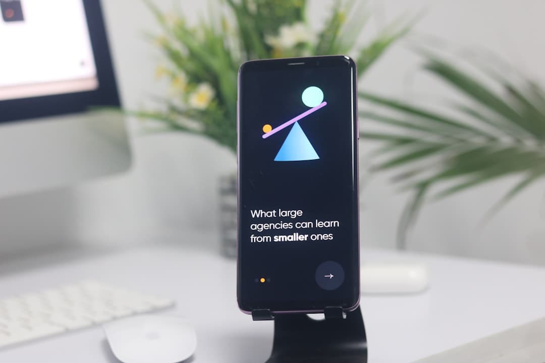
- Onboarding’s job is to get users to their first meaningful win, not to tour every feature.
- Progressive disclosure beats long upfront tutorials, because users learn by doing.
- The strongest onboarding patterns include checklists, empty states, contextual tooltips, and sensible defaults.
- Reducing required fields and decisions at the start is one of the highest-leverage moves you can make.
- Personalization based on a short intent question makes the rest of onboarding feel relevant.
- Framer makes it practical to design, prototype, and ship onboarding flows that feel polished from day one.
What onboarding UI is really for
Most teams treat onboarding as a feature tour. They build a five-step modal sequence that points at buttons and explains what each one does, then congratulate themselves for educating the user. This is the wrong mental model. Users do not want a tour. They want the outcome they signed up for, and they want it fast.
The real purpose of onboarding is to deliver the first meaningful win as quickly as possible. For a project management tool, that might be creating a first task and assigning it. For an analytics product, it might be seeing a real chart populated with the user’s own data. Everything in your onboarding flow should bend toward that first win, and anything that delays it should be questioned.
This reframing changes your design decisions immediately. Instead of asking how to explain a feature, you ask how to get the user to use it. Instead of front-loading information, you reveal it exactly when it becomes relevant. The interface becomes a guide, not a lecture.
Understanding the onboarding audience
The person in your onboarding flow is in a fragile state. They were curious enough to sign up but have not yet decided your product is worth their time. They have low patience, low context, and a dozen competing tabs open. Any friction is an exit ramp.
They also arrive with different goals. A solo founder evaluating your tool wants something different from an employee who was told to use it. A power user migrating from a competitor wants to skip the basics. Good onboarding accounts for this variety, often by asking one short question up front and adapting the path accordingly. The principles behind reading and serving an audience in those first moments mirror what we cover in our breakdown of hero section best practices, where the same fragile, low-patience visitor decides in seconds whether to continue.
The takeaway is that onboarding is not one flow for one user. It is a guided path that respects where different people are starting from and gets each of them to value with as little resistance as possible.
The core sections of an onboarding flow
A well-structured onboarding experience tends to move through a few clear stages, even when they are spread across screens and sessions.
The welcome and intent moment
The first screen sets expectations and ideally captures one piece of intent. A single question such as what the user wants to accomplish lets you personalize everything after it. Keep it to one decision. A long survey at the door is a guaranteed drop-off point.
The setup phase
This is where the user configures the minimum needed to get value. The guiding rule is to defer everything that is not strictly required. Connect later. Invite teammates later. Customize later. Every field you remove from the critical path increases completion.
The first-win moment
This is the heart of onboarding. The user performs the core action and sees a real result. Design this moment to feel like an achievement, with a clear, satisfying confirmation. This is the moment that converts a signup into a believer.
The expansion phase
Only after the first win do you introduce secondary features, and you do it contextually rather than all at once. A checklist or a series of well-timed prompts works far better than a feature dump.
Proven onboarding patterns
Several patterns show up repeatedly in onboarding that works, and they are worth keeping in your toolkit.
Progressive disclosure is the foundational principle. Reveal complexity gradually, exactly when the user needs it, rather than all at once. This respects working memory and lets people learn by doing. The way the eye groups and prioritizes information here is governed by the same perceptual rules we cover in our guide to the Gestalt principles in web design, which explain why a well-grouped, gradually revealed interface feels effortless.
Onboarding checklists give users a visible sense of progress and a clear set of next actions. They work because of the well-documented pull of completing a partially finished list. A checklist that shows three of five steps done is a powerful nudge to finish.
Thoughtful empty states turn blank screens into guidance. Instead of showing an empty dashboard, show a friendly prompt that explains what will appear here and offers the single action that fills it. Empty states are prime real estate for guiding the first action.
Contextual tooltips and inline hints teach in the moment. Rather than a modal that explains a feature the user cannot yet see, a small hint appears next to the relevant control exactly when the user reaches it. This is teaching by relevance, not by interruption. These patterns also reflect the broader direction we track in our overview of UI design trends for 2026, where contextual, low-friction guidance continues to replace heavy upfront tutorials.
Smart defaults quietly remove decisions. Pre-fill sensible values, pre-select the most common option, and let users change things later. Every decision you make for the user is one they do not have to make themselves.
Onboarding for trust and conversion
Onboarding is a conversion surface, not just an education surface. The completion rate of your onboarding flow is one of the strongest leading indicators of retention. A user who reaches their first win is dramatically more likely to come back, and the design of those first screens decides whether they get there.
Trust is built in these moments too. Asking for a credit card before any value is delivered erodes it. Demanding a long form before the user has seen anything erodes it. By contrast, a flow that respects the user’s time, delivers a quick win, and only asks for more once value is proven builds the confidence that leads to activation and, eventually, payment.
The visual quality of onboarding matters more than people expect. A polished, consistent flow signals a polished, reliable product. Rough, inconsistent onboarding signals the opposite, and it does so at the exact moment the user is deciding whether to trust you.
A practical example
Consider a team scheduling tool. The naive onboarding asks for company size, role, team names, and a calendar connection before showing anything. Completion is poor because the user has to give a lot before getting anything.
The improved flow asks one question on the first screen, namely whether the user is setting up for themselves or a team. It then drops them into a pre-populated example schedule so they immediately see what the product does. A short checklist invites them to add their first real event, invite one person, and connect a calendar, in that order. The credit card request appears only after they have created and shared a working schedule. Each secondary feature is introduced with a contextual hint when the user first encounters it, not before. The result is a flow where value comes first and commitment comes after, which is exactly the order that drives activation.
Common onboarding mistakes
The most common mistake is the feature tour that explains instead of activates. Users skip these, and even when they read them, they forget the content because they had no context to anchor it to.
The second is asking for too much too early. Every required field and every upfront decision is a place to abandon the flow. Defer everything that is not essential to the first win.
The third is hiding the value behind setup. If the user has to configure for ten minutes before seeing anything useful, most will leave. Find a way to show value first, even with sample data, and let configuration follow.
The fourth is treating every user the same. A power user forced through a beginner tutorial is annoyed, and a confused beginner dropped into an empty advanced screen is lost. A single intent question lets you serve both.
The fifth is neglecting the empty state. A blank dashboard with no guidance is a dead end. Empty states should always answer what goes here and how do I fill it.
Measuring whether onboarding works
Onboarding is one of the few experiences you can and should measure directly. The clearest signal is the completion rate of the flow, meaning the share of users who reach the first win. If most signups never get there, the flow is leaking, and the place they drop is where you focus. Watching where people abandon, step by step, tells you exactly which screen is asking for too much or hiding the value.
Time to first value is the companion metric. A flow that everyone completes but that takes too long still loses people in practice, because patience runs out before the win arrives. Shortening that time, by cutting steps and deferring setup, usually lifts both completion and downstream retention. Treat onboarding as a living surface you iterate on with data, not a one-time build you ship and forget. The teams that win are the ones who keep removing friction long after launch, guided by where real users actually stall.
How Framer helps you build onboarding
Framer is well suited to designing and shipping onboarding because it collapses the gap between prototyping the flow and publishing it. You can design the welcome moment, the setup screens, and the first-win confirmation, prototype the transitions between them, and ship the whole experience without handing off to a separate build step. That tight loop is exactly what onboarding needs, because onboarding is iterated constantly as you learn where users drop off.
Turn signups into active users
A polished onboarding flow is the difference between a curious visitor and a committed customer. See how we design and build conversion-focused experiences in Framer.
Frequently Asked Questions
How long should an onboarding flow be?
As short as it can be while still reaching the first win. There is no fixed number of steps. The right length is whatever gets the user to a meaningful result with the least friction, and anything beyond that should be deferred or removed.
Should onboarding be skippable?
Often yes, especially for experienced users migrating from another tool. Forcing everyone through the same tutorial frustrates power users. A skip option, paired with contextual hints that appear later, respects different starting points.
What is the single highest-impact onboarding change?
Reducing what you ask for before the first win. Cutting required fields and deferring non-essential setup almost always lifts completion. Get the user to value first, then ask for the rest once value is proven.
Can I build onboarding flows in Framer?
Yes. Framer lets you design the screens, prototype the transitions, and publish the flow without a separate development step. That tight design-to-live loop makes it easy to iterate as you learn where users drop off.