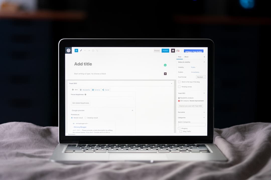
To build a Framer pricing toggle, create two price Variants for each plan, one monthly and one annual, add a toggle Component built from an interactive switch, and link its on and off states to swap the visible prices using Variants. Framer handles the state change natively, so clicking the switch instantly updates every plan’s price and billing label without any code.
What a Pricing Toggle Does
A pricing toggle is the small switch near the top of a pricing section that flips the displayed prices between monthly and annual billing. When a visitor clicks it, every plan’s price updates at once, usually revealing a discount for paying yearly. It is a standard pattern on modern SaaS and service sites because it lets you present two billing options without doubling the length of the section.
In Framer, this is a Components-and-Variants problem. You define the states a piece of UI can be in, then wire an interaction to move between them. The toggle itself is an interactive Component, and the prices it controls are Variants that swap based on the toggle’s state. Once you understand that relationship, the build is quick and fully visual.
Key Takeaways
- A pricing toggle swaps all plan prices between monthly and annual billing with one click.
- Build it with Variants for each price state and an interactive Component for the switch.
- Use Framer’s Variant linking so toggling the switch drives every price at once.
- Default to the annual view to anchor on the lower effective price, and label the savings clearly.
- Test the interaction on mobile, where toggles are easy to mis-tap if they are too small.
How the Toggle Mechanism Works in Framer
The core of a Framer pricing toggle is state. Framer lets any Component hold multiple Variants, which are saved visual states, and interactions move a Component between them. For a pricing section you are really managing two layers of state at once.
The two layers
- The switch state: the toggle Component itself has a Monthly Variant and an Annual Variant. Clicking it flips between the two and animates the knob sliding across.
- The price state: each price block also has a Monthly Variant and an Annual Variant, showing the relevant number and billing period.
The job of the build is to connect these layers so that flipping the switch also flips every price. Framer offers a few ways to do this, and the cleanest is to drive the prices from the same interaction that drives the switch, so a single tap updates the entire section in sync.
Step-by-Step Build
Step one: build the toggle switch
Create a Frame for the switch: a rounded pill background with a circular knob inside. Convert it to a Component. Add a second Variant and move the knob to the opposite side. Add an On Tap interaction that switches between the two Variants. You now have a working visual switch with a smooth sliding animation.
Step two: build the price blocks
For each plan, design the price block once. Convert it to a Component. Create a Monthly Variant showing the monthly figure and the label “per month,” then create an Annual Variant showing the annual-equivalent figure and the label “per month, billed annually.” Keep the layout identical between Variants so only the numbers and labels change, which keeps the swap clean and jump-free.
Step three: connect the switch to the prices
Wire the toggle so that tapping it changes both the switch Variant and the price Variants together. The simplest reliable method is to place all the prices inside a shared parent Component with its own Monthly and Annual Variants, then have the toggle control that parent. One tap, one state change, every price updates. If you ever extend this to a dark theme as well, the same Variant logic applies, and our walkthrough of a Framer dark mode toggle uses the identical interactive Component pattern, so the skills transfer directly.
Pricing Psychology: How to Frame the Discount
The toggle is a design element, but it is also a conversion lever. How you present the two options materially affects which one visitors choose and how they feel about the price.
Tactics that work
- Default to annual: set the annual view as the starting state so the first price a visitor sees is the lower effective monthly cost. This anchors expectations downward.
- Show the savings explicitly: add a badge next to the toggle like “Save 20%” or “2 months free” so the benefit of switching is obvious.
- Display the per-month equivalent for annual: showing 49 per month billed annually feels smaller than showing 588 per year, even though they are identical.
- Keep the discount honest: a real, meaningful annual saving converts. A token one feels like a gimmick.
Getting the underlying numbers right matters as much as the interaction. If you are still settling on your tiers and what to charge, our breakdown of how Framer pricing works and how to think about plans is a useful reference for structuring offers that the toggle then presents cleanly.
Designing the Surrounding Pricing Table
A toggle never lives alone. It sits at the top of a pricing table, and the table’s clarity decides whether the toggle even gets used. A confusing grid of features and prices buries the switch and the visitor bounces.
Table essentials
- Two to four plans is the readable range. More than four overwhelms.
- Highlight one recommended plan with a border or a “Most popular” tag to guide the choice.
- List features as a clean, scannable column so visitors can compare across plans at a glance.
- Put a clear call-to-action button on every plan, never just on one.
If you want a head start on the layout itself rather than building the grid from scratch, our guide to building a Framer pricing table covers the structure, spacing, and Component approach that pairs naturally with the toggle you are adding.
Making the Toggle Work on Mobile
Toggles are small, and small interactive elements are easy to mis-tap on a phone. Framer’s Breakpoints let you adjust the toggle and the surrounding table for touch, and you should always do so.
Mobile checklist
- Make the toggle’s tap target at least 44 pixels tall so thumbs hit it reliably.
- Stack the plan cards vertically instead of side by side, with the toggle sitting above all of them.
- Keep the “Save” badge visible on mobile so the annual benefit is not lost.
- Confirm the price swap animates smoothly on a real device, since a janky transition undermines trust at the exact moment of decision.
Because the toggle controls the whole section’s state, test it after every layout change. It is easy to break the link between the switch and the prices when you rearrange cards for a new Breakpoint, and a toggle that flips the switch but not the prices is worse than no toggle at all.
Common Toggle Mistakes
- The prices do not actually change: the most common bug, caused by wiring the switch Variant but forgetting to link the price Variants. Always test both directions.
- Layout shift on swap: if the monthly and annual Variants have different heights or alignments, the section jumps when toggled. Keep layouts identical.
- Hidden savings: a toggle with no indication that annual is cheaper gives visitors no reason to switch.
- Ambiguous labels: a price with no billing period leaves visitors unsure what they are committing to. Always label the period.
- Tiny mobile target: a toggle that is hard to tap frustrates the visitor right before they would convert.
A pricing toggle is a high-leverage piece of UI because it sits at the exact moment of purchase intent. The interaction has to be flawless, the savings have to be clear, and the layout has to stay stable. Get those three right and the toggle quietly does its job on every visit.
Extending the Toggle Beyond Monthly and Annual
Once you understand that a toggle is just a Component switching between Variants, you can extend the same pattern to other pricing dimensions. The two-state switch is the most common, but the underlying mechanism scales to richer controls when your offer needs them.
Variations worth building
- A three-way segmented control: instead of a binary switch, build a pill with three options such as Monthly, Quarterly, and Annual. Each segment is a Variant, and tapping one sets the active state and updates every price block. This suits businesses with a genuine middle billing option.
- A currency switcher: the same logic lets visitors flip prices between currencies. Each price block gets a Variant per currency, and a small selector drives them. This is useful when you sell to multiple regions and want the price to feel local.
- A seats or usage slider: for usage-based pricing, a slider Component can update a calculated price as the visitor drags it. This is more advanced and often benefits from a small code component, but the principle is the same: an interaction changes a state, and the price responds.
The discipline that makes these work is keeping every price block on an identical layout across its Variants. The moment one state is taller or wider than another, the section shifts when a visitor switches, and that visible jump erodes the polish you are trying to project. Build the layout once, duplicate it into each Variant, and change only the numbers and labels.
Measuring Whether the Toggle Is Working
A pricing toggle is not just decoration, so treat it as something to measure. Framer integrates cleanly with analytics, and a few simple events tell you whether the control is helping or confusing visitors.
What to track
- Toggle interactions: fire an event when a visitor flips the switch. A high interaction rate means people are exploring the annual option, which usually correlates with more considered purchases.
- Which state converts: tag your call-to-action clicks with the active billing state so you can see whether monthly or annual drives more signups.
- Drop-off after toggling: if many visitors flip to annual and then leave, the annual price may be landing as a shock. That is a signal to reframe the savings or adjust the number.
These signals turn the toggle from a guess into a tested element. If the data shows annual default is hurting conversions, switch the default to monthly and compare. The toggle’s job is to present a real choice cleanly, and measurement is how you confirm it is doing that rather than quietly costing you signups.
If you would rather have your pricing section, toggle and all, designed and built to convert without the trial and error, take a look at our Framer website pricing and packages and we will build it for you.
Frequently Asked Questions
Do I need code to build a pricing toggle in Framer?
No. A pricing toggle is built entirely with Framer’s Components, Variants, and interactions. You create Monthly and Annual Variants for the prices, build an interactive switch Component, and wire one to drive the other. No JavaScript is required.
Should the toggle default to monthly or annual?
Default to annual in most cases. It shows the lower effective monthly price first, which anchors the visitor on a smaller number, and it nudges toward the billing option that improves your cash flow and retention. Pair it with a clear savings badge.
Why do my prices not update when I click the toggle?
Almost always because the switch Variant is wired but the price Variants are not linked to the same interaction. Place the prices inside a shared parent Component with its own Monthly and Annual Variants and have the toggle control that parent so one tap updates everything.
How do I show the annual discount clearly?
Add a badge next to the toggle such as “Save 20%” or “2 months free,” and display the annual price as a per-month equivalent. Showing 49 per month billed annually reads as smaller and more appealing than showing the full yearly total.