A Framer dark mode toggle lets visitors switch your site between light and dark themes with one click. You build it using Framer color variables for every theme-aware color, then wire a toggle that swaps a variant or applies a CSS class so all those variables flip at once. Done right, the whole site changes instantly with no flicker.
How Dark Mode Works in Framer
The key to a clean dark mode toggle is preparation. Instead of hand-coloring every element twice, you define your colors once as variables and let those variables carry a light value and a dark value. When the toggle fires, every element bound to a variable updates together. This is far more maintainable than building two separate copies of each page.
Framer’s color styles and variables are the foundation. If you have not used them, read our Framer variables and tokens guide first, because a working dark mode depends entirely on disciplined use of variables across your design.
Step 1: Set Up Theme Color Variables
Before touching a toggle, structure your colors as semantic variables rather than raw hex values scattered across the canvas.
- Background: The main page background.
- Surface: Card and panel backgrounds that sit on top of the page.
- Text primary: Headings and body copy.
- Text secondary: Muted and supporting text.
- Border: Dividers and outlines.
- Accent: Your brand color for buttons and links.
Define each as a color variable and apply it everywhere instead of typing hex codes directly. The payoff comes when you create the dark theme, because you only update the variable values once and the entire site responds. Pay close attention to contrast so text stays legible in both themes. Our color contrast guide explains the ratios that keep dark mode readable and accessible.
Step 2: Choose Your Toggle Approach
There are two common ways to build the actual switching mechanism in Framer.
Approach A: Variant-Based Toggle
You can build the toggle as a component with two variants, light and dark, and use Framer’s interactions to swap the theme. This approach stays fully within Framer’s no-code tools. You design a toggle component, set up the variant change on click, and bind your sections to the appropriate theme state. It works well for contained sections and simpler sites.
The limitation is that variant-based switching across an entire multi-page site can become fiddly, because the theme state needs to apply everywhere consistently. For a small site, this is manageable. For a large one, a code-based approach scales better.
Approach B: Code Component Toggle With a CSS Class
For a robust site-wide toggle, use a small custom code component that toggles a class on the document root and persists the choice. Your color variables then map to that class, so flipping it changes the whole site at once and remembers the visitor’s preference between visits.
This is the approach professional builds usually take because it is reliable, fast, and persistent. You will need a code component, which we cover in our Framer code components guide. The component does three things: read the saved preference on load, apply the correct theme, and toggle plus save the new preference on click.
Step 3: Build the Toggle Logic
For the code approach, the toggle stores the visitor’s choice in the browser and applies a class that your styles respond to. A minimal pattern looks like this:
function toggleTheme() {
  const isDark = document.documentElement.classList.toggle("dark");
  localStorage.setItem("theme", isDark ? "dark" : "light");
}

// On load, apply the saved preference
const saved = localStorage.getItem("theme");
if (saved === "dark") {
  document.documentElement.classList.add("dark");
}
You can also respect the visitor’s operating system setting on first visit using the prefers-color-scheme media query, then let the toggle override it. This gives users a sensible default while keeping control in their hands.
Step 4: Prevent the Flash of Wrong Theme
The most common dark mode bug is a brief flash of the light theme before the dark theme applies. This happens when the preference is read after the page renders. To avoid it, apply the saved theme as early as possible, ideally in a script that runs before the page paints. Reading localStorage and setting the class on the document root at the top of the page load eliminates the flash.
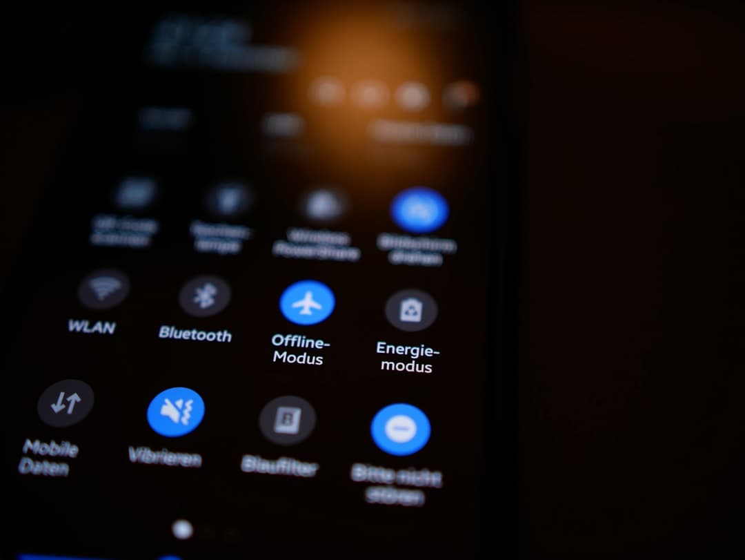
Step 5: Design the Toggle Control Itself
The control should be instantly recognizable. Common patterns include a sun and moon icon that swaps based on the active theme, or a sliding switch. Place it where users expect, usually the top right of the header. A few details improve it:
- Clear icon state: Show which mode is active or which one the click will switch to.
- Smooth transition: A short color transition feels polished, but keep it fast so it does not feel sluggish.
- Accessible label: Add an aria-label so screen reader users understand the control. See our ARIA labels guide for the right approach.
- Keyboard support: Ensure the toggle is focusable and operable with the keyboard.
Common Mistakes to Avoid
Hardcoding Colors Instead of Using Variables
If even a few elements use raw hex values, they will not switch and your dark mode will look broken. Audit your design and replace every hardcoded color with a variable before you ship.
Forgetting Images and Media
Logos and illustrations designed for light backgrounds can disappear on dark ones. Provide theme-aware versions or use SVGs whose colors are bound to variables.
Poor Dark Theme Contrast
Pure black backgrounds with pure white text can be harsh. Use a very dark gray for backgrounds and slightly softened white for text to reduce eye strain while keeping strong contrast. For broader guidance on building dark interfaces, read our dark mode website design guide.
Not Persisting the Choice
A toggle that resets on every page load annoys users. Save the preference so the site remembers it across pages and return visits.
Handling Images, Logos, and Illustrations in Both Themes
Colors are the easy part of dark mode. Media is where many builds fall apart. A logo with dark text looks great on a light background and vanishes on a dark one. Plan for this from the start so your brand stays visible in both themes.
The cleanest solution is to use SVG logos whose colors are bound to your theme variables, so the logo recolors automatically when the theme flips. When that is not possible, provide two versions of the asset, a light-theme version and a dark-theme version, and swap them based on the active theme. Illustrations follow the same logic: either build them with theme-aware colors or supply alternates.
Photographs are usually fine in both themes, but watch for images with white or transparent edges that blend into a light background and stand out awkwardly on a dark one. A subtle border or a contained card around such images keeps them looking intentional in either mode. Test every image-heavy page in both themes before launch, because this is the most common place dark mode looks unfinished.
Testing Your Dark Mode Toggle Before Launch
A dark mode toggle touches every page, so test it thoroughly. Run through this checklist on the staging URL before going live.
- Switch on every page type. Toggle the theme on the homepage, a content page, a CMS collection page, and the contact page. Confirm each one responds fully.
- Reload after switching. Set dark mode, refresh, and confirm the site stays dark with no flash of light theme.
- Navigate between pages. Switch theme, then click through the navigation. The choice should persist across the whole site.
- Check contrast in both themes. Read body text, captions, and muted labels in dark mode to confirm nothing is too faint.
- Inspect forms and buttons. Input fields, placeholders, and disabled states often slip through and need theme-aware colors.
- Verify on mobile. Confirm the toggle is reachable and works on small screens, where the control sometimes hides in a menu.
- Test keyboard and screen reader access. Tab to the toggle, activate it with the keyboard, and confirm the accessible label announces its purpose.
How Framer Websites Builds Dark Mode
At Framer Websites, we build dark mode the durable way: a full set of semantic color variables, a persistent code-based toggle, and an early-load script to prevent theme flash. We test contrast in both themes, handle logos and imagery for each mode, and make the control accessible by keyboard and screen reader. The result is a toggle that feels native and works flawlessly across the whole site.
If you want a polished dark mode toggle without wrestling with variables and code components yourself, our team handles it as part of a professional Framer build. See what is included on our pricing page and let us bring your site to life in both themes.
Frequently Asked Questions
Does Framer have built-in dark mode?
Framer does not include a one-click dark mode switch out of the box, but it gives you everything you need to build one. You define theme-aware color variables, then create a toggle using either component variants or a custom code component that swaps the theme site-wide and remembers the visitor’s choice.
How do I stop the light theme flashing before dark mode loads?
The flash happens when the saved preference is read after the page renders. Fix it by applying the stored theme as early as possible, with a script that reads the preference and sets the theme class on the document root before the page paints, so the correct theme is in place from the first frame.
Should dark mode follow the visitor’s system setting?
A good default is to respect the visitor’s operating system preference on their first visit using the prefers-color-scheme media query, then let your toggle override it and save that choice. This gives new visitors a sensible starting theme while keeping full control in their hands afterward.