Dark Mode Website Design: A Complete Guide for 2026
Dark mode website design has gone from a novelty to a baseline expectation, particularly for tools, content platforms, and developer-focused products. The right dark mode reduces eye strain, looks premium, and saves battery on OLED screens. The wrong dark mode washes out content, breaks contrast ratios, and ships a second class experience. This guide covers when dark mode makes sense, how to design it well, and the technical pieces that make implementation clean.
Pull from the patterns shipping in 2026 across Linear, Vercel, Notion, GitHub, and dozens of well-built marketing sites. The approaches that work tend to share a few habits: deliberate color shifts rather than simple inversion, system preference detection, manual toggle support, and careful attention to imagery and accent colors that read very differently against dark backgrounds.
When Dark Mode Makes Sense
The Case for Dark Mode
Dark mode is a strong fit when users spend long sessions on the site, often in low light. Code editors, analytics dashboards, reading apps, design tools, and developer documentation all benefit. Users who work at night appreciate it. OLED screens save measurable battery in dark mode. And visually, dark interfaces can feel more premium and focused, particularly for technical audiences.
The Case Against
Dark mode is not always better. For long-form reading, well-designed light mode remains more legible for most users. Some studies show comprehension drops slightly in dark mode for dense text. Marketing sites that depend on heroic photography often look worse in dark mode because images that worked on white feel disconnected against black. The honest answer: provide both, let users choose, and design each mode with care.
Audience Signals
Watch what your audience uses elsewhere. Developer tools default to dark. Reading apps default to light. Most modern operating systems set dark mode based on time of day, so respecting prefers-color-scheme means matching the user’s broader environment without forcing a choice.
Color Strategy: Beyond Black on White Inversion
The biggest mistake in dark mode design is treating it as a simple color inversion. Pure white on pure black is harsh, hard to read, and fatigues the eyes faster than well-designed light mode. The best dark modes use deliberate, slightly warm grays for both background and foreground.
Background Choices
Pure black (#000000) saves battery on OLED but can feel oppressive and amplify halation around text. A slightly elevated dark like #0F0F11, #121212, or #1A1A1F gives the eye somewhere to rest. Add subtle layering with even lighter surfaces (#1F1F25 or #252530) for cards, modals, and elevated elements. The contrast between layers communicates depth without resorting to heavy shadows.
Foreground and Text
Pure white (#FFFFFF) at full opacity creates eye strain. Use 87 percent white for primary text, 60 percent for secondary text, and 38 percent for disabled or hint text. This convention from Material Design holds up well in 2026. The opacity-based approach keeps the foreground tinted by the background, which is what real-world surfaces do.
Accent Colors That Survive Dark Mode
Many brand colors that look saturated against white look muddy or vibrating against dark backgrounds. Pure reds and blues often need to shift toward orange or cyan in dark mode. Test your brand color on dark and lighten or shift it as needed. The pair should feel related, not identical.
Contrast Ratios and Accessibility
WCAG Targets
Body text needs a contrast ratio of at least 4.5:1 against the background. Large text needs 3:1. These targets do not change in dark mode. Test with tools like WebAIM’s contrast checker for every text-on-surface combination.
Avoid Pure Black for Body Backgrounds
Pure black backgrounds with white text can produce contrast that is technically compliant but visually painful. The high contrast amplifies any halation effect, which makes text appear to vibrate. A near-black like #121212 with 87 percent white text gives a contrast ratio above 15:1 with significantly less strain.
Focus States Must Stay Visible
Focus rings designed for light mode often disappear against dark backgrounds. Test keyboard navigation through every interactive element in dark mode. Focus rings should use the brand accent color or a high-contrast neutral, not just a darker shade of the surrounding surface.
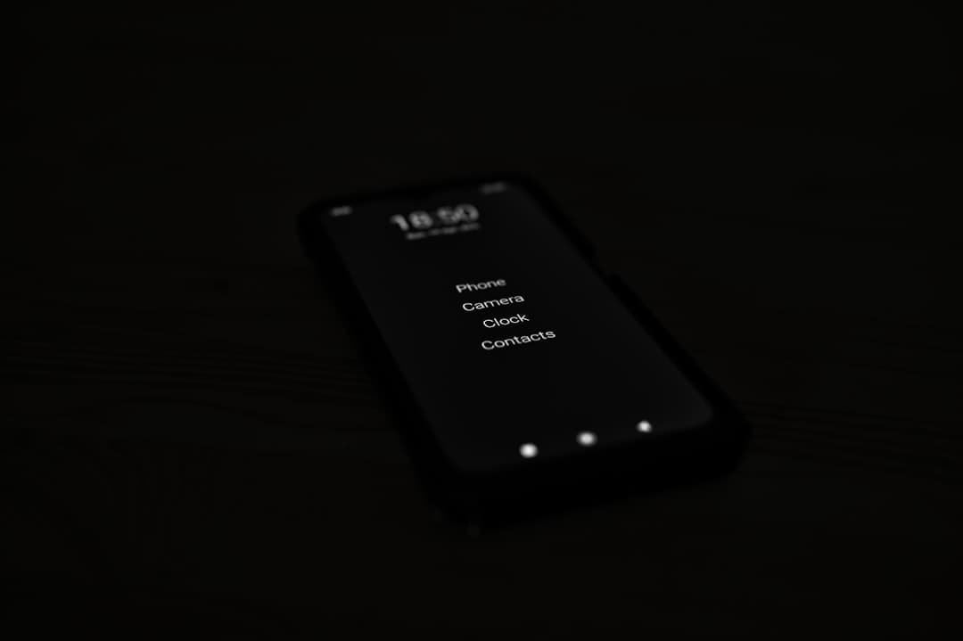
Imagery and Illustrations in Dark Mode
Photographs
Photographs designed for white backgrounds often have hot spots, white edges, or color casts that read poorly on dark surfaces. Add subtle borders, vignettes, or background gradients to bridge the image and surface. For product screenshots, consider a dark-mode version of the product itself rather than a light screenshot floating on a dark page.
Illustrations and Icons
Line illustrations and icons should adjust stroke colors and weights for dark mode. A two-pixel black stroke on white becomes a two-pixel light stroke on dark. SVG with currentColor lets icons inherit text color automatically, which simplifies maintenance.
Logos
Most logos need a dark-mode variant. Either a fully white version, or a version with adjusted brand colors that hold up against dark surfaces. Detect the active mode in CSS and serve the right logo with picture or SVG fragments. The investment pays off because a logo that looks broken in dark mode undermines the rest of the design.
System Preference and Manual Toggle
Respect prefers-color-scheme
Modern browsers expose the user’s system preference via the prefers-color-scheme media query. Sites should respect this on first visit. A user who has set their entire system to dark mode expects sites to follow suit. Ignoring the system preference forces visitors to flip the switch on every site, which feels broken.
Provide a Manual Toggle
The system preference is a default, not a mandate. Some users want light mode at night for reading, or dark mode during the day for coding. A clear toggle in the header or footer lets them override. Persist the choice in localStorage so it survives across sessions.
Three-State Toggles
The cleanest pattern is a three-state toggle: light, dark, system. The system option follows prefers-color-scheme dynamically, while light and dark lock to that mode. This handles every user preference without forcing a single default. GitHub, Linear, and many modern tools use this pattern.
Implementation Patterns
CSS Custom Properties
The cleanest implementation uses CSS custom properties at the root level. Define light mode variables on :root and dark mode variables under a [data-theme=”dark”] selector or @media (prefers-color-scheme: dark) block. Components reference the variables directly. Adding a new component automatically inherits both modes.
Token Architecture
Build a two-layer token system. The base layer defines raw color values: gray-50, gray-900, blue-500. The semantic layer references base tokens by role: surface, on-surface, primary, on-primary. Components only use semantic tokens. Switching modes only requires changing the semantic layer.
Avoiding the Flash of Unstyled Content
If JavaScript handles the initial theme detection, users may see a flash of light mode before the dark mode kicks in. Inline a small script in the document head that reads the saved preference and applies the theme class to the html element before the body renders. This prevents the flash and looks much more polished.
Dark Mode in Modern Visual Builders
Visual builders increasingly support dark mode as a first-class feature. Framer lets you define color tokens and switch the entire design between modes with one toggle. WordPress with most premium themes can do the same, though plugin compatibility is uneven. The platform comparison in Framer vs Webflow covers how each handles theme tokens.
For a developer-focused brand, shipping a strong dark mode signals technical taste in a way visitors notice. For a consumer brand, dark mode may be optional. Either way, treat the second mode as a real design problem, not a switch flipped on at the end. The patterns in Framer website examples show how successful sites handle the transition.
Common Mistakes to Avoid
Pure Black With Pure White Text
Looks dramatic, reads poorly. Use slightly off-black backgrounds and slightly off-white text for comfortable extended reading.
Ignoring the Brand Color
Many brand colors that look perfect on white look muddy on dark surfaces. Test, adjust, and ship a dark-mode-tuned version of the brand color if needed.
Light-Mode Imagery
Photographs, illustrations, and screenshots designed for light mode often look out of place on dark surfaces. Plan dark-mode versions of key imagery from the start.
Forgetting Email and PDF
Marketing emails and PDFs often render in their own light or dark contexts. Make sure these assets work in both modes, especially for transactional emails that may be read at night.
One-Way Toggles
Some sites only let users switch from light to dark, never back. Test the full toggle flow including page transitions, modals, and form states.
Frequently Asked Questions
Should every website have dark mode?
Not every website. For tools, content platforms, and developer-focused products, dark mode is increasingly expected. For marketing sites with photography-heavy heroes, dark mode can hurt the brand presentation. The honest answer is to assess your audience and the nature of your content. When in doubt, ship dark mode but design it as carefully as light mode.
Does dark mode actually save battery?
On OLED and AMOLED screens, yes. Pixels rendering pure black are turned off entirely, which saves measurable power during long reading sessions. On LCD screens, the savings are negligible because the backlight stays on regardless. Most modern phones use OLED, so for mobile users the savings are real.
How do I test dark mode effectively?
Test with real users in real conditions. Borrow phones in low light, look at the site at night, switch between modes mid-session. Run accessibility scans in both modes. Watch session recordings to see whether users actually use the toggle. The combination of synthetic and real testing catches issues that any single method misses.
Can I use AI to generate dark mode colors?
Tools can suggest a starting palette, but final tuning requires human judgment. Brand colors, accent shifts, and the subtle layering of surfaces all benefit from a designer’s eye. Use AI for first drafts, then refine. The investment in manual refinement is what separates a well-built dark mode from a generic one.
Ship a Dark Mode That Earns Its Keep
Dark mode design rewards attention to detail. Color shifts, contrast tuning, image variants, and a clean toggle pattern add up to a second-class experience or a first-class one. The work is real, but the payoff is a site that respects user preference and feels considered at every level. If you want a partner who designs both modes with equal care, see how our team approaches dark mode work.