To add custom fonts in Framer, open the typography settings on any text element, click the font dropdown, and select “Add Custom Font” to upload your own files (WOFF2, WOFF, TTF, OTF) or connect a Google Fonts or Adobe Fonts source. Framer self-hosts uploaded fonts for fast, privacy-friendly loading across your whole site.
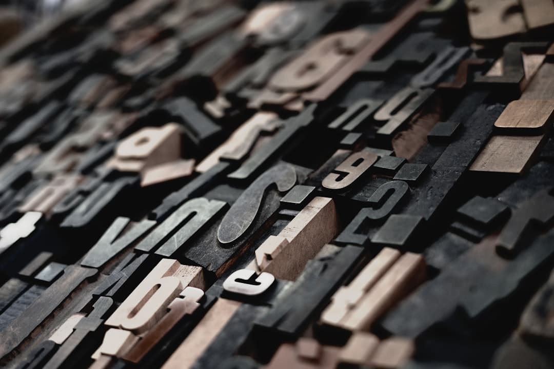
Why Custom Fonts Matter in Framer
Typography is one of the fastest ways to make a site feel like a real brand instead of a template. The default font stack is fine for a quick prototype, but the moment you want your Framer site to match a brand kit, a pitch deck, or a logo, you need your own typeface. Framer treats custom fonts as a first-class feature, which means you get full control without touching code.
There is also a performance and privacy angle. Framer can self-host the font files you upload, so the browser pulls them from Framer’s own content delivery network rather than calling out to a third party on every page load. That keeps load times tight and avoids the cookie and tracking concerns that come with some external font services. If you care about speed, font handling sits right next to image and script optimization in the list of things that quietly decide whether your pages feel instant or sluggish.
The Three Ways to Add Custom Fonts
Framer gives you three distinct paths. Pick the one that matches where your font lives.
1. Upload Your Own Font Files
This is the most common route for licensed or purchased typefaces. Select any text layer, open the typography panel on the right, and click the font name to open the font picker. At the bottom you will see an option to add a custom font. Drag in your files and Framer handles the rest.
For best results, upload WOFF2 first. It is the most compressed modern web format and every current browser supports it. Add WOFF as a fallback if you want to cover very old browsers, though in 2026 that is rarely necessary. You can also upload TTF or OTF files and Framer will accept them, but WOFF2 will always render faster because the file is smaller.
When you upload, give each weight its own file. A typeface family like “Inter” is really a set of separate files: Regular (400), Medium (500), Semibold (600), Bold (700). Upload each weight and map it to the correct style so that when you set text to bold, Framer loads the true bold file instead of faking it by smearing the regular weight.
2. Connect Google Fonts
Framer ships with the full Google Fonts library built in. Open the font picker and start typing a name like “Manrope” or “Space Grotesk” and it appears instantly. No upload, no account, no license fee. Google Fonts are free for commercial use, which makes them the default choice for most projects that do not have a specific brand typeface.
The nice part is that Framer self-hosts these fonts too. Even though they originate from Google, Framer serves them from its own infrastructure, so you get the convenience of the library without the privacy tradeoff of pinging Google on every visit.
3. Connect Adobe Fonts (Typekit)
If your brand uses a typeface licensed through Adobe Fonts, you can connect it through Framer’s custom font flow using the Adobe web project embed. This is the path for premium foundry fonts that are part of an Adobe Creative Cloud plan. Check your license terms first, since some Adobe Fonts are licensed for web use and some are not.
Step-by-Step: Uploading a Custom Font
- Gather your font files. Aim for WOFF2 for each weight you plan to use.
- Select any text element on the canvas.
- In the right panel, click the current font name to open the picker.
- Scroll to the bottom and choose the option to add a custom font.
- Drag your WOFF2 files into the upload area.
- Assign each file to its weight (400, 500, 600, 700) and style (normal or italic).
- Name the family clearly so it is easy to find later.
- Apply it to your text and confirm it renders on the canvas.
Once uploaded, the font becomes available across your entire project, not just the element you started from. That is important when you set up text styles, which we cover next.
Wire Custom Fonts Into Text Styles
Uploading a font is only half the job. The real time-saver is connecting it to your text styles. In Framer you can define reusable text styles like Heading 1, Heading 2, Body, and Caption. Set the custom font once inside each style, and every element using that style updates automatically.
This matters for two reasons. First, consistency. If a client asks to swap the heading font three weeks after launch, you change it in one place instead of hunting through fifty text layers. Second, responsive control. Framer text styles can carry different sizes per breakpoint, so your custom font scales cleanly from desktop to mobile. If you are still mapping out how your layouts shift across screens, the Framer breakpoints guide pairs well with a solid typography system.
Performance: Keep Custom Fonts Fast
Custom fonts can slow a page if you are careless. Here is a short checklist to keep them quick.
- Limit weights. Each weight is a separate file. Loading nine weights when you use three is wasted bandwidth. Upload only what you actually use.
- Prefer WOFF2. It is the smallest format with universal modern support.
- Subset if you can. If you only need Latin characters, a Latin subset cuts file size. Some foundries provide subset files.
- Watch for layout shift. Fonts swapping in after load can push content around and hurt your layout stability score. Framer handles font loading sensibly by default, but heavy custom fonts on a slow connection can still cause a flash.
Typography is one piece of overall page speed. If you want the full picture on how fonts, images, and scripts add up, the website speed optimization guide walks through every lever. For typeface pairing and hierarchy decisions, the website typography guide goes deeper than this post can.
Common Font Problems and Fixes
The font looks bold everywhere
This usually means you uploaded a single file and Framer is synthesizing the other weights. Upload each real weight as its own file and map them correctly.
Italics render as slanted regular text
Faux italics happen when no true italic file exists. Upload the dedicated italic file for each weight you need.
The font does not show on the published site
Republish after adding the font. Changes on the canvas do not go live until you publish. Also confirm the font is applied through a text style or directly on the element, not left on a hidden layer.
Licensing warnings
Self-hosting a font you do not have web rights to is a license violation. Always confirm your purchase covers web embedding before uploading commercial typefaces.
Pairing Custom Fonts Well
Adding a custom font is the technical step. Choosing fonts that work together is the design step, and it is where a lot of sites go wrong. A reliable approach is to use one font for headings and one for body text, with enough contrast between them to feel intentional. A geometric sans for headings paired with a humanist sans for body reads cleanly and modern. A serif heading over a sans body gives an editorial feel. Avoid pairing two fonts that look almost the same, since the result feels like a mistake rather than a choice.
Limit yourself to two typefaces for most projects, three at the absolute most. Each additional family is more files to load and more visual noise. If you need variety, get it from weights and sizes within a single family rather than introducing new typefaces. A well-built scale of one heading font at three weights and one body font at two weights covers almost any layout you will design in Framer.
Consider how the font behaves at small sizes too. A display typeface with thin strokes and tight spacing can look stunning at 72 pixels and become unreadable at 14 pixels. Test your body font at the actual sizes it will appear on mobile, where most of your traffic likely sits, before you commit. The font that wins the desktop hero is not always the font that should carry your paragraphs.
Variable Fonts in Framer
Variable fonts pack multiple weights and styles into a single file, with smooth interpolation between them. Instead of uploading separate Regular, Medium, and Bold files, one variable font file can deliver the entire weight range. This can reduce the total bytes you ship when you use many weights, and it opens up fine-grained control over weight that fixed fonts cannot match. If your typeface is available as a variable font, it is often the more efficient choice for a Framer site that uses a wide range of weights. For a site that only uses two weights, separate static files can still be the lighter option, so weigh it against your actual usage.
How Framer Compares for Font Control
Compared with other builders, Framer’s font handling is unusually clean. WordPress typically needs a plugin or theme settings to manage custom fonts, and self-hosting them properly often means editing CSS. Squarespace limits you to its curated list unless you inject code. Wix has a custom font uploader but less granular weight control. Webflow is closest to Framer and also supports self-hosted uploads. For designers who want pixel-level typographic control with no code, Framer and Webflow lead the pack, and Framer edges ahead on speed of setup.
This is part of why we build exclusively in Framer at Framer Websites. Typography, animation, and CMS content all live in one tool, so a brand typeface flows from the design canvas to the live site without a handoff. If you want a site built this way, see our recent work for examples of brand-true typography in production.
Frequently Asked Questions
What font formats does Framer support for custom fonts?
Framer accepts WOFF2, WOFF, TTF, and OTF files. WOFF2 is recommended because it is the most compressed format with full support in every modern browser, which keeps your pages fast.
Are Google Fonts in Framer free to use commercially?
Yes. The Google Fonts library built into Framer is free for commercial use, and Framer self-hosts the files so they load from Framer’s own servers rather than calling Google on every page load.
Can I use a paid or licensed font on my Framer site?
Yes, as long as your license covers web embedding. Upload the WOFF2 files through the custom font flow and assign each weight. Always confirm your purchase includes web rights before self-hosting a commercial typeface.
Why does my custom font look bold or slanted incorrectly?
That happens when Framer synthesizes a weight or italic from a single file. Upload a separate real file for each weight and a dedicated italic file, then map each to the correct style so Framer loads the true version.