A dental clinic website turns local searches into booked appointments. The strongest dental sites load fast, look clean and trustworthy, make booking obvious on every screen, and answer the practical questions patients ask before they call. The job is to reduce anxiety and remove friction so a nervous visitor confidently books a visit.
Key takeaways
- Patients arrive anxious and practical, so the site must reassure them and make booking effortless.
- A prominent, persistent booking call to action belongs on every page and in the navigation.
- Trust signals like real photos, reviews, credentials, and insurance details drive the decision to book.
- Clear service pages, location and hours, and a friendly team section answer the questions patients have.
- Mobile speed and accessibility matter because most local dental searches happen on phones.
- Framer lets a clinic ship a fast, polished, easy-to-update site without a developer on retainer.
Who visits a dental clinic website
People searching for a dentist are rarely browsing for fun. They are in pain, overdue for a cleaning, new to the area, or unhappy with their current practice. Many feel some anxiety about dental visits, and a meaningful share are choosing under time pressure or discomfort. This shapes everything about the site. Visitors want speed, clarity, and reassurance, and they will leave a confusing or slow site for a competitor without hesitation.
Most of these searches happen on mobile, often with intent to book the same day. A patient with a toothache wants to find your hours, confirm you take their insurance, and tap a button to call or book. If your site buries that information or makes them pinch and zoom, you lose them. Understanding this anxious, practical mindset is the foundation of every good dental site, much like the audience-first thinking behind any effective website design approach applied to a local service business.
The key sections a dental website needs
A reassuring homepage with an obvious next step
The homepage should immediately communicate who you are, where you are, and how to book. A warm headline, a real photo of the practice or team, and a prominent Book Appointment button do more than any stock image. Visitors should never have to search for how to take the next step.
Clear service pages
Patients look for specific treatments: cleanings, fillings, crowns, implants, teeth whitening, emergency care, and pediatric dentistry. Dedicated pages or clearly labeled sections for each service help patients confirm you offer what they need and help your site appear in searches for those treatments. Each page should explain the service in plain language, set expectations, and end with a booking prompt.
Location, hours, and contact details
This is non-negotiable for a local business. Your address, a map, parking notes, opening hours, and phone number should be easy to find from any page. Many patients decide based on convenience, so make distance and hours obvious. A click-to-call phone number is essential on mobile.
A team and about section
Dentistry is personal. Patients are trusting someone with their health and comfort, so showing the real people behind the practice builds confidence. Photos and short bios of the dentists and staff, including credentials and a friendly note about their approach, help an anxious visitor feel they are choosing a practice run by competent, caring humans.
Building trust and driving conversion
For a dental clinic, trust is the conversion. A patient who trusts you will book. The site should surface proof of competence and care at every opportunity.
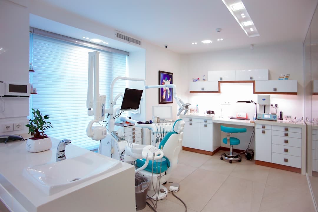
Real photography beats stock every time. Photos of your actual office, treatment rooms, and team reassure patients far more than generic smiling models. Reviews and testimonials carry enormous weight in healthcare decisions, so feature genuine patient reviews prominently, ideally with names or initials and the treatment received. Display professional credentials, association memberships, and any awards. List the insurance plans you accept clearly, because insurance is one of the first questions patients have and an unanswered question often means a lost booking.
Conversion comes from making the desired action effortless. The primary action is booking, so a booking call to action should be persistent: in the header, repeated through the page, and reinforced in the footer. Offer multiple ways to book, since some patients prefer to call and others prefer an online form or scheduler. The fewer steps between intent and appointment, the more appointments you get. This conversion-first discipline mirrors the patterns we cover in our website design guide, adapted to a healthcare context where reassurance carries extra weight.
Designing for the anxious patient
A large share of people delay dental care because of fear, so a dental website carries an emotional job alongside its practical one. The design choices that ease anxiety are concrete. Warm, calm colors feel more reassuring than stark clinical white. Friendly, plain-language copy that acknowledges nervousness, such as a short line about gentle care or sedation options, tells anxious patients they are understood. Photos of smiling staff and comfortable treatment rooms replace the cold, intimidating imagery many people associate with the dentist.
It also helps to explain what a first visit looks like. A short description of the steps, from check-in to consultation to treatment plan, removes the fear of the unknown. When a hesitant patient can picture exactly what will happen, the barrier to booking drops. Highlighting any comfort-focused services, such as numbing options, flexible scheduling, or financing for larger treatments, turns a daunting decision into a manageable one. Every detail that reduces fear nudges a reluctant visitor closer to picking up the phone.
Local SEO and getting found
A beautiful dental site only converts if patients find it. Because dentistry is hyper-local, the site should be built to appear when nearby people search for a dentist. That means including your city and neighborhood naturally in your page copy and headings, creating clear service pages that match the treatments people search for, and ensuring your name, address, and phone number are consistent everywhere they appear. Fast load times and a clean mobile experience also support search visibility, since search engines favor sites that serve users well on phones.
Content can extend your reach further. A few helpful pages or short articles answering common patient questions, such as how often to get a cleaning or what to do in a dental emergency, can attract searchers earlier in their decision and build authority for your practice. Each of these pages should still guide the reader toward booking, so educational content doubles as a gentle conversion path. The goal is to be the obvious, trustworthy local choice the moment someone in your area decides they need care.
What a great dental homepage looks like
Imagine landing on the page. The header carries the practice name, a phone number, and a bright Book Now button. The first section shows a real photo of the welcoming reception area with a headline like Gentle, modern dentistry in your neighborhood and a booking button. Below that, a short row of service highlights links to detail pages. Next come patient reviews with real names, then a friendly team section with photos and credentials. Location, hours, and a map sit clearly before the footer, and the footer repeats the phone number, address, and booking link. Every scroll reinforces trust and keeps the next step one tap away.
Common dental website mistakes
Hiding contact information is a frequent and costly error. If a patient in pain cannot find your phone number in seconds, they call the next clinic. Keep it visible everywhere.
Relying on stock photos undermines trust. A site full of generic models feels impersonal and interchangeable. Real photos of your office and team set you apart and reassure anxious patients.
Slow load times drive patients away before the page even appears. Heavy image galleries and bloated templates are common culprits. Local visitors on mobile networks will not wait.
Forgetting insurance information frustrates patients who need to know whether you accept their plan. An unanswered insurance question is a silent reason patients move on.
Making booking hard is the ultimate failure. A single buried contact form with no phone option, or a multi-step process, kills conversions. The booking path should be short, visible, and available in more than one form.
Finally, neglecting mobile design loses the majority of your audience. Tiny tap targets, cramped layouts, and unreadable text on phones turn high-intent searches into bounces.
How Framer helps dental clinics
Framer is a strong fit for dental practices because it produces fast, polished, mobile-ready sites that a small team can maintain. You can embed an online booking widget or scheduler directly, add click-to-call buttons, and build clean service pages with reusable components so updates stay consistent. Because Framer sites load quickly by default, anxious mobile visitors are less likely to bounce. The visual editor means a practice manager can update hours, add a new service, or swap a photo without hiring a developer for every small change.
The result is a professional, trustworthy site that reflects the quality of care your practice provides and turns local searches into booked chairs. If you want a dental website built to convert, our team can design one tailored to your practice, your patients, and your local market. For practices that want a deeper look at dental-specific patterns, our focused guide on dental website design goes further into layout and content choices.
Turn local searches into booked appointments
We design fast, trustworthy Framer dental websites with online booking, real photography, patient reviews, and clear service pages that reassure anxious patients and fill your schedule.
Frequently Asked Questions
What should a dental clinic homepage include?
A dental homepage should show the practice name, a phone number, and a prominent Book Now button in the header, a welcoming photo of the real office or team, clear service highlights, patient reviews, credentials, and easy-to-find location and hours. Every section should keep booking one tap away.
Why are real photos better than stock images for dental sites?
Dentistry is personal, and patients are trusting you with their health and comfort. Real photos of your actual office, treatment rooms, and team build genuine confidence, while generic stock models feel impersonal and interchangeable. Authentic imagery helps an anxious visitor feel they are choosing a real, caring practice.
How important is mobile design for a dental website?
It is critical. Most local dental searches happen on phones, often with intent to book the same day. A site that loads slowly, uses tiny tap targets, or hides the phone number on mobile will lose high-intent patients to competitors. Fast, clean mobile design directly affects how many appointments you book.
Can I update a Framer dental website myself?
Yes. Framer uses a visual editor, so a practice manager can update hours, swap photos, add a new service, or change contact details without coding or hiring a developer for every small edit. Reusable components keep the design consistent while making routine updates quick and simple.