A split-screen layout divides the viewport into two or more vertical sections of roughly equal weight, letting you present two distinct pieces of content side by side. It works well for showing contrast, pairing imagery with copy, or offering two paths to a visitor. Used carefully, it creates balance and visual interest; used carelessly, it competes for attention and breaks on mobile.
Key takeaways
- Split-screen layouts divide the page into two side-by-side panels, ideal for contrast, pairing, or offering two paths.
- The design works best when each side has a clear, distinct purpose rather than competing for the same attention.
- Visual hierarchy is critical, since two equal halves can leave visitors unsure where to look first.
- Mobile handling is the make-or-break detail, because two columns must stack cleanly on small screens.
- Common mistakes include overcrowding each half, mismatched visual weight, and ignoring accessibility.
- Framer makes split-screen layouts straightforward through stacks, breakpoints, and component reuse.
What a split-screen layout actually is
A split-screen layout splits the visible area into two (sometimes more) panels that sit beside each other, each holding its own content. The most common version is a 50/50 vertical split, but the ratio can shift to 60/40 or 70/30 depending on which side deserves more weight. The defining trait is that two areas share the screen at once, inviting the eye to compare or choose between them.
This pattern became popular because it solves a real problem: how to present two things of similar importance without forcing one above the other. A hero with text on one side and a product image on the other, a “for individuals / for teams” choice, or a before-and-after comparison all benefit from the side-by-side structure. It creates a sense of balance and a clear visual rhythm.
The key word is purpose. A split-screen works when each half earns its place. If both sides try to be the main focus, the layout fights itself. The best split-screens give each panel a distinct role that supports a single overall goal for the section.
When to use a split-screen layout
Reach for a split-screen when you have two pieces of content that genuinely belong together at equal weight. Pairing a headline and call to action with a supporting image is the classic use, common in hero sections. Offering two audience paths, such as one side for buyers and one for sellers, is another strong fit, because the structure mirrors the decision the visitor needs to make.
Contrast is a third great use. Before-and-after, problem-and-solution, or old-way-versus-new-way all map naturally onto two panels. The side-by-side arrangement makes the comparison instant and intuitive. Pricing comparisons and feature contrasts often use this same logic to help visitors weigh options quickly.
When not to use it
Avoid a split-screen when one piece of content is clearly more important than the other. Forcing a primary message into half the width can weaken it. Also avoid it when you have three or more competing ideas, since cramming them into split panels creates clutter. And be cautious on content-dense sections, where two columns of text become hard to scan.
Principles of effective split-screen design
The first principle is clear hierarchy within balance. Even when two halves look equal, the design should guide the eye to a starting point, usually through a stronger headline, a brighter color, or a more prominent call to action on one side. Equal visual weight does not mean equal attention; one side should still lead the visitor into the section.
The second principle is contrast between panels. The two halves should feel distinct through color, imagery, or typography so the division reads clearly. If both sides use the same background and similar elements, the split blurs and the layout loses its point. A clear seam, whether through color blocks or imagery, makes the structure obvious.
The third principle is restraint within each panel. Because each side has only half the width, it must hold less. One headline, one short supporting line, and one action per panel is a safe maximum. Overloading a half-width column is the fastest way to make a split-screen feel cramped and confusing.
Real-world patterns that work
The hero split is the most reliable pattern: copy and a call to action on one side, a product shot or illustration on the other. It anchors the top of a page with both message and visual proof. The dual-path split is another proven pattern, presenting two clear options, each with its own button, so visitors self-select their journey immediately.
The image-and-feature split alternates panels down the page, with an image on the left and a feature description on the right, then reversing on the next row. This rhythm keeps a long page engaging while maintaining the side-by-side structure. The comparison split, placing two options or states next to each other, makes differences obvious at a glance and supports faster decisions.
Common mistakes to avoid
The most common mistake is mismatched visual weight. If one panel has a bright image and the other has plain text on a flat background, the layout tilts and the balance breaks. Match the visual intensity of both sides, or deliberately weight one if it should lead, but never let it happen by accident.
The second mistake is overcrowding. Designers often treat each half like a full-width section and pack in too much. Half the width means half the content. Cut ruthlessly so each panel breathes.
The third mistake is ignoring the mobile experience. A split-screen that looks elegant on desktop can collapse into an unreadable mess on a phone if the columns do not stack cleanly. This is so important it deserves its own section. A fourth, related mistake is letting the layout shift unexpectedly as the page loads. Sudden movement hurts both usability and search rankings, which our cumulative layout shift guide explains in depth.
Handling mobile and responsiveness
On small screens, a side-by-side split almost always becomes a stack. The two panels move from left-and-right to top-and-bottom, preserving the content but changing the arrangement. The critical decision is stacking order. Which panel comes first when they stack? Usually the one with the primary message or the most important call to action leads, so mobile visitors see it first.
Spacing and sizing also change. Images that filled half the width on desktop may need to shrink or crop on mobile, and text that sat comfortably beside an image now needs its own breathing room above or below it. Test the stacked version as carefully as the desktop version, because most of your traffic likely arrives on a phone. A split-screen that ignores mobile is only half-designed.
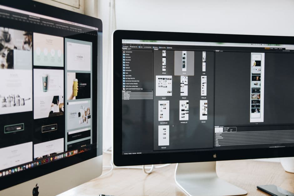
Building split-screen layouts in Framer
Framer is well suited to split-screen design because its layout system is built around stacks. You create a horizontal stack with two child frames, each holding one panel’s content, and set them to share the width. Framer’s layout engine keeps them aligned and lets you control spacing, padding, and ratios precisely. Related layout techniques are covered in our Framer stacks layout guide, which is worth reading before you build.
Responsiveness is where Framer makes the pattern easy. At the mobile breakpoint, you switch the horizontal stack to a vertical one, and the two panels stack automatically in the order you set. You adjust each panel’s content for the smaller screen without rebuilding anything. Because Framer lets you design each breakpoint visually, you can confirm the stacked mobile version looks right before you publish.
Components add another advantage. If you reuse a split-screen pattern across multiple sections, building it as a component means a single change updates every instance, keeping your design consistent. This is especially useful for the alternating image-and-feature pattern, where the same structure repeats with different content.
Accessibility within Framer split-screens
Two visually parallel panels can confuse the reading order for assistive technology if the structure is not clean. Make sure the underlying content order matches the logical reading order, so screen reader users encounter the panels in a sensible sequence. Maintain strong color contrast on both sides, especially if one panel uses a colored background. Our guide to screen reader optimization covers the details that keep a visually rich layout usable for everyone.
Color, imagery, and typography choices
The visual treatment of each panel determines whether a split-screen reads as intentional or accidental. Color is the most direct tool. Giving each side a distinct but harmonious background color makes the division obvious and gives the section structure. A common approach pairs a dark panel with a light one, creating instant contrast while keeping the overall palette cohesive. The two colors should feel like partners, not clashing opposites.
Imagery needs equal care. If one panel holds a photograph or illustration, it should fill its half cleanly without awkward cropping, and its visual energy should roughly match the opposite panel so the layout stays balanced. A busy image beside a sparse text column can tip the composition, so either calm the image or strengthen the text side to restore equilibrium. Treat the two halves as a single composition rather than two unrelated boxes.
Typography ties it together. Headlines in a split-screen often run slightly smaller than in a full-width hero because each panel has less room, so sizing and line length need adjustment to avoid cramped or awkward wrapping. Keep the type styles consistent across both panels unless you are deliberately using a different treatment to signal a different role. Consistency in type, paired with contrast in color and imagery, is what makes the pattern feel polished rather than improvised.
The bottom line
A split-screen layout is a powerful way to present two pieces of content with balance and clarity, whether you are contrasting ideas, pairing message with imagery, or offering two paths. Its success depends on giving each panel a clear purpose, maintaining visual hierarchy, keeping each side uncluttered, and handling the mobile stack with care. In Framer, stacks, breakpoints, and components make the pattern both easy to build and easy to keep consistent.
See split-screen layouts done right
Our team designs and builds Framer sites with balanced, conversion-focused layouts that look sharp on every screen. Take a look at what we have built.
Frequently Asked Questions
When should I use a split-screen layout?
Use a split-screen when you have two pieces of content of roughly equal importance that belong together, such as a headline paired with an image, two audience paths, or a before-and-after contrast. Avoid it when one piece is clearly more important or when you have three or more competing ideas.
How do split-screen layouts work on mobile?
On mobile, the two side-by-side panels typically stack vertically, moving from left-and-right to top-and-bottom. The most important decision is stacking order, since the panel that appears first should usually carry the primary message or call to action. Test the stacked version carefully because most traffic is mobile.
Is a split-screen layout good for SEO?
It can be, as long as the content order is logical and the page does not shift unexpectedly as it loads. Layout stability and a clean reading order both support search performance and usability, so build the structure cleanly and confirm the mobile stack does not cause sudden movement.
Are split-screen layouts hard to build in Framer?
No. Framer’s stack-based layout system makes split-screens straightforward. You create a horizontal stack with two panels, then switch it to a vertical stack at the mobile breakpoint so the panels stack in your chosen order. Building it as a reusable component keeps repeated split sections consistent.