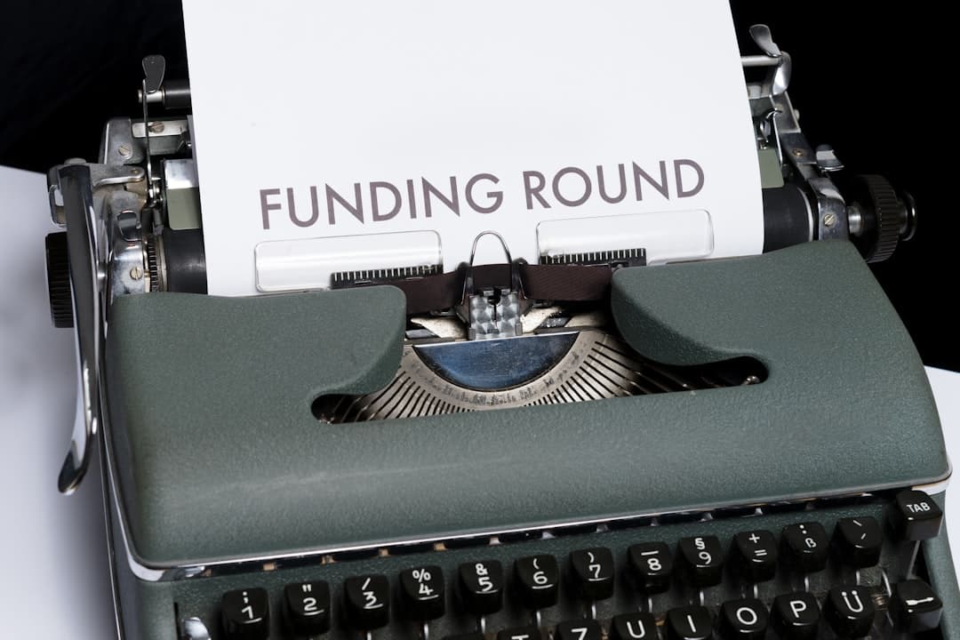
A fundraising landing page is the dedicated page a startup launches to announce a funding round — Series A, B, C, growth, or seed extension. It’s part press release, part recruiting magnet, part customer signal, part competitive shot across the bow. The best fundraising landing pages tell a narrative, show enough proof to be credible, and route different visitors (press, candidates, customers, investors) to the right next action.
Why a dedicated fundraising landing page matters
You only announce a funding round once. The blast of attention — Twitter, LinkedIn, TechCrunch, podcasts, your investor’s portfolio newsletter — pushes a brief but huge spike of relevant visitors to your site. A homepage isn’t built for that moment. It speaks to customers in a generic voice. A fundraising landing page captures the moment, frames the narrative, and converts the spike into hires, sales conversations, and second-wave press coverage.
Without one, the announcement traffic lands on your homepage and bounces. With one, you turn one news cycle into a recruiting pipeline that fills roles for the next six months and a sales pipeline that closes deals in the next quarter. The work is straightforward — the page is usually 800-1,500 words plus visuals — but the leverage is significant.
Who actually visits a fundraising landing page
Map the page to the audiences who’ll see the announcement:
- Press and bloggers. Looking for the story angle, the numbers, the customers, the quotes.
- Potential hires. Engineers, designers, salespeople reading the announcement and thinking “should I work there?”
- Customers and prospects. Existing pipeline taking notice. Some will accelerate decisions.
- Competitors. Studying what you say to figure out their counter-position.
- Industry watchers. Other founders, VCs, analysts, market researchers.
- Family and friends. The founder’s network seeing the news.
Each audience needs a path forward. Press wants the press kit. Candidates want the careers page. Customers want the product page. Investors want the investor relations contact. Build those paths into the page.
The narrative structure that works
The strongest fundraising pages follow a story arc, not a feature list. The arc:
- Why now. The market problem that’s becoming acute. The reason this category exists today and didn’t five years ago.
- What we’ve built. The product, in two sentences. Not a feature list — the singular value proposition.
- The traction. Customer count, revenue (if disclosed), growth rate, named logos. Concrete proof you’re earning the round.
- What we’re building next. The roadmap angle — what the capital unlocks.
- Who we’re building with. Investor names, advisors, customer quotes.
- Who we want to build it with. The hiring pitch.
This structure works because it answers every visitor’s implicit question — why does this round matter, why now, why this team. Linear’s Series B page, Vercel’s Series D, Resend’s Series A, and Cal.com’s various rounds all followed versions of this. Our startup website design guide covers the broader site patterns.
What numbers to show — and what to keep private
You don’t have to disclose everything. The numbers that almost always help:
- Round size and round type (Series B, $40M led by [investor]).
- Total raised to date.
- Customer count if it’s compelling (50,000 developers, 4,000 teams, 200 enterprise customers).
- Growth metrics that contextualize traction (3x ARR YoY, 200% net revenue retention).
- Named customer logos.
- Team size and growth (“we’ve grown from 12 to 80 in 18 months”).
Numbers that are usually kept private: exact ARR, exact valuation, churn rates, gross margin, runway, burn. You can hint (“strong unit economics,” “runway through 2028”) without disclosing specifics. The narrative carries the weight — investors who care about specifics will ask in a follow-up conversation.
Investor logos and quotes
The investor lineup is part of the credibility stack. Lead investor first, then co-investors, then notable individual angels (“plus angels including [recognizable name]”). Logos linked to investor sites. A quote from the lead investor — usually pulled from the press release — adds external validation.
Don’t crowd the investor section. Five logos clean beats fifteen logos cluttered. If you have many co-investors, group them by tier (lead, participating, angels) and use small logos. The visual hierarchy mirrors the cap table — lead is biggest, others smaller.
Customer proof: the second credibility layer
Investors validate that smart capital believes. Customer logos validate that smart users actually use. Both matter on the fundraising page. Show 6-12 customer logos in a clean grid. Pull a quote or two from named customers — ideally tied to a quantitative outcome (“We replaced three tools with [product] and our team ships features 3x faster”).
If you have public case studies, link to them from the customer section. Press readers click through. Candidates read them. Prospects scan them. Don’t put generic testimonials — at this stage, you want named, specific, outcome-driven proof.
The hiring pitch on the fundraising page
Most fundraising pages dramatically underweight the recruiting opportunity. The traffic spike is one of the rare moments where engineers, designers, and PMs across the industry actively check your careers page. Capitalize on it.
Have a dedicated section: “We’re hiring across engineering, design, sales, and operations.” List 3-5 of the most critical roles with one-line descriptions. Link to the full careers page. Include a quote from a recent hire or a brief “what it’s like to work here” paragraph. Our careers page design guide covers the deeper patterns.
The fundraising page should drive applications. Track applications attributed to the campaign for the next 30, 60, 90 days. If you do it well, the round announcement can fill 5-10 critical hires.
Press kit and assets
Make the press’s job easy. A press section with: company logo (light and dark, SVG and PNG), product screenshots, founder headshots, brand colors and fonts, fact sheet (one-pager with key stats), and a media contact email. Journalists will use your page as the source of truth if you make the assets easy to find and high-quality.
The press kit should live on the same page or one click away. Don’t make journalists submit forms to access logos — they’ll quote you with a screenshot instead, and you lose control of how you’re represented.
Visual and brand considerations
The fundraising page is a brand moment. Many companies upgrade their visual language at this point. New hero illustration, new product screenshots, refreshed photography. The page should feel premium — this is when serious money is reading your site.
Common visual elements: founder portrait section, team group photo, office photos if relevant, illustration or motion graphic in the hero. Some companies commission a custom illustration for the round (Stripe and Figma have both done this). The aesthetic signals seriousness without being corporate.
The CTA strategy
Multiple CTAs, each routing different audiences:
- Primary: The product CTA — try the product, book a demo, or sign up.
- Secondary: See open roles (careers).
- Tertiary: Read the press release (often links to the lead VC’s blog post or TechCrunch).
- Media contact: A direct email or form for press inquiries.
- Investor contact: Often omitted, but include if you’re open to follow-on investor conversations.
Place CTAs throughout the page, not just at the bottom. The customer CTA appears after the traction section. The careers CTA appears after the “who we’re building with” section. Match the CTA to the moment the visitor is most likely to take action.
Distribution: getting the page seen
The page is only as good as its distribution. The standard playbook:
- Coordinated press release with embargoed coverage.
- Founder thread on X (Twitter) with the page linked.
- LinkedIn post from founder and key team members.
- VC blog post linked back.
- Customer-facing email blast.
- Job posts referencing the round.
- Podcast appearances scheduled to coincide.
- Investor’s portfolio newsletter inclusion.
All paths drive back to the fundraising landing page. The URL is everywhere for a week, then becomes a permanent reference doc.
SEO and long-term value
The page outlives the news cycle. People search “[company] Series B” or “[company] funding” months and years later. The page should be SEO-friendly with the round name in the URL slug, the title, and the H1. Don’t archive it — keep it live as a historical record. Update it later when subsequent rounds happen (“In 2026 we raised our Series C — read the announcement here”).
2026 patterns specific to fundraising pages
- Founder video. A 60-90 second video from the founder explaining the round and the vision. Embedded in the hero or after the narrative.
- Customer count counters. Live or daily-updated numbers showing growth.
- AI-focused positioning. Almost every 2026 round mentions AI strategy somewhere. Be specific, not generic.
- Product roadmap previews. What the round unlocks — feature previews, beta sign-ups.
- Press embed cards. Logos and links to the actual coverage as it goes live.
- Open roles previews. Live job feeds pulled from Greenhouse, Lever, or Ashby.
- Social proof streaming. Recent customer signups, GitHub stars, community member counts.
What to avoid on a fundraising landing page
Self-congratulatory tone. Vague language about “changing the world.” Buzzword soup. Stock photography. Long blocks of text without visuals. CTAs that point to a 404. Press kit assets that are low-resolution or in inconsistent formats. A page that’s slow because it loads ten tracking scripts at once. Disclosing valuation when you didn’t have to. Naming customers without their permission.
Frequently asked questions
Should I disclose the valuation of my funding round?
Usually no. Disclose the round size and lead investor. Valuation is rarely required and can box you in for future rounds, hiring negotiations, and competitive positioning. Press will sometimes report a valuation regardless — that’s their reporting, not your disclosure.
How long should a fundraising landing page be?
800-1,500 words plus visuals. Long enough to tell the narrative; short enough that press, candidates, and customers can scan it in 2-3 minutes. Hero, narrative section, traction, investors, customers, team, hiring, press kit, CTAs. That’s the structure.
Should the fundraising page replace my homepage temporarily?
No. Keep the homepage as the homepage. The fundraising page lives at /series-b, /announcement, or /raise. Link to it prominently from the homepage for the first 1-2 weeks. After the news cycle, drop the homepage link but keep the page live for SEO and historical reference.
How quickly does a fundraising landing page need to ship?
The page should be ready the day the embargo lifts. That usually means starting design and copy 2-3 weeks before announcement day. Coordinate with PR, your lead investor’s marketing team, and your design team early. Last-minute fundraising pages look last-minute, and the audience can tell.
Ship your fundraising landing page
We design fundraising landing pages for startups announcing rounds across Series A, B, C, and growth stages. Most clients ship within 5-10 business days. Get in touch or check pricing.