Customer journey mapping for websites is the practice of plotting every step a buyer takes from first awareness to long-term loyalty, then matching each step to the exact page, content piece, and call to action on your site. Done well, it turns a flat sitemap into a guided path that meets visitors where they are and moves them toward the next decision.
What Is Customer Journey Mapping?
A customer journey map is a visual model of how a prospect or customer interacts with your brand over time. It captures the sequence of moments where someone discovers a problem, researches options, picks a solution, uses it, and (ideally) tells others about it. Each moment includes the question on the visitor’s mind, the channel they use, and the outcome they hope for.
Applied to a website, the map becomes an operating document. Every URL exists to serve a stage of the journey. A blog post answers a top of funnel question. A pricing page answers a bottom of funnel one. A docs hub keeps active customers successful. When you can point at a page and name the stage it serves, your site stops feeling like a brochure and starts feeling like a guide.
Why It Matters for Websites Specifically
Most websites are built around what the company wants to say. A journey-mapped site is built around what the visitor needs to know at the moment they arrive. The difference shows up in bounce rate, time to conversion, and the quality of the leads that fill out forms.
When a top of funnel visitor lands on a pricing page through paid search, the mismatch between intent and content costs you the click. When a high intent visitor cannot find a clear path from a feature comparison to a demo signup, the friction costs you the deal. A mapped site also gives your team a shared vocabulary for debating whether a page belongs in consideration or decision.
The 5 Standard Journey Stages
Most teams converge on five stages, though the exact labels vary. The model below works for both B2B SaaS and consumer products and maps cleanly onto site architecture.
1. Awareness
The visitor recognizes a problem or curiosity. They do not know your brand yet, and they may not even know that a category of solutions exists. Search queries here are broad and symptom-driven, like “why is my checkout abandonment so high.”
2. Consideration
The visitor knows they need a solution and is evaluating approaches. They compare categories, read explainers, and look for credible voices. They might search “best heatmap tools” or “session replay vs analytics.” Brand-aware visits begin here.
3. Decision
The visitor has shortlisted options and is now choosing. They check pricing, look for proof, and try free tiers. Search queries get specific: “Hotjar pricing,” “Mixpanel vs Amplitude,” “Calendly enterprise plan.”
4. Retention
The visitor became a customer and needs to extract value. Their searches are task-driven: “how to set up funnels in (your product name),” “exporting reports,” “team permissions.” This stage is often neglected on websites because marketing teams do not own it.
5. Advocacy
The customer is successful enough to refer, review, or co-create. They visit referral pages, community forums, integration directories, and partner programs. Advocacy traffic is small in volume but enormous in influence on the prior four stages.
Mapping Stages to Website Pages and Content
The most useful exercise in journey mapping is a simple three-column table: stage, the question a visitor asks at that stage, and the page that answers it. Empty rows are content gaps. Rows with three competing pages are clarity problems. This audit alone usually surfaces a quarter’s worth of work.
The cleanest sites use distinct URL patterns per stage. Awareness lives under /blog or /guides. Consideration lives under /resources or /compare. Decision lives under /pricing, /demo, and /contact. Retention lives under /docs or /help. Advocacy lives under /community, /partners, or /referral. For a deeper look at how visitors actually traverse those groupings, see our user flow design guide.
Awareness Stage Pages
Awareness pages should rank for symptom-level queries and answer the question directly in the first 60 words. Common formats:
- Blog posts on the underlying problem (not your product). A SaaS billing company writes about churn forecasting, not their dunning module.
- Glossary or definition pages that capture broad informational queries and act as internal link hubs.
- Comparison and “vs” content at the category level (for example, “SEO vs SEM”), separate from product-vs-product pages, which belong in consideration.
- Organic landing pages targeting use cases or roles, designed to convert browsing into newsletter signups, not demos.
The CTA on an awareness page should be soft: subscribe, download a checklist, or read the next post in a series. Asking for a demo here is asking a stranger to marry you.
Consideration Stage Pages
Consideration visitors have a problem and want to evaluate approaches. They want evidence that your category (and ideally your product) is the right fit. Pages that serve them well:
- Case studies with named customers, specific metrics, and the exact use case. “We lifted activated trials by 34 percent in 90 days” beats “we increased conversion.”
- Interactive demos and product tours that let the visitor see the product without booking a call.
- Product-vs-product comparison pages (“Framer vs Webflow,” “Notion vs Confluence”) that answer the search query honestly.
- ROI calculators that turn a vague benefit into a number specific to the visitor’s situation.
Decision Stage Pages
Decision pages exist to remove final friction. The visitor knows they want to buy in your category and is verifying that you specifically are the right pick. These pages need to be clean, fast, and direct.
- Pricing pages with transparent tiers and a clear next step. If pricing is genuinely custom, say so, then give a range.
- Contact and demo signup forms with as few fields as possible. Every extra field measurably reduces submissions.
- Trial activation pages that make the first 60 seconds successful, with onboarding inside the product.
- Security, compliance, and legal pages (SOC 2, GDPR, DPA) that satisfy procurement without an email exchange.
For more on optimizing this drop-off-prone stretch, our conversion funnel guide breaks down the exact metrics to watch between awareness and signup. When you are ready to build out the decision pages themselves, our team can help design a path that converts.
Retention Stage Pages
Retention pages are usually owned by product and customer success, but they belong in your journey map because they decide whether the customer renews:
- Documentation and help articles indexed for in-product search and external search, written for the task the customer is trying to complete.
- Knowledge base and FAQ hubs organized by use case, not by product feature.
- In-product dashboards that surface usage data and “next best action” prompts so customers see their own progress.
- Support and ticket pages with response time expectations and self-serve options for the most common requests.
Advocacy Stage Pages
Advocacy pages turn happy customers into a distribution channel. Smallest part of the site by traffic, highest leverage by impact:
- Referral program pages with clear rewards, a one-click share flow, and a dashboard so referrers can track their results.
- Community pages (Slack, Discord, forum) that connect customers to each other and to product staff.
- Partner and integration directories that let your ecosystem grow without your headcount growing.
- Customer story submission flows so the next case study has a queue.
Building a Journey Map for Your Site
Journey mapping fails when it ends as a workshop poster. The map only matters if it changes which pages get built and which get cut. A working process:
- Pick one persona at a time. Mapping for “everyone” produces a map that fits no one. Start with the persona that drives the most revenue.
- List the questions they ask at each stage. Pull these from sales call transcripts, support tickets, your own analytics search bar, and search console queries.
- Match each question to an existing page, or mark it as a gap. Be honest. A page that “kind of” answers the question is a gap.
- Identify the CTA on each page and check that it matches the stage. A pricing CTA on an awareness post is a leak.
- Sequence the gaps by stage volume. If 60 percent of your traffic is in awareness, fix awareness gaps first. If your trial-to-paid conversion is the bottleneck, fix decision gaps.
- Add the map to your editorial calendar and information architecture review. If your information architecture does not reflect the journey, no amount of page-level optimization will fix it.
Aligning Copy, CTAs, and Offers to Each Stage
The same offer that converts at decision will repel at awareness. A working heuristic for what to ask for at each stage:
- Awareness: attention. Newsletter, related post, free checklist.
- Consideration: engagement. Webinar, interactive demo, gated calculator.
- Decision: action. Free trial, paid plan signup, demo booking.
- Retention: adoption. Feature tutorial, advanced workflow guide, certification.
- Advocacy: amplification. Review, referral, case study participation.
Measuring Journey Health
A mapped site needs measurement that respects the stages. A single bounce rate number tells you nothing. Stage-specific metrics tell you everything:
- Awareness: organic sessions, scroll depth, newsletter signups, branded search lift.
- Consideration: demo views, calculator completions, pages per session.
- Decision: pricing-to-signup conversion, demo request-to-meeting-held rate, trial activation rate.
- Retention: docs search success rate, feature adoption, time to first value, ticket deflection.
- Advocacy: referral signups, community growth, partner-sourced revenue, NPS.
Build funnels in your analytics tool for each transition (awareness to consideration, consideration to decision, decision to retention) and watch the drop-off between them. The biggest leak is your highest-leverage project. For the broader set of metrics worth instrumenting, see our breakdown of the most important website KPIs to track.
Tools That Help
The tools matter less than the discipline of reviewing them weekly. A workable stack:
- Quantitative analytics: Google Analytics 4, Plausible, or Fathom. Pair with PostHog or Mixpanel for product analytics inside the app.
- Heatmaps and session replay: Hotjar, Microsoft Clarity (free), or FullStory to see what visitors actually do.
- Search intent: Google Search Console for incoming queries, plus Ahrefs or SEMrush for queries you are missing.
- Qualitative research: 1:1 customer interviews, Maze for unmoderated usability tests, Typeform for surveys.
- Design and prototyping: Figma for flows, FigJam or Miro for the journey map itself.
Frequently Asked Questions
How long does it take to build a customer journey map for a website?
A first usable draft takes 1 to 2 weeks for a single persona on a mid-sized site. Most of that time is spent gathering inputs (sales calls, support tickets, search console exports) rather than drawing the map itself. Plan for the map to be revised every quarter as you learn what is working.
Do small businesses need a customer journey map?
Yes, and the lighter scope makes it easier, not harder. A small business often has 10 to 20 pages total. Mapping them to stages takes an afternoon and exposes the missing pages immediately. The exercise is more valuable for a 15-page site than a 1,500-page one because the gaps are obvious and fixable in days.
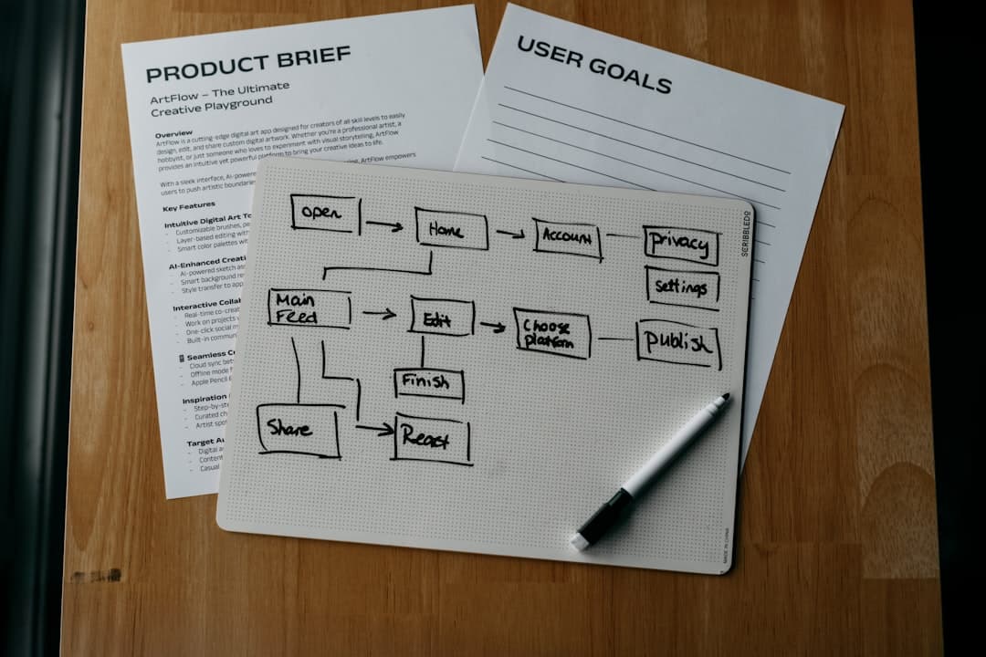
What is the difference between a user flow and a customer journey map?
A user flow is tactical and shows the screens or pages a visitor moves through to complete a single task (signing up, checking out, booking a demo). A customer journey map is strategic and shows the entire arc from first contact to long-term loyalty. You need both: the journey map sets the strategy, the user flows execute it on specific paths.
How do I know which stage a page belongs to?
Look at the intent behind the search query (or referral) that brings people to it. If the query is symptom-focused and educational, the page is awareness. If it compares options, it is consideration. If it includes pricing, your brand name, or a buying verb, it is decision. If it is a task or a feature name owned by an existing customer, it is retention.
Can one page serve multiple stages?
It can, but it usually serves none of them well. A single page trying to introduce a problem, compare solutions, sell the product, and onboard the customer is too long and too unfocused. Split it. Each stage deserves a page (or section) optimized for the question the visitor is asking at that moment.