A Framer loading animation is a short visual that plays while your page or content loads, smoothing the gap between a click and a fully rendered screen. In Framer you build one with an overlay frame, a looping animation, and a transition that fades it out once the page is ready, keeping the experience polished without hurting perceived speed.
Key takeaways
- A loading animation bridges the moment between navigation and a fully painted page, making your site feel intentional.
- In Framer you build it as a top-level overlay frame that covers the screen, then fade or slide it away on load.
- Keep loaders short, ideally under one second, so they reassure visitors without making them wait longer.
- Use simple loops like a spinning mark, a progress bar, or a logo reveal rather than heavy video.
- Avoid blocking real content behind a long animation, which can hurt conversions and Core Web Vitals.
- Test on slow connections and mobile so the loader never traps the visitor.
Why loading animations matter
Loading animations are about perception. A blank flash or a sudden content jump makes a site feel cheap, while a brief, branded animation signals craft. The goal is not to make people wait. It is to make the unavoidable moments of loading feel deliberate and on-brand. Done well, a loader can hold attention for a fraction of a second and then hand off seamlessly to your hero section.
There is a balance to strike. A loader that lingers too long becomes friction, and friction costs conversions. The best Framer loading animations are fast, lightweight, and tied to actual load state rather than a fixed timer that always runs the full length regardless of how quickly the page is ready.
Types of loading animations in Framer
Logo reveal
A logo reveal animates your brand mark into view, then fades out to expose the page. It is the most common choice for agency and product sites because it reinforces brand recognition in the first second of the visit. Keep the reveal tight, a quick fade or scale, so it never feels like a long intro.
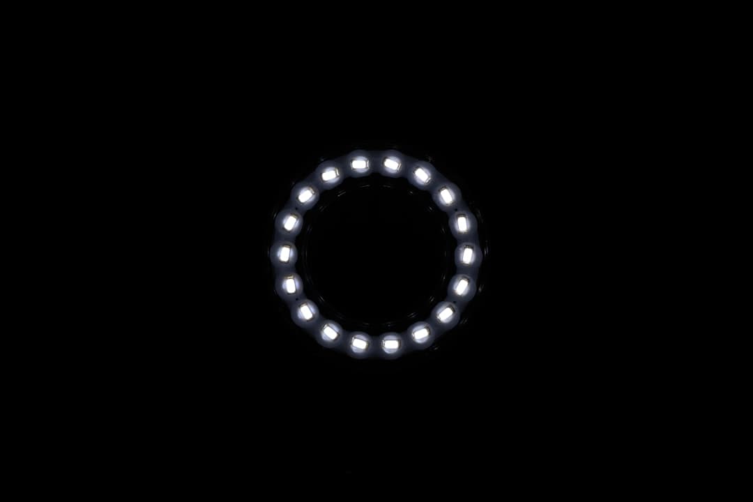
Spinner or loading mark
A simple spinning shape or pulsing dot tells the visitor that work is happening. Spinners are best for dynamic content that genuinely takes time to load, such as a gallery or an embedded tool. For a static marketing page, a spinner can feel unnecessary, so reserve it for cases where loading is real.
Progress bar
A progress bar communicates that something is coming and roughly how far along it is. This pattern works well for content-heavy pages or interactive experiences. Even a simple animated bar gives visitors a sense of control and patience.
Skeleton screens
Skeleton screens show grey placeholder shapes where content will appear, then swap in the real content once it loads. This approach feels fast because the layout is visible immediately, even before the data arrives. It is popular for dashboards and feeds.
How to build a loading animation in Framer
Step 1: Create a full-screen overlay frame
Add a Frame that covers the entire viewport and place it at the very top of your layers list so it sits above all content. Set its background to match your brand, often a solid color or a subtle gradient. This overlay is what the visitor sees first while the page loads behind it.
Step 2: Add your animated element
Inside the overlay, drop in your logo, a shape, or a progress element. Use Framer’s animation features and variants to make it move. A logo can fade and scale, a dot can pulse, a bar can fill. Keep the motion smooth and the duration short. The animation library options in Framer give you easing curves and loop controls to refine the feel. For a deeper look at motion options, our guide to the Framer animation library walks through transitions, variants, and effects you can reuse here.
Step 3: Trigger the exit on load
The overlay needs to disappear once the page is ready. In Framer, use an appear or page-load transition to fade the overlay out and reveal the content beneath it. Set the exit to fire quickly so the visitor is not staring at the loader longer than necessary. A clean fade of around 300 milliseconds usually feels right.
Step 4: Tie timing to real load when possible
The most common mistake is a fixed timer that always runs the full animation, even when the page loaded instantly. Whenever possible, link the loader’s exit to the actual load event so fast connections see a fast site. If you must use a timer, keep it short so it never adds avoidable delay.
Step 5: Handle responsive and slow-connection cases
Preview the loader on mobile and on a throttled connection. Confirm the animation scales correctly and that the overlay always exits, even if something loads slowly. A loader that gets stuck is worse than no loader at all, so build in a safety exit so the content is never permanently hidden.
Performance and SEO considerations
Loading animations sit at the front of the visit, which means they directly affect perceived and measured speed. A heavy loader can delay your Largest Contentful Paint and drag down Core Web Vitals, which Google factors into rankings. Keep the animation lightweight: prefer SVG and CSS-driven motion over large video files or heavy image sequences.
Because the loader runs on every visit, even small weight adds up. Run a Lighthouse or PageSpeed audit after adding it to confirm your scores held. If the loader pushed your metrics down, simplify it. The fastest perceived experience usually comes from a near-instant fade rather than an elaborate intro. If you want components that handle loaders and transitions cleanly, our roundup of the best Framer plugins highlights tools that speed up the build.
Design patterns that work
Match the loader to the site’s personality. A minimal product site benefits from a quiet logo fade, while a bold creative portfolio can carry a more expressive reveal. Keep the color and motion consistent with the rest of the brand so the loader feels like part of the site, not a separate screen.
Avoid loaders that block interaction longer than needed, animations that loop endlessly, and intros that play on every single page navigation within the site. A loader is a first-impression tool, not something to repeat at every click. Many polished templates already ship with tasteful load transitions, so reviewing the best Framer templates for agencies is a quick way to see proven patterns you can adapt.
Common mistakes to avoid
The biggest mistake is making the loader longer than the load. If the page is ready in 200 milliseconds but your animation runs for two seconds, you have just made your fast site feel slow. Always favor real load timing over arbitrary duration.
Other pitfalls include heavy video loaders that hurt performance, loaders without a safety exit that can trap visitors on slow connections, and overlays that block screen readers from reaching the content. Keep the loader light, quick, and accessible, and it will lift your site rather than weigh it down.
When a loading animation is worth it
Not every site needs a loader, so it helps to know when one earns its place. A loading animation is most valuable when your site loads genuinely dynamic content, when your brand identity benefits from a strong first impression, or when a page transition would otherwise feel jarring. For a fast static marketing page that paints almost instantly, a full-screen loader can actually do harm by inserting a delay where none existed.
A useful test is to ask what the visitor sees without the loader. If the page snaps into view cleanly, you probably do not need one. If there is a flash of unstyled content, a layout shift, or a noticeable wait while images load, a loader can smooth that moment. Let the actual experience decide rather than adding an animation because it seems expected.
Page transition animations versus initial loaders
It is worth separating two related ideas. An initial loader runs once when someone first lands on your site. A page transition animates the move between pages as a visitor clicks around. They use similar techniques but serve different goals. The initial loader sets the tone for the visit, while transitions keep navigation feeling fluid.
In Framer, you can apply page transitions so moving from your homepage to your pricing page feels like a smooth slide or fade rather than an abrupt swap. Keep these transitions quick, because a visitor clicking through your site does not want to wait for an animation each time. The same rule applies: motion should support the flow, never slow it down. Used together, a single tasteful initial loader plus light page transitions can make a site feel cohesive and considered.
Matching the loader to brand personality
A loading animation is a small but visible expression of your brand, so it should match the tone of everything else. A minimal, premium product brand is well served by a quiet logo fade on a clean background. A bold, playful creative studio can carry a more expressive animation with movement and color. The motion, easing, and color all communicate something, so make deliberate choices rather than reaching for a default spinner.
Consistency is the goal. The loader should feel like the opening note of the site, not a separate screen that belongs to a different brand. Use your brand colors, your typography for any text, and easing curves that match the rest of your animations so the handoff from loader to content feels seamless.
Want polished animations without the performance hit?
We build fast Framer sites with tasteful loaders, transitions, and motion that look great and keep your Core Web Vitals strong.
Frequently Asked Questions
How long should a Framer loading animation be?
As short as possible. Ideally the loader is tied to the real load event so fast connections see almost no delay. If you use a fixed timer, keep it under one second. A loader that runs longer than the page takes to load makes a fast site feel slow and can cost conversions.
Do loading animations hurt SEO in Framer?
They can if they are heavy. A large video or image-sequence loader delays Largest Contentful Paint and drags down Core Web Vitals, which Google considers in rankings. Keep the animation lightweight with SVG and CSS-driven motion, and run a Lighthouse or PageSpeed check to confirm your scores stayed strong.
How do I make the loader disappear once the page loads in Framer?
Build the loader as a full-screen overlay frame at the top of your layers list, then use an appear or page-load transition to fade it out and reveal the content beneath. Where possible, link the exit to the real load event, and add a safety exit so the overlay always disappears even on slow connections.
Should every page have a loading animation?
No. A loading animation is a first-impression tool, best used once on the initial visit. Replaying a full intro at every internal click frustrates visitors. For pages with genuinely dynamic content, a lighter pattern like a skeleton screen or progress bar is usually better than a full-screen loader.