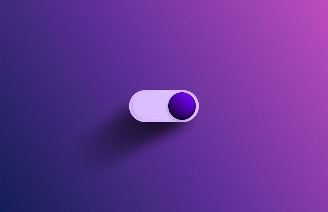
Framer hover effects are interactions that change a layer’s appearance when a visitor’s cursor moves over it, such as a button shifting color, a card lifting with a shadow, or an image scaling slightly. In Framer you create them with the Hover variant: design a second state for the layer, and Framer animates between the default and hover states automatically on mouse enter and exit.
Hover states are one of the highest-leverage details in web design. They tell visitors what is clickable, add polish that signals quality, and guide the eye through a page. Framer treats hover as a first-class interaction, so you build these effects visually rather than writing CSS transitions by hand.
This guide covers every hover technique Framer supports, the exact editor steps to build each one, transition settings that make hovers feel natural, and the mobile considerations that hover-based designs always need to address.
Key takeaways
- Hover effects in Framer are built with the Hover variant, a second state of a component that Framer animates to when the cursor enters.
- Common patterns include color shifts, scale-up, shadow lift, underline reveals, and icon or text swaps.
- The transition curve and duration matter as much as the effect itself, with 150 to 300 milliseconds and an ease-out curve feeling the most natural.
- Hover does not exist on touch devices, so every hover interaction needs a sensible default or tap-based alternative on mobile.
- Subtle, consistent hover states across a site read as more premium than dramatic effects applied inconsistently.
How hover variants work in Framer
In Framer, a component can have multiple variants, which are saved visual states. Every interactive layer starts with a default variant. When you add a Hover variant, you are creating a second snapshot of the layer with different styling, perhaps a darker background, a larger scale, or a visible shadow. Framer then animates between the two states whenever the pointer enters or leaves the layer.
Because the hover state is a full variant, you can change almost anything between default and hover: color, size, position, opacity, shadow, border, text, and even which child layers are visible. This makes Framer hover far more flexible than a basic CSS color swap, since you can reveal an icon, slide in a label, or rearrange a card on hover.
Components versus simple layers
Hover variants live on components. If you try to add a hover state to a plain frame, Framer will offer to convert it into a component first. This is expected and worth accepting, because components also let you reuse the same hover behavior across the whole site. Build a button component once with its hover state, and every instance inherits the interaction.
Building a basic hover effect: step by step
Here is the standard workflow for a button that darkens and lifts slightly on hover.
- Select your button layer and, in the right-hand panel, find the Interactions or Variants section.
- Add a Hover variant. Framer creates a copy of the current state labeled Hover.
- With the Hover variant selected, change the styling you want to animate, for example darken the background fill and add a soft drop shadow.
- Optionally increase the scale to around 1.03 so the button gently grows.
- Open the transition settings and set a duration of about 200 milliseconds with an ease-out curve.
- Preview the page and move your cursor over the button. It should smoothly darken, lift, and grow, then reverse when the cursor leaves.
That single component now carries its hover behavior everywhere it appears. Changing the hover state on the master component updates every instance at once, which keeps a large site consistent without repetitive work.
Hover effect patterns and when to use them
Different elements call for different hover treatments. The table below maps common patterns to the elements they suit best.
| Pattern | What changes on hover | Best for |
|---|---|---|
| Color shift | Background or text color | Buttons, links, navigation items |
| Scale up | Layer grows slightly | Cards, image thumbnails, icons |
| Shadow lift | Drop shadow appears or deepens | Cards, pricing tiles, feature blocks |
| Underline reveal | Animated underline draws in | Text links, menu items |
| Image zoom | Image scales within a fixed frame | Portfolio grids, blog thumbnails |
| Content swap | Hidden label or icon appears | Project cards, team photos, gallery items |
The strongest hover systems pick two or three of these patterns and apply them consistently. Buttons all use the same color and lift, cards all use the same shadow, links all use the same underline. That consistency is what separates a designed site from one that simply has effects bolted on. For richer visual treatments like blur and color overlays on hover, our Framer effects and filters guide walks through how each filter renders and pairs with hover variants.
Transition timing and easing
An effect that snaps instantly feels cheap, and one that drags feels sluggish. The transition between default and hover states is where polish lives.
Duration
For most hover effects, a duration between 150 and 300 milliseconds feels responsive without being abrupt. Buttons and links sit at the faster end around 150 to 200 milliseconds, since visitors expect immediate feedback. Larger movements like a card lifting can run slightly longer, around 250 to 300 milliseconds, so the motion reads clearly.
Easing curve
An ease-out curve, where the motion starts fast and settles gently, feels the most natural for hover because it mirrors how physical objects decelerate. Framer also offers spring transitions, which add a slight overshoot and bounce. Springs work well for playful brands and card scale effects, while ease-out suits professional, restrained designs. Avoid linear easing, which feels mechanical.
Hover and the mobile problem
Touch devices have no hover. A finger either touches an element or it does not, so any information or affordance you hide behind a hover state is invisible to mobile visitors. This is the single most important thing to plan for when designing hover interactions.
Rules for hover on a responsive site
- Never hide essential content or actions behind hover alone. The default state must communicate everything a visitor needs.
- Treat hover as enhancement, not as a requirement. If the hover never fires, the page should still work perfectly.
- For cards that reveal a button on hover, show that button by default on mobile breakpoints.
- Test every hover interaction on a real phone to confirm the default state stands on its own.
When you design the default state to be complete and let hover add a layer of polish on top, the same component serves desktop and mobile gracefully. Many polished starting layouts already handle this correctly, and several in our roundup of the best Framer templates for an agency include hover states that degrade cleanly on touch.
Advanced hover techniques
Once the basics are solid, Framer supports several techniques that elevate a design further.
Staggered child animations
Inside a card component, you can give individual child layers their own hover-driven motion so they animate in sequence. An image scales while a label slides up and an arrow icon fades in, each with a slightly different timing. The result feels choreographed rather than uniform.
Hover-driven color overlays
Portfolio and gallery grids often place a semi-transparent color overlay over an image on hover, with a project title fading in on top. Build this by adding the overlay and title as child layers set to zero opacity in the default state, then to full opacity in the hover variant.
Magnetic and cursor-following effects
For brands that want standout interactivity, Framer supports more elaborate cursor-aware effects, sometimes through community plugins. These should be used sparingly on key call-to-action elements, since overusing them across a page quickly becomes distracting. Our guide to the best Framer plugins lists several that extend interaction beyond the native hover variant when a design genuinely calls for it.
Common hover mistakes to avoid
A few patterns reliably undermine an otherwise clean design. Inconsistent timing across elements makes a site feel unfinished, so standardize your durations and curves. Effects that are too dramatic, such as a button that doubles in size, pull attention away from content. Layout shift on hover, where an element grows and pushes its neighbors around, looks broken, so scale from the center and reserve space. Finally, hover states that change color without enough contrast can fail accessibility checks, so verify that hovered text and backgrounds still meet contrast guidelines.
Frequently Asked Questions
How do I add a hover effect in Framer?
Select the layer you want to animate, open the Interactions or Variants section in the right-hand panel, and add a Hover variant. Framer creates a second state where you change the styling, such as color, scale, or shadow. Set a transition duration and easing curve, then preview the page. Framer animates between the default and hover states automatically when the cursor enters and leaves.
What is the best transition duration for hover effects?
Most hover effects feel best between 150 and 300 milliseconds. Buttons and links sit at the faster end, around 150 to 200 milliseconds, for immediate feedback. Larger movements such as a card lifting can run slightly longer, around 250 to 300 milliseconds. Pair these durations with an ease-out curve so the motion settles gently rather than snapping or dragging.
Do Framer hover effects work on mobile?
Touch devices have no hover state, so hover effects do not fire on phones or tablets. This means you should never hide essential content or actions behind hover alone. Design the default state to be complete, treat hover as enhancement, and show any hover-revealed buttons by default on mobile breakpoints. Always test on a real device.
Can I apply the same hover effect across my whole site?
Yes. Build your hover effect on a component rather than a plain layer. Every instance of that component inherits the same hover behavior, and editing the hover state on the master component updates all instances at once. This is how you keep buttons, cards, and links consistent across a large Framer site without repeating work.
If you want a Framer site where every interaction feels deliberate and consistent, our team designs and builds exclusively in Framer. Explore options on our pricing page or start a conversation through our contact page.