Image compression reduces the file size of your images so they download faster without ruining how they look. Since images are usually the heaviest part of a web page, compressing them well is one of the most effective ways to speed up your site, improve search rankings, and keep visitors from leaving before the page finishes loading.
Key takeaways
- Images are typically the largest contributor to page weight, so compressing them yields the biggest speed gains.
- Compression comes in two kinds: lossless, which preserves every pixel, and lossy, which trades a little quality for a much smaller file.
- Modern formats like WebP deliver the same visual quality at a fraction of the size of older formats.
- Sizing images to their actual display dimensions is as important as compressing them.
- Responsive images serve the right size to each device, avoiding wasted bytes on small screens.
- Framer compresses and serves images automatically, so your visuals stay sharp and fast without manual work.
Why image compression matters so much
On a typical web page, images account for the majority of the total download size. A single uncompressed photo straight from a camera can weigh several megabytes, more than the entire rest of the page combined. When a page is heavy with large images, every visitor waits longer, and many of them leave before the page is usable. That lost traffic never sees your content, your offer, or your call to action.
Because images dominate page weight, compressing them is the highest-leverage performance work you can do. You can shave milliseconds off scripts and styles, but if your hero image is three megabytes, none of that matters. Get the images right and the whole page transforms. This is why image work sits at the center of our broader website speed optimization guide, where image weight is consistently the first and biggest problem to solve.
The encouraging part is that the savings are usually enormous and nearly invisible. Most images can be compressed to a small fraction of their original size with no perceptible loss in quality. The bytes you remove are bytes the human eye was never going to notice, which makes compression close to free performance.
Lossless versus lossy compression
Understanding the two types of compression helps you choose the right approach for each image.
Lossless compression
Lossless compression reduces file size without discarding any image data. When the image is decompressed, it is pixel-for-pixel identical to the original. The trade-off is that the savings are modest compared to lossy methods. Lossless is the right choice for images where every detail must be preserved exactly, such as logos, line art, and graphics with sharp edges and flat colors.
Lossy compression
Lossy compression achieves much smaller files by selectively discarding data the eye is least likely to miss. Done well, the result looks identical to the original at normal viewing, but the file can be a fraction of the size. Push it too far and you start to see artifacts, blurring, and banding. Lossy is the right choice for photographs and complex images, where its aggressive savings shine and the discarded detail is genuinely imperceptible.
The practical skill is matching the method to the image. A photograph compressed losslessly wastes an opportunity for huge savings. A logo compressed too aggressively with lossy settings can look smudged. Choosing deliberately per image type is what separates good compression from a blunt batch job.
Modern image formats
Format choice is as impactful as compression itself. Older formats served the web for decades, but newer formats deliver dramatically better compression for the same visual quality.
WebP is the current workhorse format for the web. It supports both lossy and lossless compression, handles transparency, and typically produces files significantly smaller than the older equivalents at the same quality. For most photographs and graphics, serving WebP is a straightforward and substantial saving with no visible downside in modern browsers.
Even newer formats push compression further still, offering even smaller files at equivalent quality, though support and tooling vary. The practical approach is to serve a modern format like WebP to the browsers that support it, with a fallback to a widely supported format for the rest. The browser picks the best one it can display, and most visitors get the smaller file.
Choosing the right format per image, lossy WebP for photos, lossless for sharp-edged graphics, and a scalable vector format for icons and simple shapes, gives you the best size at the best quality across your whole site.
Sizing images correctly
Compression is only half the job. The other half is making sure each image is the right dimensions for where it appears. A common and costly mistake is uploading a huge image and letting the browser shrink it with styling. The image still downloads at its full enormous size, then gets displayed small, so all those extra bytes are pure waste.
The fix is to size images to their actual display dimensions. If an image is shown at a few hundred pixels wide, it should not be a few thousand pixels wide in the file. Accounting for high-density displays, you might serve an image at roughly twice its display size for crispness, but that is still far smaller than an unconstrained original.
Responsive images take this further by serving different sizes to different devices. A phone receives a small version sized for its screen, while a large monitor receives a larger one. Nobody downloads more than their device can use, which is especially valuable for mobile visitors on slower connections. This pairs naturally with the priorities in our guide to image optimization for websites, where right-sizing and responsive delivery are treated as essential companions to compression.
Compression, trust, and conversion
Slow pages cost conversions, and images are the usual culprit. When a hero image takes seconds to appear, the visitor’s first impression is of a sluggish, unpolished site, and that impression forms before they have read a word. Fast-loading images, by contrast, make the page feel immediate and professional, which builds the confidence that leads to action.
There is a search dimension as well. Loading performance influences rankings, and heavy images are one of the most common reasons a page fails its performance targets. Compressing images well lifts your Core Web Vitals, which helps the page rank, which brings more visitors to convert. The benefit compounds from speed to ranking to traffic.
Quality still matters for trust, which is why the goal is never to crush images into blurry artifacts. A pixelated product photo or a banded background undermines credibility just as much as a slow load. The aim is the sweet spot where the file is small and the image still looks crisp, and that sweet spot is achievable for almost every image with the right method and format.
A practical example
Imagine a portfolio page with a dozen full-width photographs, each uploaded straight from a camera at full resolution in an older format. The page weighs over thirty megabytes, takes many seconds to load, and visitors on phones abandon it before the images appear. The work is beautiful, but almost nobody waits long enough to see it.
The optimized version converts each photograph to a lossy WebP at a quality level where the compression is invisible, resizes every image to the dimensions it actually displays at, and serves smaller versions to phones through responsive images. The same dozen photographs now weigh a small fraction of the original, the page loads quickly even on mobile, and the photographs still look sharp. Nothing about the visual quality changed for the viewer. The download size collapsed, and with it the abandonment.
Common image compression mistakes
The first mistake is uploading full-resolution images and relying on styling to shrink them. The browser still downloads every byte of the original. Always size the file to its display dimensions.
The second is using outdated formats when a modern format like WebP would deliver the same quality at a much smaller size. Format choice alone can halve image weight or more.
The third is over-compressing and introducing visible artifacts. The goal is invisible compression, not the smallest possible file at any cost. Find the point where quality is preserved and stop there.
The fourth is applying one compression setting to every image regardless of type. Photographs and logos need different treatment, and batching them identically either wastes savings or degrades quality.
The fifth is ignoring responsive images and sending the same large file to every device. Phones do not need desktop-sized images, and serving them anyway punishes the exact visitors most sensitive to slow loading.
How Framer helps
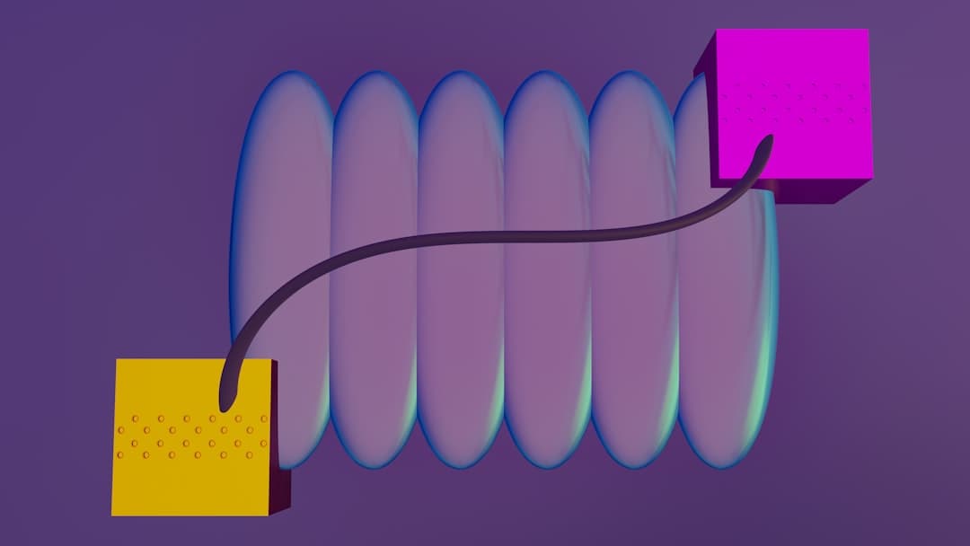
Framer handles image compression and delivery automatically. When you add an image, Framer optimizes it, serves modern formats to browsers that support them, and delivers appropriately sized versions to different devices, all without you opening a compression tool or generating multiple file sizes by hand. The images are served from fast infrastructure close to your visitors, so they arrive quickly everywhere. You upload your visuals at full quality, and Framer takes care of making them fast, which means your site stays both sharp and quick without ongoing manual effort.
This automation removes the most error-prone part of image work. There is no risk of forgetting to resize a hero image, no stale batch of oversized uploads dragging down a landing page, and no need to maintain a pipeline of generated formats and sizes. The optimization happens at the moment of delivery, tuned to each visitor’s browser and device, which is exactly where the savings are largest. For a closer look at the platform-specific behavior, our Framer image optimization guide covers how this works in practice and what it means for your build. The result is that your team can focus on choosing the right visuals while the heavy lifting of compression, format selection, and responsive sizing is handled for you on every page.
Sharp visuals that still load fast
You should not have to choose between beautiful images and a fast site. We build Framer sites where images are optimized automatically. Let us build yours.
Frequently Asked Questions
What is the difference between lossless and lossy compression?
Lossless compression shrinks a file while preserving every pixel exactly, which suits logos and sharp graphics. Lossy compression achieves much smaller files by discarding detail the eye is least likely to notice, which suits photographs. The right choice depends on the image type.
Which image format should I use?
For most photos and graphics, WebP offers the best balance of small size and high quality, with a fallback to a widely supported format for older browsers. Use a scalable vector format for icons and simple shapes, where it stays crisp at any size.
Does compressing images hurt their quality?
Not if done well. Most images can be compressed to a fraction of their size with no visible loss, because the discarded data is what the eye would not notice anyway. Quality only suffers when compression is pushed too far, which you can avoid.
Do I need to compress images manually in Framer?
No. Framer optimizes images for you, serving modern formats and appropriately sized versions automatically. You upload at full quality and Framer handles the compression and delivery, so your site stays fast without you running a separate compression step.