A website wireframe is a structural blueprint that maps content, hierarchy, and layout before any visual design happens. Wireframes come in three fidelity levels — low (rough sketches), mid (greyscale layouts in tools like Figma or Whimsical), and high (near-final mockups with real content) — each serving a different stage of the design process.
What a Wireframe Actually Is (And Is Not)
A wireframe is a layout decision frozen on a page. It is not a sketch of how the site will look; it is a plan for what the site will say and where the eye will go. Color, typography, imagery, brand voice — all of that is design and content work that happens later. The wireframe answers different questions: where does the headline sit, what comes immediately below it, what is the primary call to action, and how does a visitor scan the page in the first three seconds.
The most common wireframing mistake is to skip past structure straight into visual design. The result is a beautiful page that says nothing the audience needs to hear. The second most common mistake is over-investing in wireframe polish. A wireframe with custom typography, real photography, and pixel-perfect spacing is no longer a wireframe — it is a mockup, and you have spent days on it before anyone agreed on the structure.
Wireframes sit in the middle of the broader design process. The website design process guide covers the full sequence from research to launch. Wireframing usually starts after discovery and content strategy, and ends when stakeholders sign off on structure.
The Three Fidelity Levels
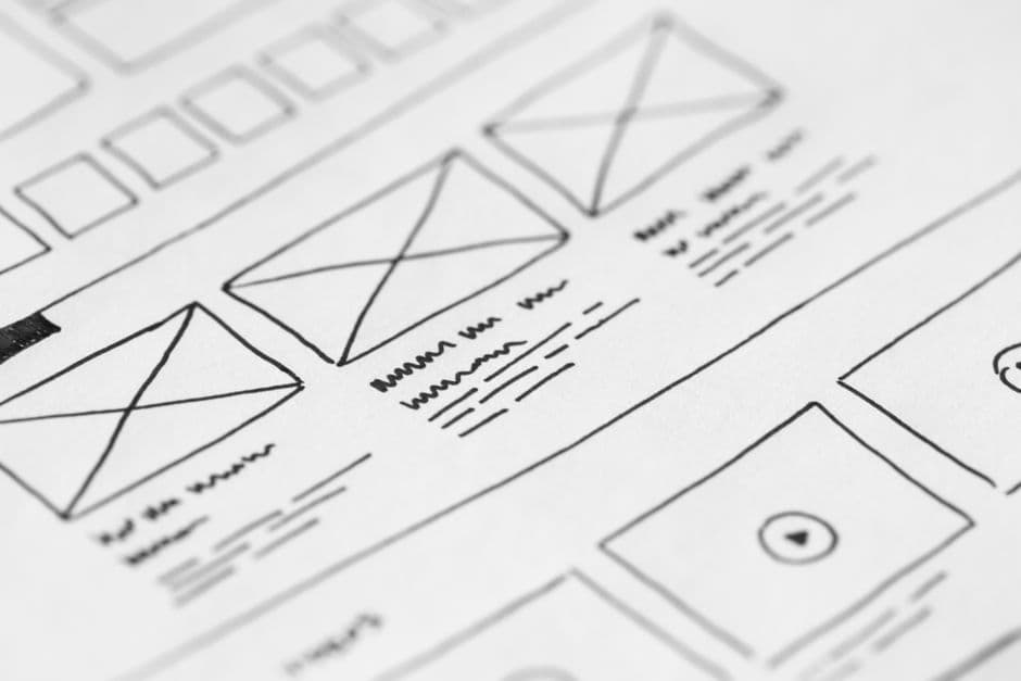
Low-Fidelity Wireframes
Low-fidelity wireframes are rough. Think pencil sketches, whiteboard drawings, or simple boxes-and-text layouts in Whimsical or Balsamiq. There is no real copy, no real imagery, no styling. The point is to get a layout idea onto paper fast enough to throw away.
This is the right stage to explore three or four structural options for the same page. Low-fi cost is low, so the cost of being wrong is also low. Show stakeholders multiple layouts side by side and the conversation becomes “which structure works best?” instead of “do you like this design?”
Skip low-fidelity for small pages or routine layouts you have built before. Use it heavily for complex pages — pricing pages, dashboards, multi-step forms, anything with conditional logic.
Mid-Fidelity Wireframes
Mid-fidelity is the workhorse stage. Greyscale layouts in Figma, real headline copy and body copy (or strong placeholder text), defined spacing and hierarchy, but no visual design treatments yet. The wireframe should communicate the page completely without color or imagery.
Mid-fi wireframes are what most teams mean when they say “wireframe”. They are detailed enough to test with real users, hand off to developers for technical scoping, and review with stakeholders for content and structural sign-off.
The discipline at this stage is restraint. Resist the urge to add color, fonts, or branded illustrations. Once the wireframe starts looking like a mockup, the conversation shifts from structure to aesthetics, and structural feedback dries up.
High-Fidelity Wireframes
High-fidelity wireframes blur into mockups. Real type, real photography, brand colors, finalized component states. Some teams skip this stage entirely and jump from mid-fi to design. Others use high-fi as a final pre-design alignment, especially for stakeholders who struggle to imagine the finished page from a greyscale layout.
The risk with high-fi is sunk cost. The closer the wireframe gets to a finished mockup, the harder it becomes to throw away. If you find yourself defending a layout decision because “we already invested two days in this wireframe,” you have spent too long at the wrong fidelity.
When to Use Each Fidelity Level
The right fidelity depends on the audience, the question being asked, and the cost of being wrong.
For internal exploration with a designer or content strategist, low-fi is fine. The conversation is “what are the options?” and a sketch is enough.
For stakeholder review where the goal is structural sign-off, mid-fi is the sweet spot. It is detailed enough to be specific but rough enough to invite challenge.
For executive presentations or investor reviews, high-fi sometimes wins because non-design audiences cannot read mid-fi well. But beware: showing high-fi too early invites color and font feedback when you wanted structural feedback.
For accessibility reviews and dev hand-off, mid-fi annotated with notes on responsive behavior, interaction states, and edge cases is the standard. The responsive web design guide covers the breakpoint and grid considerations that wireframes need to make explicit.
Tools: Figma, Whimsical, Balsamiq, FigJam
Figma is the industry default for everything from low-fi to high-fi. Components, auto-layout, and the comment system make collaborative wireframing fast. Most agencies and product teams default to Figma.
Whimsical is a strong choice for low-fi flows and structural diagrams. The library of pre-made wireframe components is opinionated and fast. Use Whimsical when speed matters more than polish.
Balsamiq pioneered the deliberately rough sketch aesthetic. It is still useful when you want stakeholders to engage with structure without getting distracted by fidelity. The “this looks unfinished on purpose” effect is hard to replicate in Figma.
FigJam is Figma’s whiteboard product and has become a strong tool for collaborative low-fi work, especially for remote teams brainstorming structure before anyone opens the main design file.
Pick a tool based on team familiarity, not novelty. The wireframing tool matters far less than the rigor of the wireframing process.
How to Present Wireframes to Stakeholders
Stakeholders rarely have design training. They will read a wireframe with all the assumptions and visual reflexes of a person looking at a finished website. That is a problem because they will give feedback on the wrong layer — colors that are not there, photos that are not there, fonts that are not there.
Frame the conversation explicitly. “Today we are reviewing structure. We are not deciding colors, photos, or branding yet. Tell me whether the headline says the right thing, whether the calls to action are in the right place, and whether the page flow makes sense.”
Walk the wireframe top to bottom, narrating the user’s path: “A first-time visitor lands here. They read the headline. The first thing they see is the value proposition, then the social proof, then the primary call to action.” This forces the conversation onto the structure level.
Capture feedback live in the wireframe file. Comments in Figma, sticky notes in FigJam, or annotations in Whimsical all work. Walking out of a stakeholder review with feedback in your head and not on the document is how decisions get lost.
From Wireframe to Mockup to Prototype
Wireframes evolve. The mid-fi wireframe becomes a high-fi mockup once visual design starts. The mockup becomes an interactive prototype once flows are wired up. The prototype becomes the build spec for engineers.
Maintain version history along the way. The wireframe that earned stakeholder sign-off three weeks ago is your reference point if a design decision is being questioned later. “We agreed on this structure on March 12” is a stronger argument when the file shows the timestamp.
Most modern tools handle this natively. Figma’s version history, Framer’s draft system, and FigJam’s snapshots all let you roll back if a later round of edits goes off-track.
Common Wireframing Mistakes
Watch for these patterns in your own work and in reviews:
Skipping wireframes entirely. Going straight from a content brief to a finished design produces beautiful pages that say the wrong thing. Wireframing is a forcing function for content discipline.
Wireframing in too high a fidelity from the start. If your “first wireframe” already has photos and brand colors, it is not a wireframe.
Wireframing without real content. Lorem ipsum hides content problems. Use real headlines, real proof points, real CTAs — even if rough — so the wireframe tests the actual page.
Treating wireframes as immutable. Wireframes are decisions that are easy to change. The point of working in wireframes is to fail cheaply.
Reviewing wireframes only with designers. The people who own the page outcomes — marketing, product, sales — should see and challenge the structure.
Wireframes in 2026
The wireframing stage is changing. AI-assisted tools generate first-pass wireframes from a brief in seconds. Component libraries make hand-drawing boxes feel slow. Some teams now skip mid-fi entirely and jump from low-fi to mockup, relying on robust component systems to keep structural decisions visible inside the visual layer.
The discipline still matters. Whether you call the artifact a wireframe, a structure draft, or a content layout, the question is the same: have we agreed on what the page says, where the eye goes, and what we want the visitor to do, before we start making it look good? If the answer is no, you are not ready for design. The Framer Websites pricing page and many other strong product pages walked through wireframing before a single visual treatment was chosen.
Frequently Asked Questions
Do I always need to wireframe before designing?
For new pages, complex layouts, or any structure your team has not built before — yes. For routine pages following an established pattern (a standard blog post, a basic contact page), wireframing is overkill and slows the process. The rule of thumb: if you cannot describe the page structure in two sentences without ambiguity, wireframe it.
How long should wireframing take?
For a single landing page, a few hours of low-fi exploration plus a half-day of mid-fi refinement is typical. For a full site redesign, a week of dedicated wireframing across the priority pages is reasonable. If wireframing stretches beyond two weeks for a typical project, you are probably treating wireframes as mockups.
Should I wireframe in colour?
No, except at the high-fi stage. Greyscale wireframes force the conversation onto structure, hierarchy, and content. Color triggers aesthetic feedback that derails structural review. Save color for the visual design stage, after structure is signed off.
What is the difference between a wireframe and a mockup?
A wireframe shows structure (greyscale, no real imagery, simplified type). A mockup shows the finished visual design (brand colors, photography, finalized typography). A prototype adds interaction. The same file often evolves through all three stages, but the deliverables answer different questions and are reviewed by different audiences.