University website design is the practice of building higher-education websites that simultaneously serve prospective students, current students, faculty, alumni, donors, and the press. The challenge is that a university site is closer to a small city of microsites than a single product page. Great university sites use clear information architecture, accessibility-first design, and a prospective-student funnel that respects how teenagers and parents actually shop for college.
Why university websites are harder than they look
A typical university site has hundreds of microsites — academic departments, research centers, athletics, libraries, residential life, financial aid, alumni associations, foundations, the news office, faculty pages, and individual program pages. Each has its own audience, its own owner, and its own opinions about how it should look. The job of a university web team is to create coherence across this without losing the unique character of each unit.
On top of that, the prospective-student funnel is the most important conversion path. Universities compete for applications. The site needs to convince a 17-year-old (and their parents) that this school is worth four years and significant tuition. That’s a different design problem than a SaaS landing page or a K-12 school site. The patterns in our K-12 school website design guide partially overlap, but higher ed has its own conventions.
The audiences a university site must serve
- Prospective undergraduate students. Highest-priority funnel. Want academics, life, outcomes, cost.
- Prospective graduate students. Different funnel — research fit, faculty alignment, funding.
- Parents. Researching alongside prospective students. Care about safety, cost, outcomes.
- Current students. Daily logistics — registration, billing, library, dining, transcripts.
- Faculty. Research support, internal services, HR, IT.
- Alumni. Events, giving, networking, transcripts.
- Donors. Giving pages, impact reports, foundation contact.
- Press and public. News, expert directory, public events.
- Researchers and partners. Centers, institutes, partnership pages.
The homepage cannot speak to all of these. Modern university homepages function as a routing layer — direct prospective students to /admissions, current students to /portal, alumni to /alumni, and so on. The homepage’s job is to convince prospective applicants while routing everyone else efficiently.
The prospective-student funnel: design priority one
For most universities, prospective applications drive the budget. The website is the top of that funnel. The 2026 prospective-student journey looks like:
- Discovery. Search, social, peer recommendations, ranking lists.
- Browsing. Homepage, programs, campus life, outcomes.
- Comparison. Cost calculators, virtual tours, program detail pages.
- Inquiry. Request info form, campus visit booking, chat with admissions.
- Application. Common App, Coalition App, or institutional app portal.
Each stage maps to specific page types. The /programs index lists every major and degree, filterable by field, level, format (online, on-campus, hybrid). Each program has its own page with curriculum, faculty, outcomes, cost, application requirements. The /admissions page funnels by applicant type — first-year, transfer, international, graduate. The /campus-life page sells the experience. The /outcomes or /careers page closes the deal with employment and graduate school placement data.
Information architecture: the make-or-break problem
University sites accumulate cruft fast. Without disciplined IA, you end up with 30,000 pages, broken navigation, and a search bar that returns garbage. The IA disciplines that work:
- Audience-based top nav. Prospective Students | Academics | Campus Life | About | Athletics | Giving. Each links to an audience-aware hub.
- Consistent program page template. Every degree program uses the same template: overview, curriculum, faculty, outcomes, admission, cost. Predictability beats novelty.
- Centralized search. Site search that actually works. Algolia, Coveo, or a modern enterprise search. Slow or irrelevant search kills the funnel.
- Microsite governance. Departments can have personality but must follow brand and accessibility standards. Build a design system everyone uses.
- Footer as service directory. Quick links to MyU, library, registrar, IT, public safety, accessibility office.
The IA needs ongoing maintenance. Audit pages annually. Sunset outdated content. Update links. A university website is never “done.”
Outcomes content: the conversion driver
Parents and prospective students are increasingly outcomes-focused. Tuition is high; the question is what students get for it. Universities that publish outcomes data prominently convert better. The key metrics:
- Six-year graduation rate. Federal data; everyone has it.
- Job placement within six months of graduation. By major.
- Median starting salary. By major. Compared to national averages.
- Graduate school placement. Where alumni go for advanced degrees.
- Internship participation. Percentage of students who complete internships.
- Study abroad participation. If relevant to the institution.
- Career services usage. What support is actually available.
Outcomes pages by major, and an outcomes dashboard on the homepage or in /about. Make the data downloadable. Be honest — bad data published transparently builds more trust than no data at all.
Cost transparency: net price calculator and beyond
Sticker prices on universities are misleading because most students receive aid. The net price calculator is now a federal requirement, but the best sites go further. They show:
- Sticker price (tuition, fees, room, board, books).
- Average net price by family income band.
- Percentage of students receiving aid.
- Average grant aid, average loan debt at graduation.
- Comparison to peer institutions.
The /cost or /financial-aid section is one of the highest-intent surfaces. Don’t bury it. The faster a prospective student can estimate their real cost, the faster they move down the funnel.
Accessibility: legal floor and ethical standard
Universities face accessibility lawsuits regularly. Section 508 compliance is mandatory for institutions receiving federal funding. WCAG 2.2 AA is the practical standard. Specific issues that show up in audits: missing alt text, inaccessible PDFs (much of university content lives in PDFs), poor color contrast, keyboard-trap modals, uncaptioned video, inaccessible forms.
Build accessibility into the design system from day one. Train department site owners. Set up automated scanning (axe, WAVE, Siteimprove). Have an accessibility statement and a clear remediation process. Schools that treat accessibility as core, not afterthought, win on both ethics and SEO.
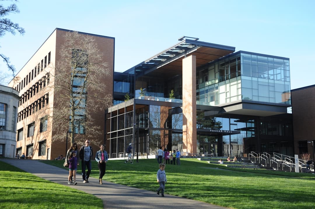
Photography and video: showing campus life
Prospective students choose schools partly on emotional fit. The visuals carry that. Avoid stock photography — it’s spotted instantly. Use real photography of real students and faculty on the real campus. Diverse, candid, recognizable settings. Video walkthroughs of the campus. Virtual tour technology (YouVisit, Concept3D, or in-house 360).
Drone footage of campus is now standard. Short-form video for social can be repurposed for the site. A homepage video loop showing campus life across seasons builds emotional connection faster than any copy.
Faculty and research profiles
Graduate students choose programs largely on faculty. Faculty pages are conversion pages. Each profile needs a photo, current research interests, recent publications, courses taught, contact info, and links to current projects and labs. Don’t let faculty pages stagnate — a 2018 publication list signals an inactive program.
The research office or research division should have its own well-designed sub-section showcasing current grants, research centers, recent publications, and partnership opportunities. This drives external partnerships and research funding.
News and editorial
University news offices generate a constant stream of content. The /news section needs to be both a press resource and a marketing engine. Faculty research highlights, student achievements, athletics, capital projects, and institutional announcements all live here.
Tag content rigorously by school, department, topic, and audience. Build a press contact directory with expert finders — journalists looking for sources should be able to find faculty by topic in under 30 seconds. This is how universities win earned media. Patterns overlap with our about page design guide.
Alumni and giving
Alumni sections need to feel less corporate and more community. Alumni magazines, class notes, event calendars, regional chapter directories. The /giving page is fundraising-critical. Show impact stories. Show the giving levels and what each unlocks. Make giving forms one-page, mobile-friendly, and fast. Integrate with the foundation’s CRM (Blackbaud, Salesforce). Donors don’t bounce because of design alone, but bad design causes drop-off in the donation flow that compounds over a fiscal year.
2026 patterns specific to university websites
- AI chatbots for admissions. Trained on the site, available 24/7, escalating to human counselors when needed.
- Major exploration tools. Interactive quizzes that help undecided students explore programs.
- Career outcomes dashboards. Interactive tools where students can filter by major, see salary ranges, see top employers.
- Virtual tours and 360 content. Especially important for international applicants and accessibility.
- Personalized homepages. Returning visitors see content tailored to their inferred audience.
- Multilingual content. Real translation, not Google Translate widgets, for international recruitment.
- Generative AI search. Search that answers questions, not just returns pages.
- Modern CMS migrations. Many universities are migrating off legacy Cascade or Drupal 7 to modern stacks.
What to avoid in university web design
Crowded homepages trying to serve every audience equally. Buried prospective-student CTAs. Hidden cost information. Stock photography of generic college students. Inaccessible PDF-heavy content. Department microsites that ignore the brand system. Outdated faculty bios. Slow search. Carousels that nobody clicks. Excessive use of brand colors that fail contrast. Animations that distract from content. Hero videos with sound that auto-play.
Frequently asked questions
How do I prioritize audiences on a university homepage?
Prospective undergraduate students are the primary audience for most universities. The hero, top CTA, and primary visuals speak to them. Other audiences route through clearly-labeled secondary navigation. The mistake is trying to give equal homepage real estate to current students, alumni, and faculty — that diffuses the message and weakens the prospective student funnel.
Should we show cost prominently on the homepage?
Not the sticker price, but yes — link to the net price calculator and aid information visibly. Cost is the biggest barrier for prospective students. Hiding it doesn’t reduce concern; it transfers concern to mistrust. Transparency wins.
How should we structure program pages?
Use a consistent template. Overview, curriculum, faculty, outcomes, admission requirements, cost, application CTA. Same structure for every major. Predictability helps users compare and reduces design debt. Don’t let individual departments build their own template.
What CMS works best for university websites?
Drupal is still dominant in higher ed. WordPress is gaining for smaller institutions. Cascade CMS holds market share among traditional Cascade shops. Modern options include Contentful, Sanity, and headless WordPress with a Next.js or Astro front-end. Choose based on team capacity, integration requirements, and governance model. Avoid forcing a tech-first answer over an organizational fit.
Ship your university site faster
We work with institutions on redesigns, microsite governance, and prospective-student funnel optimization. Get in touch or check pricing.