Security SaaS website design must establish trust before it sells anything. The buyer is a CISO, a security engineer, or a compliance lead, and they evaluate vendors against a specific set of trust signals: compliance badges, customer logos in regulated industries, technical credibility in copy, and a demo path that respects their time. Get the trust layer right, and the conversion follows.
Why security SaaS websites are different
Security buyers are professionally paranoid. They evaluate vendors with the assumption that any tool entering their stack could become an attack vector. A flashy homepage with vague claims and missing compliance documentation reads as risk, not innovation. The visual language of security SaaS leans serious, restrained, and detail-rich for a reason.
The stakes are also asymmetric. A wrong purchase in marketing software wastes a quarter. A wrong purchase in security software can lead to a breach, a regulatory fine, or a job loss. Buyers feel that asymmetry, and they look for evidence that you understand it too.
Companies like Snyk, Okta, 1Password, and CrowdStrike have refined the design pattern for this category. The shared playbook centers on trust signals above the fold, technical credibility in the body, and a frictionless path to a real conversation with a security expert.
The trust layer above the fold
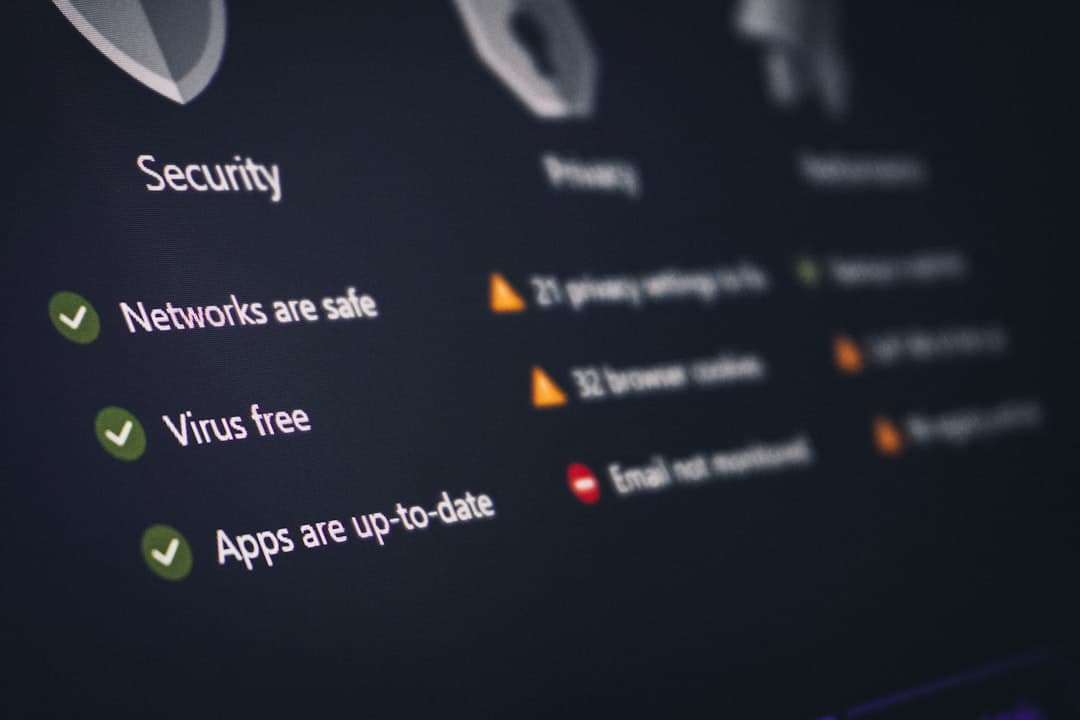
The hero of a security SaaS site does double duty: it has to communicate what the product does and prove that the company itself is trustworthy. The pattern that wins combines a problem-anchored headline, a customer logo bar in your ICP, and visible compliance badges (SOC 2 Type II, ISO 27001, HIPAA where relevant).
Compliance badges as design elements
Compliance badges are not afterthoughts in security SaaS. They are conversion drivers. SOC 2 Type II, ISO 27001, HIPAA, FedRAMP, PCI DSS, and GDPR all signal that you have invested in the audit process and can be trusted with sensitive data.
The best implementations show three to five badges in a clean horizontal strip, either directly under the hero or in a dedicated trust band. Each badge links to your trust portal or a downloadable compliance package. The signal is “we have done this work, here is the evidence.” A trust portal at /trust or /security is now table stakes for any vendor selling into regulated industries.
Customer logos that signal seriousness
For security SaaS, the right logo is worth a thousand product features. A logo bar with five to seven recognizable brands in regulated industries (financial services, healthcare, government, large enterprise) signals that serious security teams have already vetted you. Avoid logos from non-regulated startups in this section. They do not carry the same trust weight.
If you serve a specific vertical, segment the logo bars. Healthcare buyers want to see other healthcare logos. Financial services buyers want to see other banks. Verticalized social proof converts better than generic enterprise logos.
Technical credibility in copy
Security buyers are technical, and they read copy with a critical eye. Generic claims like “next-generation security” or “enterprise-grade protection” read as marketing fluff. Specific claims like “scans 12B lines of code per day across 1,400 enterprise customers” read as a real product.
The copy that converts security buyers names threats specifically (supply chain attacks, credential stuffing, lateral movement, ransomware) and explains your defense mechanism without hand-waving. Reference real CVEs where relevant. Explain your detection methodology. Link to technical whitepapers and threat research from your team.
For broader patterns specific to cybersecurity positioning, the cybersecurity website design guide covers the deeper threat-landscape framing and category positioning.
The demo-first CTA
Security SaaS overwhelmingly runs demo-first. The reason is straightforward: a security tool typically requires environmental access, identity provisioning, and policy configuration before it can demonstrate value. Self-serve trial works only at the lowest end of the market (developer-focused tools like Snyk or 1Password Business).
The CTA pattern that converts: “Get a demo” as the primary button, “Watch the product tour” as a secondary option that lets the buyer evaluate without booking. A pre-recorded product tour with timestamps and speed controls respects the buyer’s time and pre-qualifies them before sales contact.
Some vendors run a “Free assessment” CTA as a third option. This works well when you can deliver real value pre-sale (a free vulnerability scan, a free posture assessment) without giving away the full product.
The threat landscape framing
Security SaaS sites often dedicate a section to the threat landscape: what is changing in the attack surface, what new vulnerabilities are emerging, and how your product addresses them. This section serves three purposes. It educates the buyer, demonstrates your team’s expertise, and primes the buyer to see your product as the answer.
The most effective threat-landscape sections are data-backed. Cite specific stats from Verizon DBIR, CrowdStrike Global Threat Report, IBM Cost of a Data Breach, or your own research. Avoid generic FUD (“hackers are everywhere”). Specific data converts.
The integration ecosystem
Security tools must fit into a stack of identity providers, SIEMs, ticketing systems, and developer workflows. The integration grid is mandatory. The strongest implementations group integrations by category: identity (Okta, Azure AD, Google Workspace), SIEM and SOAR (Splunk, Sentinel, Cortex), developer tools (GitHub, GitLab, Jira), and cloud platforms (AWS, GCP, Azure).
Each integration logo links to a setup guide. Flagship integrations get a one-line description of what the connection unlocks. This section also doubles as SEO real estate for “your-product + integration-name” search queries.
Trust portal and security documentation
A trust portal at /trust or /security has become standard for security SaaS. It hosts your compliance certificates, security documentation, sub-processor list, vulnerability disclosure policy, penetration test summaries, and uptime status. Buyers and procurement teams will request all of this during evaluation. Self-serving it on your site shortens the sales cycle.
The trust portal is also a strong signal of operational maturity. Vendors who can produce a SOC 2 report, a GDPR DPA template, and a sub-processor list within minutes look more credible than vendors who require a sales call to access any of it.
Pricing transparency in security SaaS
Security SaaS has historically been opaque on pricing, but the market is shifting. Self-serve products (developer-focused tools, password managers, basic identity) increasingly publish pricing. Enterprise products (SIEM, EDR, full identity platforms) still gate pricing behind sales conversations because pricing genuinely depends on environmental complexity and seat counts.
The middle ground works for most: publish your starter and team tiers with concrete pricing, show “Custom” or “Contact sales” for enterprise. Pair each tier with a feature comparison and a clear FAQ on annual commitments and seat-based pricing.
For broader B2B conversion patterns that apply across enterprise software, the B2B SaaS website design guide covers homepage architecture for the full enterprise sales motion.
Visual design: serious, not boring
Security SaaS visual design has historically defaulted to dark backgrounds, cyan accents, and generic shield iconography. The buyer notices the cliche. The strongest sites in 2026 reject the cliche while keeping the seriousness. Restrained color palettes, real product screenshots instead of abstract code visualizations, and editorial typography work harder than another shield icon ever will.
Animation should be subtle. A scrolling threat-detection ticker can work as ambient motion. A complicated shader background hurts performance and reads as theatrical, not credible. Keep visual complexity earned by the content.
Where Framer fits for security SaaS
Framer suits security SaaS sites that need to ship a credible, polished marketing site without an agency retainer. The component model handles repeated patterns (compliance badges, integration grids, customer logos) cleanly. The CMS handles security advisories, threat research posts, and customer stories. Native animations cover the motion design without third-party libraries.
For new security products launching in 2026 or established vendors rebuilding outdated marketing sites, Framer compresses the build cycle from months to weeks. See framerwebsites.com/industries/saas for the SaaS-specific design system and conversion patterns.
Frequently Asked Questions
What is the most important section on a security SaaS homepage?
The trust layer above the fold. A security buyer needs to see compliance badges (SOC 2, ISO 27001), customer logos from regulated industries, and a clear demo CTA in the first scroll. Without these signals, the technical buyer leaves before reading the product copy.
Should security SaaS show pricing?
It depends on the tier. Self-serve and team plans should publish concrete pricing. Enterprise tiers can still gate pricing behind a sales conversation when pricing genuinely depends on environment complexity. The middle ground (transparent starter, gated enterprise) works for most.
Is a trust portal mandatory?
For any vendor selling into regulated industries (healthcare, finance, government, large enterprise), yes. A trust portal at /trust or /security with your compliance certificates, sub-processor list, and security documentation shortens the sales cycle by removing back-and-forth with procurement teams.
How do you make a security SaaS site visually distinctive without losing seriousness?
Reject the dark-background-with-cyan-accents cliche. Use a restrained editorial palette, real product screenshots instead of abstract code visualizations, and typography that signals seriousness. Subtle animation only. Visual complexity should be earned by the content, not added for theater.