One page website design works brilliantly when the content fits a single narrative arc: portfolios, single events, single products, or focused campaigns. It fails when the site needs depth, multiple audiences, or content that grows over time. The decision is not about size but about whether the story is linear or branching.
What a one-page website actually is
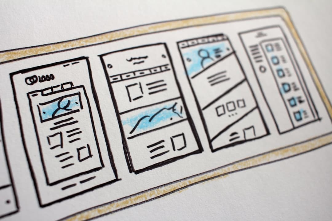
A one-page website is a single HTML document that contains all the content the visitor needs, organized into vertical sections. Navigation usually scrolls smoothly to anchored sections rather than loading new pages. The format trades depth for narrative flow and tends to look more polished because every visual element exists on a single canvas.
The format has been around since the rise of long-scroll design in the early 2010s and remains popular for projects that want to feel like a single statement rather than an information system. The trick is knowing when to use it and when to walk away.
When one-page works brilliantly
Three categories suit one-page design particularly well in 2026.
Portfolios
A designer, photographer, or independent creative typically has 10 to 30 representative pieces. That is the right amount of content for one page. The visitor flows from introduction through work to contact in one continuous gesture. Multiple pages would fragment the impression. For more on portfolio-specific patterns, our Framer portfolio guide covers structure, image treatment, and CTA placement.
Single events
Conferences, workshops, product launches, and album releases all benefit from one-page design because the content is finite and time-bounded. The visitor needs to know what, when, where, and how to act. Spreading that across five subpages adds friction without adding clarity.
Single products or campaigns
A single physical product (a watch, a book, a hardware gadget), a software product in early stage, or a brand campaign all benefit from one-page focus. The page becomes a flagship surface rather than a directory of subpages. Apple has used variants of this approach for decades on product reveal pages.
When one-page does not work
Three categories almost always fail as one-page sites.
Content-heavy sites
Blogs, news sites, knowledge bases, and content libraries need search, taxonomy, and dedicated URLs for individual pieces. Forcing all of that into a single document creates a navigation nightmare and destroys SEO. Multi-page is the only viable architecture.
Multi-product or multi-service businesses
If the business sells five distinct products or services, each deserves a dedicated page. Visitors are searching for specific solutions, not a brand overview. Cramming everything onto one page sends visitors to the wrong section and tanks conversion. Our B2B website design guide covers multi-page architecture for businesses with broad offerings.
Sites with significant SEO ambitions
One-page sites can rank for one or two keywords. They cannot capture long-tail or topic clusters effectively because there are no separate URLs to assign keywords to. If organic search is a major channel, multi-page architecture is the right choice from the start.
Navigation patterns that work
One-page sites use navigation differently than traditional sites. The navigation is a table of contents for the page, not a directory of separate pages.
Smooth scroll to anchors
Click “About” and the page glides to the about section. Click “Contact” and it lands at the form. The smooth scroll behavior is built into modern browsers via CSS scroll-behavior or via JavaScript libraries. Avoid harsh jumps; they break the flow that makes one-page work.
Sticky navigation
The nav should stick to the top of the viewport as the visitor scrolls. This gives them constant access to other sections without scrolling back to the top. Highlight the active section in the nav to give a sense of position.
Mobile nav
On mobile, a hamburger menu opens a vertical list of section links. Tapping a section closes the menu and scrolls. Avoid mega menus or multi-level structures on mobile one-page sites; they fight the format.
Section transitions
The transitions between sections carry significant visual weight on one-page sites. Done well, they make the page feel like a single guided experience.
Visual rhythm
Alternate background colors or imagery between sections to create rhythm. Avoid alternating every section (it gets dizzying); instead, group two or three light sections, then one dark, then another light. The pattern keeps the page visually interesting without exhausting the visitor.
Scroll-triggered animations
Subtle fade-ins, slide-ups, or parallax effects as the visitor reaches each section reinforce the sense that the page is responsive to their movement. Tools like GSAP, Framer Motion, and Lottie make this practical without performance hits if used judiciously. Our Framer animations complete guide covers patterns that translate to one-page contexts.
Avoiding animation overload
Every element animating in is exhausting. Pick the animations that matter (hero reveal, section header entrance, image fade) and let everything else load statically. Less is more.
Performance considerations
One-page sites load all content at once, which can hurt performance if the page contains many images or videos.
Lazy loading
Images below the fold should lazy-load via the loading=”lazy” attribute. Videos should not autoplay below the fold. Heavy animations should pause when their section is offscreen. The page should hit Largest Contentful Paint under 2.5 seconds even with rich content.
Image optimization
One-page sites often feature large hero images and gallery sections. Each image should be served in WebP or AVIF format, sized appropriately for the viewport, and compressed without visible quality loss. Our image optimization for websites guide covers technical patterns. The framerwebsites.com pricing page shows how clean section transitions can support a focused single-document experience.
Critical CSS
Inline critical CSS for the above-the-fold content. Defer non-critical CSS. The hero should be paintable before any external CSS file loads.
SEO realities
One-page SEO is constrained but not hopeless.
What you can rank for
The brand name, the primary product or service, and one or two adjacent keywords. The single H1 and the title tag carry most of the weight. Section H2s help marginally but cannot substitute for separate URLs.
What you cannot rank for
Long-tail variations, topic clusters, or city-specific terms. If those matter, you need multiple pages. Sometimes the right answer is a hybrid: a one-page homepage plus a small number of supporting pages (blog, case studies, contact).
Schema and metadata
Use structured data appropriate for the site type: Organization, LocalBusiness, Person (for portfolios), Event (for event pages), or Product. Even a one-page site benefits from rich snippets in search results.
Build platform considerations
One-page sites suit platforms that handle motion, anchored navigation, and clean section transitions natively. Framer is exceptionally good at this because it ships with smooth scroll, scroll-triggered animations, and a section-based design model out of the box. Webflow is comparable and has stronger SEO controls. WordPress is workable with a page builder but rarely produces the kind of polished one-page result that Framer or Webflow can. For a deeper comparison, our Webflow vs Framer vs WordPress guide breaks down the trade-offs.
Frequently Asked Questions
Can a one-page site be SEO-competitive against multi-page competitors?
For specific narrow queries, yes. For broad topic coverage, no. A photographer’s portfolio can rank well for “{name} photographer” with a one-page site. A photography business trying to rank for “wedding photography in {city}”, “portrait photographer”, and twenty other variations needs multi-page architecture.
How long can a one-page site reasonably be?
Six to ten distinct sections, totaling 2,000 to 5,000 words plus visuals. Beyond that, the page becomes exhausting to scroll and difficult to navigate. If the content cannot fit, the right move is to graduate to multi-page.
Do users actually scroll the whole way down?
If the design is engaging, yes. Scroll-depth analytics from well-built one-page sites typically show 50 to 70% of visitors reaching the footer. Boring one-page sites drop off in the first viewport. Engagement is a design problem, not a format problem.
Should the contact form be on the page or on a separate page?
On the page, in its own section near the bottom. Linking out to a separate contact page breaks the one-page promise and adds friction. The form should be straightforward: name, email, message, send.
When should we graduate from one-page to multi-page?
When content needs categorization (multiple products, multiple services, blog), when SEO becomes a meaningful channel, or when the page starts to feel cramped. The graduation usually happens 12 to 24 months after launch as the business grows. Plan the architecture migration in advance rather than retrofitting under pressure.