Card UI design is the practice of grouping related content into contained, rectangular units that act as a single tappable surface. Cards are the dominant interface pattern in modern web and mobile design because they support scanning, responsive layouts, and clear visual hierarchy. In 2026, the best card designs balance content density, white space, and consistent metadata.
What Is a Card in UI Design?
A card is a self-contained container that groups related content and actions about a single subject. Each card represents one entity: a product, a blog post, a profile, a property listing, a task. The card itself is usually clickable or tappable, and may contain secondary actions like favorites, shares, or quick edits.
Cards became popular through Pinterest, Twitter, and Material Design, and they are now the default pattern for content-heavy interfaces. They work because they break complex pages into bite-sized chunks the eye can scan quickly.
Why Cards Work So Well
The card pattern aligns with how humans process information. Each card is a self-contained unit, so the brain can evaluate it in isolation before moving on. Cards also map naturally to grid layouts, which gives designers predictable responsive behavior across screen sizes.
Cards support strong visual hierarchy within each unit. The image dominates, the title pulls focus, supporting text reinforces, and metadata recedes. This consistency makes scanning fast even when the page has dozens of cards.
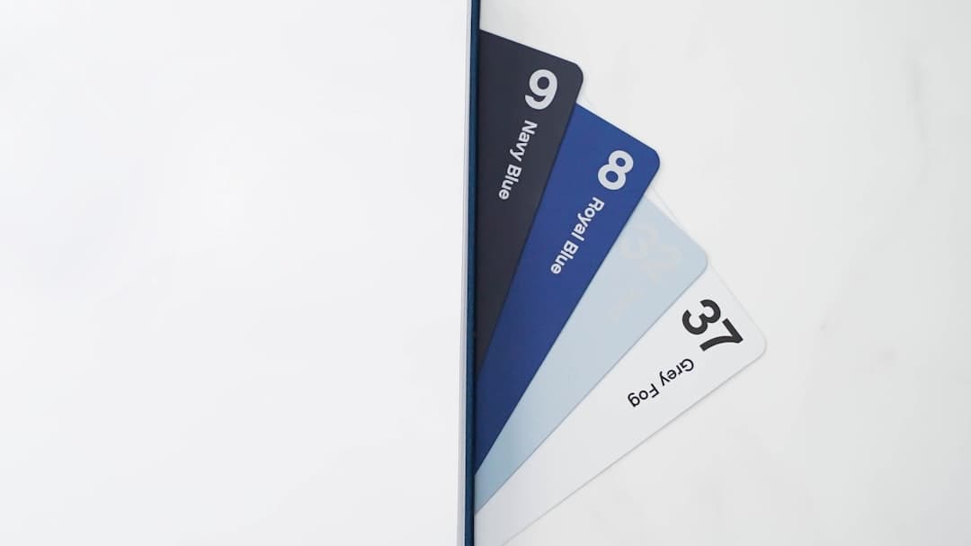
Anatomy of a Card
Most cards share a common anatomy, even when the content varies wildly.
Media Area
An image, video, or icon at the top. Usually 16:9 or 4:3 aspect ratio for landscape cards, 1:1 for square cards. The media is the visual anchor that pulls the eye. For performance, lazy-load images below the fold and serve modern formats like WebP or AVIF with a fallback.
Title
The most important piece of text, usually a heading style. Limited to one or two lines with ellipsis truncation if longer. This is what the user remembers. Match the title style across all cards in a grid so the eye can move predictably from one to the next.
Supporting Text
A short description or excerpt, two to four lines. Provides context but does not compete with the title. Use line-clamp in CSS to enforce a consistent maximum number of lines so every card aligns vertically inside the grid.
Metadata
Smaller text like date, author, category, price, or rating. Always visually subordinate to the title and description. Cap metadata at three items per card. Beyond that the eye stops parsing and starts skipping.
Actions
Buttons or icons that allow the user to take action without leaving the list, such as add to cart, save, share, or like. Keep secondary actions visually quieter than the primary card surface so the card itself remains the main tap target.
For consistent metadata styling, anchor everything to your typography scale rather than ad hoc font sizes.
Card Design Best Practices
Strong card designs follow consistent best practices across products and industries.
- Use consistent aspect ratios. All cards in a grid should have the same image aspect ratio. Variable ratios make the layout feel chaotic.
- Maintain consistent padding. 16 to 24 pixels of internal padding works well for most cards. Less feels cramped, more feels wasteful.
- Limit title lines. One or two lines with ellipsis. Variable title heights make grids look broken.
- Use subtle shadows or borders. A 1 to 4 pixel shadow with low opacity, or a 1 pixel border, is enough to define the card without screaming.
- Make the whole card clickable. Do not require users to hit a small “Read more” link. The entire card surface should be the primary tap target.
- Provide hover states on desktop. A slight lift, shadow change, or scale tells users the card is interactive.
- Use white space generously. See our white space guide for guidance on breathing room.
Card Grid Layouts
Cards are almost always laid out in a grid. The grid behavior across screen sizes is where most card designs succeed or fail.
On desktop, 3 to 4 cards per row works for most product or content lists. On tablet, 2 cards per row. On mobile, 1 card per row, stacked vertically. The transition between breakpoints should feel natural, not jarring.
Use CSS Grid or Flexbox with auto-fit and minmax to make the grid adapt without media query gymnastics. The pattern minmax(280px, 1fr) lets cards reflow gracefully at any screen width. For deeper layout guidance, see our grid systems guide.
Accessibility for Cards
Cards are easy to make and easy to get wrong from an accessibility standpoint. The whole-card click pattern in particular hides several traps.
- Use semantic markup. Wrap each card in an article element, with the title in a heading (H2 or H3 depending on the page outline). Screen readers will announce the heading and list the cards as a navigable set.
- Avoid nested interactive elements. A card with an outer link plus an inner favorite button creates two overlapping tap targets. Use the “redundant link” pattern: the entire card is clickable via JavaScript, but the title contains the actual anchor element so screen readers and middle-click work correctly.
- Make focus states visible. When a card receives keyboard focus, show a clear outline around the entire card, not just the inner link. A 2 to 3 pixel outline at high contrast meets WCAG 2.4.7.
- Announce actions clearly. Use aria-label on icon-only action buttons. “Save” is not enough on its own; “Save Marigold Sofa to wishlist” tells the user what they are saving.
- Support touch and pointer. Tap targets inside cards should be at least 44 by 44 pixels with at least 8 pixels of spacing between them.
Card Variations
Different content types call for different card patterns.
Product Cards
Used in e-commerce. Lead with the product image, then title, price, rating, and add-to-cart button. Keep the image as the dominant element. Avoid more than two badges (sale, new) per card or they cancel each other out.
Article Cards
Used in blogs and news sites. Lead with the featured image, then title, excerpt, author, and date. Often include a category tag. Reading time is a small detail that drives engagement when shown next to the date.
Profile Cards
Used in team pages and social products. Lead with the avatar, then name, role, and a short bio. Include action buttons like follow or message. For team pages, keep the bio under 140 characters so cards stay uniform.
Stat Cards
Used in dashboards. Lead with the metric value in a large font, then the label and a trend indicator. Often grouped in rows of 3 to 5. Use a small sparkline or delta indicator to give the number context at a glance.
Action Cards
Used to prompt users to do something. A prominent CTA inside a card, with a short headline and supporting text. Common in onboarding flows where each card represents one step the user can complete.
Motion and Hover States
Subtle motion makes cards feel interactive without becoming distracting. The goal is to acknowledge user input, not to entertain.
- Lift on hover. A 2 to 4 pixel translateY combined with a slightly larger shadow signals “clickable” without animation overload. Keep transitions to 150 to 200 milliseconds.
- Avoid scaling above 1.03. Larger scale shifts cause neighboring cards to feel pushed away and can break alignment.
- Animate only opacity and transform. These two properties are GPU-accelerated and will not jank during scroll. Avoid animating width, height, or top.
- Respect prefers-reduced-motion. Wrap motion in a media query so users who opt out of motion get instant state changes instead of animations.
Common Card Design Mistakes
Most cards fail in predictable ways. Avoid these to stand out.
Inconsistent Heights
If your cards have variable content lengths and you do not enforce a minimum height or truncation, the grid looks ragged. Pick a strategy and stick to it: truncate, stretch, or align to top.
Tiny Tap Targets
Putting a small “Read more” link as the only interactive element forces users to aim. Make the whole card tappable. Buttons inside cards should be at least 44 by 44 pixels.
Too Much Information
Cards are for scanning, not full details. If a card has 8 metadata fields, it stops being a card and becomes a row. Keep cards focused on the essentials.
Heavy Shadows and Borders
Drop shadows and thick borders can make a page feel cluttered when repeated across dozens of cards. Subtle is almost always better.
Missing Empty States
When the card list has no items, do not just show a blank grid. Use a proper empty state with a clear message and action.
Loading State Mismatches
Skeleton loaders should match the final card dimensions. If your skeleton is shorter than the real card, the layout will jump when content loads, which feels broken even when it is not.
Cards in Design Systems
Cards belong in your design system as a flexible, composable component. Define the base card with slots for media, title, body, metadata, and actions. Then build variants for product, article, profile, and stat. Reuse the same spacing, typography, and shadow tokens across all variants.
Tools like Figma and Framer make this easy with component variants and properties. Engineering can mirror the same structure in React, Vue, or Web Components so design and code stay aligned. Document the constraints in your system: max title lines, max metadata items, supported aspect ratios, and the matrix of allowed variants. Constraints prevent the card from sprawling over time into 14 incompatible versions.
If you want a polished card system built into your site from day one, see our pricing at Framer Websites.
Frequently Asked Questions
What is a card in UI design?
A card is a self-contained rectangular container that groups related content and actions about a single subject. Cards are commonly used in grids to display products, articles, profiles, and other collections.
Should the entire card be clickable?
Yes. Making the whole card surface a tap target is much more usable than requiring users to hit a small link. Use ARIA attributes to ensure the card behaves correctly with assistive technology.
How much padding should a card have?
16 to 24 pixels of internal padding works well for most cards. Less feels cramped, more wastes space. Maintain consistent padding across all cards in a grid.
How many cards per row on desktop?
3 to 4 cards per row works for most desktop layouts. Use 2 per row for richer cards with more content. On tablet drop to 2, and on mobile stack to a single column.
What is the difference between a card and a tile?
The terms are often used interchangeably, but tiles tend to be more uniform and grid-aligned, while cards are flexible containers that can vary in height and content. In practice the patterns overlap.