Best Real Estate Website Design Examples to Study in 2026
The best real estate website design examples in 2026 share a few traits: lightning-fast load times, beautiful photography, intuitive search, and a clear path from listing to inquiry. Below are the patterns and live examples worth studying, organized by what each one does well, so you can borrow the right ideas for your own brokerage or agent site.
Every example here is selected because it solves a real problem. Some win on listing presentation. Others win on neighborhood storytelling. A few win on conversion architecture. None of them rely on tired template patterns. Use them as inspiration for what your site could become with the right platform and design partner.
What Makes a Real Estate Website Truly Excellent
Before walking through examples, the criteria matter. A great real estate website does five things well at once. Each criterion drives a measurable outcome, and the sites that score highly on all five tend to dominate their local markets year after year.
Speed Above Everything
The best real estate sites load in under two seconds on a mobile connection. They use modern image formats, defer non-critical scripts, and avoid plugin sprawl. Sites built on Framer, Webflow, or static React frameworks consistently outperform legacy WordPress builds on Lighthouse scores. Speed is not aesthetic, it is conversion. Every second of delay drops conversion by seven percent or more.
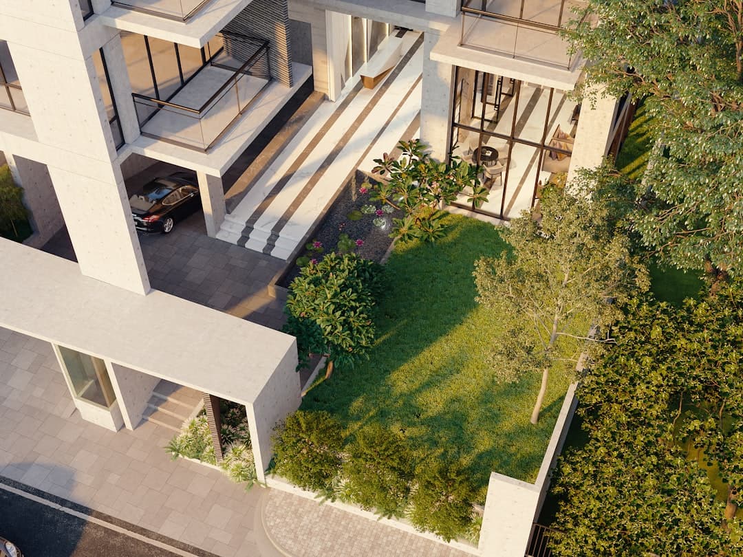
Honest Photography
Stock photography is the death of real estate sites. The best examples invest in original drone footage, twilight shoots, and lifestyle photography that shows neighborhoods rather than abstract cityscapes. When a site uses a real photo of the local farmers market or a recognizable park, visitors feel the connection instantly. Generic Manhattan skylines on a Phoenix agent site signal that nobody bothered.
Clear Lead Routing
The best sites make the next step obvious from every page. Schedule a tour. Request a market report. Talk to an agent. Each call to action is specific to the page context. Generic “Contact Us” buttons get ignored. Specific buttons like “Tour This Home This Weekend” convert at multiples of the generic version.
Examples by Category
Boutique Brokerage Sites
Boutique brokerages tend to produce the most visually interesting real estate websites because they have brand identity and design budgets. Compass set the standard for what a national boutique site can look like, with custom typography, full-bleed photography, and seamless agent profile pages. Smaller boutiques like The Agency in Los Angeles and Side in San Francisco have followed similar patterns: large hero images, minimal navigation, agent stories told as editorial content rather than corporate bios.
The lesson for smaller brokerages is to commit to a point of view. Pick a typeface. Pick a color palette. Pick a photographic style. Apply them consistently across listings, agent pages, and neighborhood content. Generic blue-and-gray real estate templates are forgettable. Brokerages with a real visual identity get remembered, shared, and referred.
Solo Agent Sites Done Right
The best solo agent sites lead with a single confident voice. They feature one or two flagship listings on the homepage. They show the agent’s actual face, not a stock headshot. They include written testimonials with full names and photos. The strongest examples include short market video updates that the agent records monthly. This kind of consistent, personal content compounds over years and builds local authority that no amount of paid advertising can replicate.
For solo agents looking at platforms, a Framer build delivers the speed and design quality of a custom WordPress site at a fraction of the cost and maintenance. See our breakdown of Framer vs Webflow for a closer look at the modern design platform options worth considering.
Listing-First Sites
Some real estate sites prioritize the search experience above everything else. Redfin, Zillow, and Realtor.com dominate this space at the national level. At the brokerage level, sites like Douglas Elliman and Sotheby’s International Realty deliver listing-first experiences with rich filters, map-based search, and luxury property storytelling. Their pages load fast, their search returns instantly, and their listing detail pages walk visitors through every dimension of a home with photos, video, floor plans, and virtual tours.
The lesson here is to treat the listing detail page as a product page. Photography first. Specs second. Story third. Call to action everywhere. The brokerage that treats listings as throwaway data fields loses every battle to the one that treats them as featured content.
Neighborhood-Focused Sites
The strongest local agents build their entire SEO strategy around neighborhood pages. Sites like Suzanne and Company in Boston, Spear Realty in Northern Virginia, and many independent agents in dense urban markets win local search by publishing genuine neighborhood guides with original photography, local restaurant recommendations, school information, and recent sales data. Each guide reads like a magazine feature. The result is page-one rankings for queries that competitors fight over with paid ads.
Design Patterns Worth Stealing
Beyond full-site examples, certain design patterns recur across the best real estate websites. Adopt them selectively where they fit your audience and market.
Hero Sections That Lead With Search
The best real estate sites put a search bar front and center, not a slider. The user arrives knowing what they want: a city, a neighborhood, a price range. Give them the search bar in the first viewport, with auto-suggest enabled. The conversion lift over slider hero sections is consistent and measurable across hundreds of A/B tests.
Map and List Combined Search
Buyers want to see properties on a map alongside a list view. The split-screen pattern that Redfin and Zillow popularized works because it matches how people think about location. The map shows the neighborhood. The list shows the details. Both update as the user scrolls or pans. Implement this pattern carefully though, because a poorly built map view destroys mobile performance. Test on real phones before launching.
Sticky Contact Buttons on Mobile
The best mobile real estate sites have a persistent contact button at the bottom of the screen. Tap to call. Tap to text. Tap to schedule a tour. The button stays visible while the user scrolls. This single design choice often doubles mobile lead volume because it removes the friction of hunting for a contact path.
Platforms Behind the Best Examples
The best real estate sites in 2026 split roughly into three camps. Custom-built sites running on React, Next.js, or other modern frameworks. WordPress sites with heavy custom development and premium IDX. And a growing number of Framer and Webflow sites for marketing pages paired with separate listings portals.
The Framer approach is winning ground fast. It produces sites that score in the high nineties on Lighthouse, edit visually like Figma, and publish instantly. Brokerages that previously spent twelve weeks and forty thousand dollars on a WordPress redesign now ship a better-looking, faster Framer site in five weeks for half the budget. For inspiration on what is possible, browse our gallery of Framer website examples to see how leading brands present their stories.
Common Threads Across the Best Sites
Studying dozens of top real estate sites reveals consistent patterns. They lead with photography, not stock imagery. They make search the primary action, not a buried link. They publish original neighborhood content, not boilerplate. They feature agents as humans, not as listings of credentials. They load fast on mobile. They use schema markup correctly. They are easy to update. None of these are secrets. The best sites just execute on the basics with discipline that most competitors lack.
Specific Sites Worth Bookmarking
A few sites are worth a careful, direct review. Compass.com showcases what national-scale brokerage design can be: huge photography, careful typography, and a search experience that rarely fails. The Agency at theagencyre.com leans into editorial storytelling, with agent profiles that read like magazine features. Sotheby’s International Realty at sothebysrealty.com balances global reach with local nuance, surfacing properties by region with genuine care for visual presentation. On the independent side, Side at side.com presents agent partners as a brand collective, signaling a different model than traditional brokerages.
For technical implementation inspiration, the listing pages on Redfin and Zillow are worth dissecting even if you do not directly compete with them. They have spent millions optimizing the listing detail experience. Save tested patterns for your own site. Borrow the photo gallery interaction, the saved-listing flow, and the clear price hierarchy. Skip the heavy advertising overlays and the aggressive sign-up gates.
Smaller Sites Punching Above Their Weight
Beyond the big names, dozens of smaller brokerage and agent sites quietly outperform their competition. Look at independent boutiques in your specific market. The ones with clean Framer or Webflow builds, professional photography, and substantive neighborhood content are usually the ones earning organic traffic and inbound calls. Bookmark three or four locally and study what they do differently. The patterns transfer directly.
How to Apply These Lessons to Your Site
If your current real estate site is underperforming, start by auditing against the patterns above. Run a Lighthouse test. Count clicks from homepage to a listing. Test the contact form on a phone. Read your neighborhood pages out loud and ask whether anyone unfamiliar with the area would learn something from them. Each weak point is a place to invest.
For brokerages considering a redesign, the platform decision shapes everything else. A Framer build is fast to launch, easy to maintain, and ranks well when the SEO foundation is built right. A WordPress build offers depth of integration with major IDX and CRM systems but demands more ongoing maintenance. Match the platform to your operational reality, not to what the agent down the street uses.
Frequently Asked Questions
What real estate website is best for solo agents?
For solo agents prioritizing speed, design quality, and ease of editing, Framer is the strongest modern option. For solo agents who need deep IDX integration with custom search filters and saved searches, a WordPress site with a premium theme and IDX plugin remains a solid choice. Most solo agents are better served by a fast marketing site paired with a third-party listings portal.
How much does a top-tier real estate website cost?
The flagship sites from major brokerages cost hundreds of thousands to build and maintain. A high-quality custom site for an independent brokerage runs forty to one hundred thousand dollars. A polished agent site on a modern platform like Framer runs eight to twenty thousand for a custom design with original photography.
What real estate website examples should I study before redesigning?
Start with Compass, The Agency, Douglas Elliman, and Sotheby’s International Realty for brokerage-level inspiration. For solo agents, look at independent agents in your market who consistently rank on the first page of Google for neighborhood queries. The agents winning local search are showing you what works in your specific market.
Should my real estate website include video tours?
Yes. Video tours, drone footage, and short walkthrough clips outperform photo-only listings on engagement metrics. Hosting matters: embed video from YouTube or Vimeo rather than self-hosting to keep page weight low. Mute audio by default and never autoplay sound on listing pages.
If you are ready to upgrade your real estate site, our team builds fast, beautifully designed sites that convert. Reach out through framerwebsites.com/contact to discuss your project.