A B2B SaaS website has one job: convince a busy buyer that your product solves a specific, expensive problem, then move them into a demo or trial in under a minute. Everything else, the gradients, the animations, the philosophical hero copy, is decoration. The best B2B SaaS sites in 2026 read like product documentation crossed with a sales deck, not like agency portfolios.
Why B2B SaaS Websites Are Different from Every Other Website
The buyer is not the user. A VP of Marketing approving a $40,000 ARR contract is not the marketer who will live in your tool every day. Your homepage has to land for both, plus a procurement contact, plus an IT reviewer who is checking SOC 2 status. That is four audiences on one page, and most SaaS sites only design for one.
The decision cycle is also longer than almost any other category. The average B2B SaaS deal involves between 6 and 11 stakeholders and takes between 30 and 180 days. Your website is not closing the deal in one visit. It is feeding a long internal sales process where someone shares a link in Slack, someone else opens it on a Tuesday afternoon, and a third person reviews pricing the following week. Design for that reality.
The Pages You Actually Need
Most B2B SaaS sites overbuild. The minimum viable structure is seven pages: home, product (one per major capability or one combined), use cases or solutions (segmented by persona or industry), pricing, customers, security, and a contact or demo page. Everything else, including the blog, exists to support these.
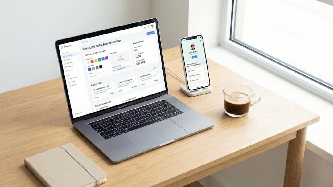
The product page is where most SaaS sites fail. It either lists 40 features in a grid (overwhelming and unmemorable) or shows three abstract benefits with no proof (vague and untrusted). The pattern that works in 2026: lead with one screenshot of the actual product doing the actual job, then show three to five capabilities with annotated UI screenshots, then close with a workflow diagram showing where the product sits in the buyer’s stack.
Hero Sections That Convert
The hero section sets everything. You have about three seconds before a visitor either scrolls or bounces. The formula that consistently outperforms: a specific outcome headline, a one-sentence subheading naming the buyer and the mechanism, a primary CTA, and a product visual or short loop video. Avoid the abstract pattern (“The future of revenue”) and the metaphor pattern (“Unleash your team’s potential”). Both test poorly with B2B buyers because neither tells them what the product does.
Strong examples to study: Linear shows the product the moment the page loads, with copy that names exactly who it is for. Vercel leads with a deploy preview that proves the product is real. Stripe’s homepage demonstrates its API with live code. All three work because they show, not tell.
Trust Signals That Move Enterprise Deals
Logos of recognizable customers above the fold. SOC 2 Type II, ISO 27001, and HIPAA badges if applicable, with links to a real trust center. Customer quote with a face, full name, title, and company logo (not initials and a stock photo). G2 or Capterra rating with star count and review volume. Funding announcement or revenue milestone if either is impressive enough to mention.
The single most underused trust signal: a public security page with a real SOC 2 attestation, a subprocessor list, a data processing addendum download, and a vulnerability disclosure email. Buyers in regulated industries (healthcare, finance, government) will not move forward without this. Building one well takes a week and removes the largest objection in mid-market deals.
Pricing Pages That Earn Demo Requests
The old advice was to hide pricing for B2B. That advice is obsolete. In 2026, buyers Google your pricing before they ever speak with sales, and a hidden pricing page sends them to your competitor’s transparent one. The new pattern: show pricing tiers with realistic numbers, anchor the middle tier as “most popular,” name what is included in each, and reserve a single “Contact sales” CTA for the top tier. Add an FAQ that handles the seven objections sales hears most.
If your pricing genuinely has to be quote-based (custom enterprise deals only), then publish a pricing methodology page: what variables drive cost, a sample range, and what a typical deal looks like. “Contact sales” with no context is a conversion killer. For a deeper dive into SaaS landing page best practices, the patterns that win on landing pages also apply to pricing.
Demo and Trial Flows
Every B2B SaaS site needs a primary conversion goal. For most, it is one of: book a demo, start a free trial, or download a lead magnet. Pick one and design every page around it. Sites with two or three competing primary CTAs convert worse than sites with one clear path.
The demo booking flow is where most SaaS sites leak pipeline. Common mistakes: a 14-field form that asks for company size and pain points before the meeting; a Calendly link that opens with no preselected sales rep so the prospect waits days for someone to claim them; an embedded scheduler that breaks on mobile. The fix is a four-field form (name, email, company, company size) that drops directly into a 30-minute calendar slot with same-day or next-day availability. Friction kills demos. For a complete look at the SaaS website design playbook, the principles extend across the funnel.
Examples Worth Studying in 2026
Linear: minimalist, fast, opinionated. Their homepage is essentially the product, scrolled. Notion: dense in content, light in chrome, with extensive use case pages tailored by persona. Attio: extreme attention to motion design without sacrificing speed. Ramp: financial software that feels like a consumer app, with category leadership through positioning copy. Mercury: banking-grade trust signals integrated naturally into a clean design. Each of these is built or could be built on a fast modern platform like Framer or Webflow.
Recommended Platform Stack
For most B2B SaaS marketing sites in the 0 to $50M ARR range, the right stack is: Framer or Webflow for the marketing site (designer-friendly, fast, easy to update), a separate Next.js or Remix app for the product itself, a CMS-driven blog (Framer CMS or Webflow CMS for low volume, Sanity or Contentful at higher volume), and analytics through PostHog plus Google Analytics 4. WordPress still works but increasingly feels heavy and dated for SaaS, especially against Framer’s animation and motion capabilities.
Squarespace and Wix are wrong tools for B2B SaaS. They cap at small business, lack the developer escape hatches you need at scale, and look generic. Shopify is for ecommerce, not SaaS. If you are weighing options, our analysis of why B2B SaaS companies switch to Framer covers the specifics.
Common Mistakes to Avoid
Vague hero copy that could apply to any company in your category. Marketing site CMS used as the product documentation system (use a real docs platform like Mintlify or GitBook). Customer logos with no permission and no case study behind them. Pricing hidden behind “Contact sales” when competitors publish numbers. Demo booking that requires a 12-field form. Blog posts that target the wrong keywords because someone confused brand SEO with product SEO. No security or trust center page. Animations that fight with content instead of supporting it.
Frequently Asked Questions
How long should a B2B SaaS website take to build?
A focused team can ship a strong eight to ten page B2B SaaS marketing site in four to six weeks on Framer or Webflow. Custom illustration, video production, and copy interviews are usually the bottleneck, not the build itself. Sites that take six months are typically suffering from stakeholder review cycles, not technical complexity.
What pages convert highest for B2B SaaS?
Across most SaaS sites we have measured, the highest-converting pages are use case or solutions pages targeted at a specific persona or industry, followed by comparison pages (alternatives content), then the pricing page. The homepage gets the most traffic but rarely the highest conversion rate.
How important is the blog for B2B SaaS?
Critical for organic acquisition, but only if the topics align with buyer search intent at the bottom of the funnel. Generic thought leadership posts rarely convert. Comparison posts, integration tutorials, and category-defining guides do. Most SaaS blogs underperform because they target the wrong keywords.
Should we A/B test the homepage?
Only after you have enough traffic for statistical significance, which usually means at least 5,000 weekly homepage visitors. Below that, qualitative feedback (sales call recordings, user testing) is more reliable than split tests. Test variants of CTA copy and hero headlines first; layout tests rarely move the needle.
What does a good B2B SaaS website cost?
Productized agency work in 2026 typically runs $15,000 to $50,000 for a complete marketing site rebuild on Framer or Webflow. Custom enterprise builds with bespoke illustration and video can run $80,000 to $250,000. The DIY route on Framer with a strong template is achievable in the $1,500 to $5,000 range if you have an in-house designer.
If you are planning a B2B SaaS site rebuild and want it shipped in weeks rather than quarters, our team builds on Framer for SaaS companies with a productized process designed around speed and conversion. Send us the brief and we will scope it the same week.