The About page is the second-most-visited page on most websites after the homepage, and one of the most-commonly underestimated. It is where evaluators decide whether the company is real, credible, and worth doing business with. The pattern that works in 2026 is a clear narrative arc (origin, mission, what we believe), real photography of real people, specific numbers that signal traction, and a clean conversion path that does not feel forced.
Who reads the About page
About page traffic skews toward high-intent visitors: prospective customers researching before a sales call, candidates considering applying, journalists writing a story, partners evaluating fit, and internal team members sharing the company link with friends. None of them are casual readers. They are reading because they are deciding whether the company is real and serious.
This audience profile changes what the page should optimize for. Not vague brand storytelling. Not paragraphs of mission language. Specific signals: who runs the company, where they sit, how long they have been at it, who their customers are, what the company believes, and why they are different. Vague About pages fail this audience hard. Specific About pages convert.
The narrative arc
The strongest About pages follow a recognizable narrative arc. The pattern: a one-line mission statement at the top that says what the company does and why, an origin story that explains how the company started and why the founders cared, a current state section that grounds the company in real numbers (customers served, team size, revenue or funding milestones, geographic reach), a beliefs or values section that goes beyond the standard “customer first, integrity, innovation” filler, and a clear call to action at the bottom (join the team, talk to sales, book a demo).
Notion’s About page does this well. Stripe’s company page does it. Patagonia’s About page is famous for it. The arc is universal, but the specifics have to be unique. The mistake is copying the arc without copying the specificity. “Founded in 2018” works because it is concrete; “Founded with a vision to disrupt the industry” does not.
Mission statements that earn trust
Mission statements are the single most-overwritten part of most About pages. The default pattern is a paragraph of abstract aspirational language that says nothing. The pattern that works is a single concrete sentence that explains what the company does and for whom.
Examples that work: “We help small businesses accept payments online” (Stripe-adjacent). “We make project management software for software teams” (Linear). “We help schools teach reading better.” “We design and build websites in Framer for B2B SaaS companies.” Each of these tells you what they do, who they do it for, and how. Each one is harder to write than “We are reimagining the future of work” because it requires specificity.
The test: if a competitor could swap their logo into your mission statement and it would still be true, the mission is too generic. Rewrite it until it is uniquely yours.
Origin story and founder bios
The origin story is the highest-engagement section on most About pages. Tell it like a real story, not a marketing brochure. The patterns that work: a specific moment that triggered the company (a problem the founder hit, a job they had, a customer they met), a clear arc from that moment to the current company, and honest acknowledgment of where the company is in its journey.
Founder bios do best when they go beyond the standard headshot-plus-LinkedIn. Include the previous companies (especially recognizable ones), why this person is the right person to build this company, and a short personal note (a hobby, a city they live in, a project they are proud of). Founder bios are conversion content for enterprise sales; buyers research the founders before signing big contracts.
For more on bio and credibility patterns across the site, our web design best practices guide covers the patterns that earn trust on long-tail pages.
Specific numbers signal traction
Specific numbers on the About page outperform generic claims by a wide margin. The numbers worth including: number of customers (“5,000 companies”), team size (“42 people across 9 countries”), funding history (“$28M raised from Sequoia and Index”), revenue or milestones (“$25M ARR” if disclosed, or “profitable since year three”), age of company (“founded in 2017”), geographic footprint (“customers in 80 countries”), and product scale (“processed $4B in transactions”).
The numbers do not have to be huge. “42 people” is more credible than “a fast-growing global team.” “7 customers” is fine for a Series A startup if the customers are notable. The point is specificity. Buyers and candidates discount vague claims and trust precise numbers.
Avoid stat inflation. “Trusted by industry leaders” without naming any leaders, “award-winning team” without naming awards, “loved by customers” without quotes. These signal that the real numbers are not flattering enough to publish. Either find the real numbers or remove the section.
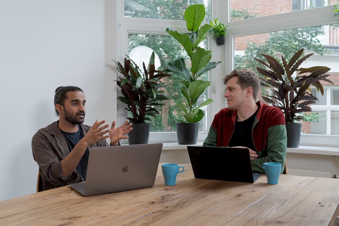
Team page and photography
The team page (sometimes a section of About, sometimes a separate page) is one of the highest-traffic sub-sections of any company website. Candidates use it heavily. Enterprise buyers click through it to verify the company is real. Press uses it to find the right person to interview.
The patterns that work: real photography (not stock, not headshots from someone’s LinkedIn), short bios with role and background, clear team or department grouping for larger companies, links to LinkedIn or personal sites for senior team members. Avoid mismatched photo styles where some headshots are professional and others are clearly cropped from a wedding. Either invest in a half-day team shoot or use simple consistent treatments (illustrated avatars, plain background headshots) until the budget is there.
For early-stage companies with two to ten people, naming and photographing every team member is a strong signal. For larger companies, consider featuring leadership prominently and linking to a careers page for the broader team. Either way, the visitor should be able to put faces to the company in 15 seconds.
Values and beliefs without the cringe
The values section is where most About pages collapse into corporate cliche. The default list (Integrity, Excellence, Customer Focus, Innovation, Teamwork) is meaningless because every company claims them. The pattern that works is a list of beliefs or principles that are specific, slightly contrarian, and would actually disqualify the wrong customers, candidates, or partners.
Stripe’s principles (“Move with urgency and focus,” “Trust and amplify”) are operational. Basecamp’s manifesto (“It will not always be roses”) is honest. Patagonia’s environmental principles are activist. Each of these tells a candidate what the company will and will not do. That is the test. If your values would not disqualify any candidate or any customer, they are too generic.
Three to seven beliefs is the right count. Each one should have a sentence or two of context, ideally with a real example of how it shows up in practice. Avoid bulleted single-word values; the words alone do not earn trust.
Press, recognition, and proof
If the company has earned real press or recognition, the About page is the right place to surface it. The patterns that work: a logo strip of publications that have actually written about the company (linked to the actual articles), a list of awards or recognitions with the awarding body and year, and customer logos with permission to display.
Avoid faking press. “As seen in Forbes” with a link to a guest contributor article that anyone can publish does not impress sophisticated buyers. Avoid logo strips of customers the company does not actually have under contract. The penalty for a discovered exaggeration is worse than the benefit of an exaggerated claim.
The CTA at the bottom
About pages should end with a clear conversion path that fits the visitor’s likely intent. The patterns that work: a primary CTA aligned with the company’s main goal (book a demo, start free, see open roles), and one or two secondary paths for different visitors (“Read our blog,” “See our customers,” “Contact us”). Avoid five competing CTAs at the bottom; pick the one or two paths that match who is reading.
For broader conversion-section design, our landing page design best practices covers the placement and structure that work across page types.
Common About page mistakes
Mission statements that say nothing specific. Generic value lists no one will remember. Stock photography of strangers in an office. Origin stories written by a marketing agency that never spoke to the founders. Founder bios with no LinkedIn links and no previous companies. Vague claims (“trusted by industry leaders”) with no actual logos. Outdated team pages where half the people listed have left the company. Missing locations and headquarters when the company genuinely has them. Awards from organizations no one has heard of, listed as if they were industry-defining. Walls of text with no headings, no scan-able structure, and no clear narrative arc. Pages that load to a 600-pixel hero of a stock photo before any actual content.
One more, common across both early and late stage companies: About pages that feel written by committee, with every department adding their preferred sentence until the page reads like a Frankenstein of internal politics. The remedy is to assign a single owner who has authority to cut, not just add.
Recommended structure and length
For most companies, the About page should fit in three to five scrolls on desktop, with a clear scroll-stopping element in each section. Suggested structure: hero with one-line mission, origin story (200 to 400 words), specific numbers section, team or leadership block with photos, values or beliefs section, optional press logo strip, and a single clear CTA. Total: 600 to 1,200 words of body copy. Longer About pages can work for editorial brands and large companies with rich histories, but for most B2B SaaS or service companies, shorter is better.
If the page is doing serious recruiting work (most early-stage companies), add a careers band: open roles with quick links, why people work here, and a few employee testimonials. Recruiting traffic on About pages is significant and underrated.
Frequently Asked Questions
How long should an About page be?
Most About pages should be 600 to 1,200 words of body copy, fitting in three to five scrolls on desktop. Shorter is fine for early-stage companies; longer can work for established brands with rich histories. The right length is the one that says everything important without filler. If you can cut a paragraph and lose nothing, cut it.
What should be on an About page?
A clear mission statement, an origin story, specific numbers showing traction (customers, team size, milestones), photos and bios of leadership or the full team, beliefs or values that go beyond cliche, optional press and recognition, and a clear CTA. Industry-specific additions vary: nonprofits add impact metrics, agencies add work samples, ecommerce brands add manufacturing or sourcing details.
Should the About page have a video?
An optional founder or company video can lift engagement significantly, especially for service businesses where personality matters (agencies, consulting, healthcare practices). Keep it under 90 seconds, captioned, and not autoplay. For most pure software companies, video is nice but not essential; the written narrative does most of the work.
Should the About page link to LinkedIn profiles?
Yes for founders and senior leadership. Linking to LinkedIn earns trust because it lets buyers and candidates verify the bios. Avoid linking to incomplete or stale LinkedIn profiles; either update them or skip the link for that person. For larger teams, linking each person individually adds clutter; a single “see the team on LinkedIn” link to the company page can work.
How often should the About page be updated?
At least every six months. Numbers (customer count, team size, revenue milestones, funding) get stale fast. Team pages need updating when people join or leave. Year references (“founded in 2018”) need updating. Outdated About pages signal organizational neglect to the highest-intent visitors on the site.
If you want an About page that earns trust on the first scroll and a site built to back it up (clean structure, real photography, specific numbers), we design and build in Framer with production-ready About and team systems. Get in touch to scope your build.