Top picks for 2026: a Minimalist Designer Portfolio template wins for visual designers, a Bold Creative Director Portfolio template suits brand leads who need maximum personality, and a Developer Engineer Portfolio template fits technical builders who want code samples and metrics alongside case studies. All three deploy in a weekend on Framer.
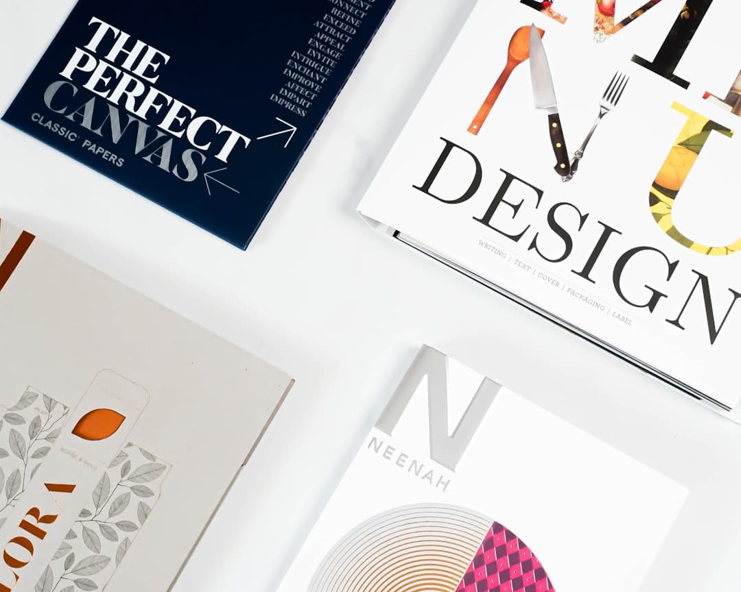
Framer has become a serious contender for portfolio sites in 2026 because it combines visual editing with real animation primitives, responsive layouts, and clean code output that scores well on PageSpeed. This guide walks through ten portfolio patterns, who each fits, and how to customize them.
What Makes a Great Portfolio Template
Most portfolios fail because they treat the project grid as the whole job. The grid matters, but it sits inside a larger system of signals that build trust with the person viewing your work. The non-negotiables for a portfolio template in 2026:
- Project showcase grid that handles 6 to 30 entries without feeling cluttered, with hover states that preview without overwhelming.
- Individual case study pages with room for context, process, decisions, and outcomes, not just final renders.
- About section that answers who you are, what you do best, and who you work with, in under 60 seconds of reading.
- Contact section that makes the next step obvious, with a clear primary action and either a form, a Calendly link, or a direct email.
- Mobile parity because more than half of portfolio traffic now arrives on phones, including from hiring managers checking work on a couch.
- Loading performance good enough to keep visitors past the hero, which means careful image optimization and minimal third-party scripts.
Selection Criteria for This List
The ten patterns below were chosen against five criteria: clarity of visual hierarchy, flexibility for different work types, customization depth available in Framer without code, mobile responsiveness, and how naturally each pattern accommodates real client work. Each entry covers the layout, the ideal user, the standout feature, and a customization tip you can apply on day one.
The 10 Portfolio Template Patterns Worth Building On
1. Minimalist Designer Portfolio
This pattern leads with a single oversized typographic statement, a thin navigation bar, and a vertical scroll of large project thumbnails with generous whitespace. Case study pages follow the same restraint: hero image, short brief, three to five process images, outcomes.
Ideal user: visual, brand, and editorial designers whose work benefits from quiet framing.
What stands out: whitespace is the design system. The underlying page rhythm does the heavy lifting, so swapping fonts, colors, and projects never breaks the feel.
Customization tip: resist accent colors and animation flourishes. Keep the palette to two colors plus one neutral, and let one carefully timed fade-in carry the whole page.
2. Bold Creative Director Portfolio
The opposite end of the spectrum: oversized type that fills the viewport, full-bleed video or image heroes, color blocks that shift between sections, and aggressive cursor interactions. Project pages double down with full-width imagery and dramatic transitions.
Ideal user: creative directors, brand leads, and art directors whose pitch is “I will give your brand a strong point of view.”
What stands out: the home page becomes the proof. Visitors decide whether you have taste in the first six seconds, and this layout uses every pixel to make that case.
Customization tip: pick one signature interaction (custom cursor, magnetic buttons, or section color shifts) and use it consistently. Stacking three or four reads as noise instead of voice.
3. Developer Engineer Portfolio
A structured pattern built around long-form case studies. The home page lists projects with a title, role, stack chips (React, TypeScript, Next.js, Vercel), and a one-sentence outcome. Each project page reads like a short engineering write-up: problem, constraints, architecture diagram, key decisions, code snippet, measurable result.
Ideal user: software engineers, technical product designers, and full-stack builders applying to senior or staff roles.
What stands out: case studies double as evidence of how you think. Hiring managers can skim them in two minutes.
Customization tip: include one project where you describe a decision you got wrong and how you recovered. It signals seniority faster than any list of frameworks.
4. 3D and Motion Designer Portfolio
A high-motion pattern built around Lottie and Spline embeds, video loops, and scroll-linked animations. The hero is usually a looping 3D scene or a continuous reel.
Ideal user: motion designers, 3D artists, and animators in advertising, product, or game studios.
What stands out: the site itself feels animated. Done well, it shows technical command of motion in the same way the embedded work does.
Customization tip: set strict file budgets. Three to five short loops per page is enough. Compress every video under 2 MB and lazy-load anything below the fold, or the loading state becomes the first impression.
5. Photography Portfolio
Full-bleed image galleries dominate, with minimal chrome. Navigation is often a small floating menu or a left-rail index. Series are grouped by client, location, or theme, with one cover image leading into a full set.
Ideal user: commercial photographers, editorial photographers, and visual storytellers selling on craft and consistency.
What stands out: the layout disappears so images become the entire experience. Color, crop, and pacing become the design.
Customization tip: commit to a consistent aspect ratio across cover images so the home grid feels intentional. For deeper inspiration, see the related photography studio website design guide.
6. Architecture and Spatial Portfolio
A measured, editorial pattern. Projects are organized by year and location, with technical drawings, plans, and photography paired side by side. Typography is conservative and animation is minimal.
Ideal user: architects, interior designers, urban designers, and spatial design studios.
What stands out: the layout respects the work. Clients in this category buy seriousness as much as creativity.
Customization tip: include scale references in every image. A human figure or a dimension callout helps non-specialist clients understand the work.
7. User Experience Research Portfolio
A content-dense pattern for research-led practitioners. Each case study is a structured document: research question, methods, participants, findings, recommendations, impact. Visuals are charts, journey maps, and synthesized quotes.
Ideal user: UX researchers, service designers, and strategists applying to roles where the deliverable is insight rather than interface.
What stands out: the layout treats writing as a first-class element. A reader can follow project logic without needing to talk to you.
Customization tip: add a “What I would do differently” section to one case study. It signals reflective practice and gives interviewers a natural opening question.
8. Multi-Discipline Freelancer Portfolio
Built for people who work across categories (design, writing, consulting, code) without diluting any one of them. The home page segments work into clear service lanes with two or three featured projects underneath each.
Ideal user: independent professionals selling more than one service, including hybrid designer-developers and design-strategy consultants.
What stands out: visitors self-select into the lane they care about within seconds. The best Framer templates for consultants guide compares adjacent patterns for this group.
Customization tip: name each service lane in your client’s words. “Brand identity systems” beats “branding” because it matches what people actually search for.
9. Studio and Team Portfolio
A pattern for small studios and boutique agencies. The home page balances three things: a clear positioning statement, a representative project carousel, and a team grid with faces and roles. Project pages credit each contributor by name.
Ideal user: design studios, development shops, and small creative teams of 2 to 12 people.
What stands out: the team grid signals capacity and craft simultaneously. Clients see who would actually do the work, which shortens trust-building in early calls.
Customization tip: write team bios in first person. A studio reads as more human when its founders sound like people instead of LinkedIn entries.
10. Personal Brand Portfolio
A hybrid between a portfolio and a personal site. Work shares space with a newsletter, talks, podcast appearances, writing, and an explicit point of view. The about section is often the most-visited page.
Ideal user: design leaders, founder-operators, writers, and practitioners who sell themselves as much as their deliverables.
What stands out: the layout treats reputation as the asset. Work proves you can do the job; the rest explains why anyone should care about your perspective.
Customization tip: add a “currently” block on the home page (current role, current focus, current side project). It keeps the site alive between major updates.
How to Choose the Right Portfolio Template
Start from the audience. A creative director hiring an art director skims ten portfolios in twenty minutes. A startup founder hiring an engineer reads three case studies in detail. A brand manager picking a photographer ignores everything except the work. Pick the pattern that flatters how your buyer actually evaluates work, then check three practical filters before committing:
- Does it fit your real volume of work? A 20-project grid looks empty with 4 projects. A 4-project hero pattern looks chaotic with 20.
- Can you maintain it? Heavy motion templates need ongoing asset production. Editorial templates need ongoing writing. Pick the maintenance burden you will carry.
- Does it match the tier of work you want next? A bold creative director template signals brand work; a structured engineer template signals product work. Pick for the next job, not the last one.
For a broader comparison before locking in, the best website builder for portfolios breakdown compares Framer to alternatives.
Portfolio Anti-Patterns to Avoid
The most common portfolio mistakes have nothing to do with template choice. They show up regardless of which pattern you pick.
- Burying outcomes. Put one outcome line on every project card.
- No context on case studies. Even two sentences of context (client, problem, your role) lifts a case study from gallery to evidence.
- Stale “about” pages. Six months without an update signals the rest of the site is stale. Date the page or include a “currently” line.
- Hidden contact paths. Put a primary action in the navigation and a contact section on every long page.
- Slow loading. Heavy hero videos that block the first paint lose 30 to 40 percent of visitors. Test on a real phone over cellular, not on your laptop over fiber.
- Generic copy. “I am a passionate designer who loves to solve problems” describes everyone. Specifics (industries, project types, problems you actually take on) do more in one sentence than a paragraph of adjectives.
Customization Tips: Making It Yours
Every template starts looking like every other deployment of the same template within weeks unless you intervene on three levers.
Typography. Swap the default type pairing for one that suits your work. A serif for editorial credibility, a geometric sans for product work, a mono for technical voice. Even a single font swap shifts the personality of the whole site.
Imagery treatment. Decide on a consistent treatment for thumbnails: same crop, same color grade, same border. Templates ship with placeholder images that look harmonious; real client work rarely does. A consistent treatment fixes this.
Voice. Rewrite every line of body copy. Default template copy is generic by definition, and it is the single biggest tell that a site was bought rather than built. Set a 30-minute timer per page and rewrite top to bottom. The about page design guide covers voice alignment in detail.
One more lever: a single signature element. A custom cursor, a unique transition between projects, or a recurring visual motif on case study pages. One signature makes a template feel custom. Three signatures fight each other.
Get Expert Help Building Your Portfolio
If you would rather have a portfolio built for you, the team at Framer Websites designs custom portfolios on Framer with project showcase, case study, and performance work handled end to end.
FAQ
How many projects should I include in my portfolio?
Six to twelve strong projects beats twenty mixed ones. Hiring managers form an opinion in the first three, and anything past project ten gets skimmed at best. Quality and recency outperform volume.
Should I include client work or personal projects?
Both, if both are strong. Lead with the work that maps to the next job you want. If your client work is in a category you are trying to leave, lead with personal projects in the new direction and keep client work in a labeled secondary section.
Do I need case study pages or are project thumbnails enough?
Thumbnails alone work for photographers and a handful of pure-visual disciplines. Everyone else needs case studies. Even a short page (brief, role, three to five images, outcome) more than doubles the time a recruiter or client spends on your work.
How often should I update my portfolio?
Quarterly at minimum, and immediately after any project you are proud of. A stale portfolio signals a stalled practice. Adding one line to a “currently” block monthly keeps the site alive between major updates.
Can I build these patterns on Framer without code?
Yes for the visual structure of every pattern above. Heavy motion and 3D portfolios benefit from light custom code, but the core layouts ship as templates or can be built with native Framer components. The Framer portfolio guide covers component choices and performance tradeoffs.